
TRONKY
Ferrero
SCENARIO
Tronky the successful snack by Ferrero targets young adults. Its market is extremely competitive and dynamic, which raises the need to refresh and rejuvenate the image of the brand.
OBIETTIVI DI COMUNICAZIONE
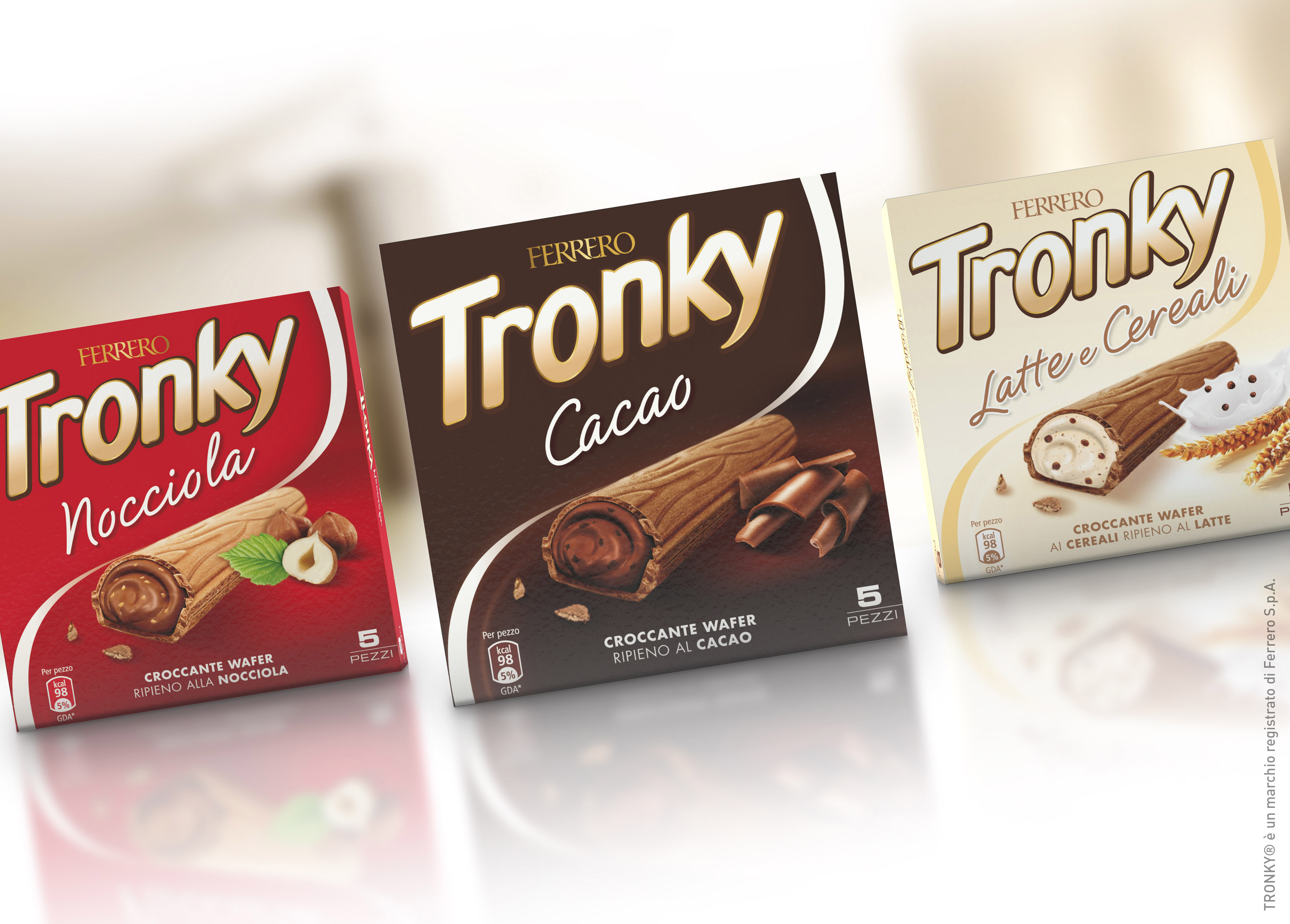
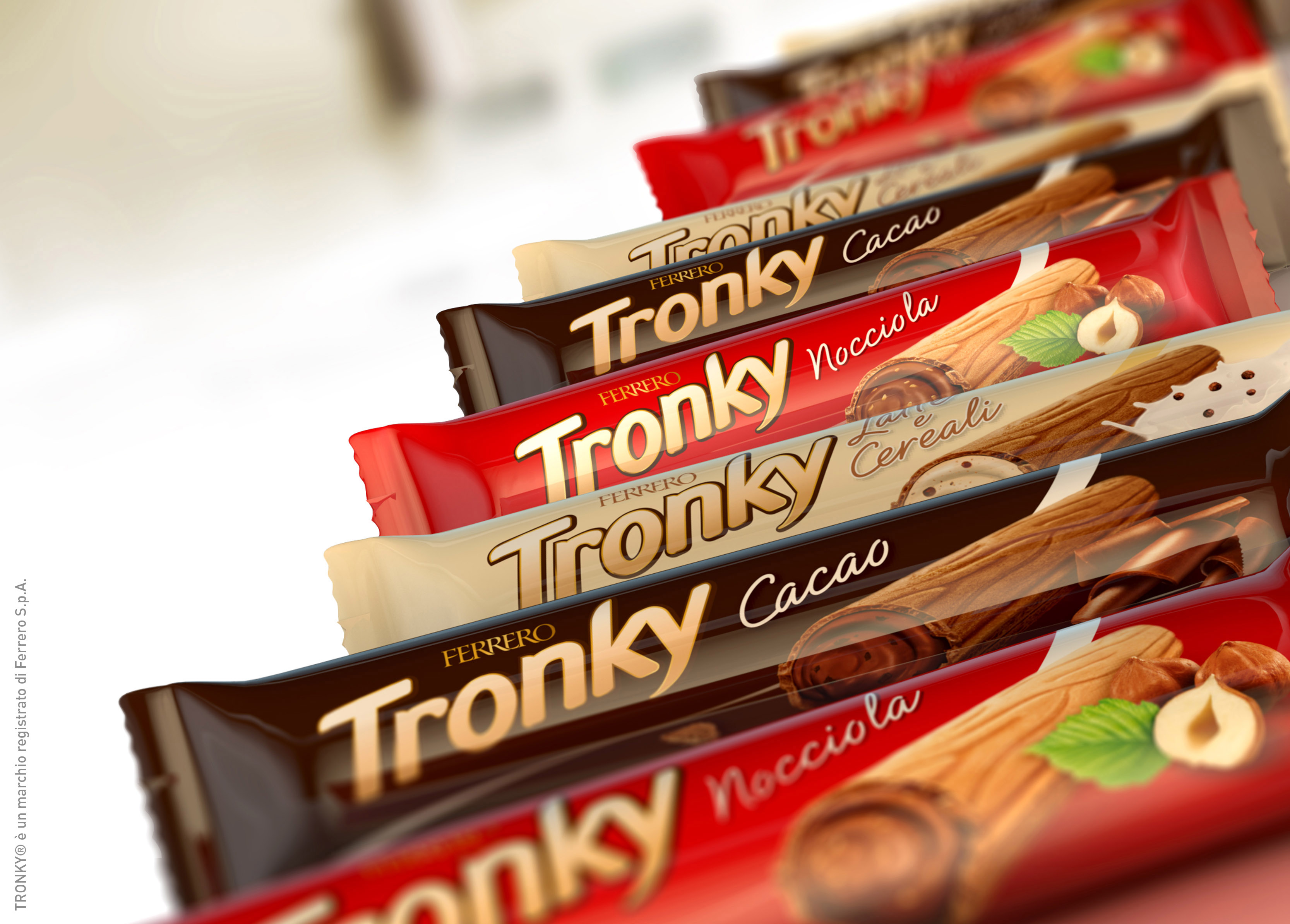
Restyling the brand and the packaging system, in order to communicate in a modern way the values of the brand, not just in terms of indulgence but also in terms of quality. The strategy also involves the creation of a line of snacks through the introduction of some new flavours.
SOLUZIONE CREATIVA
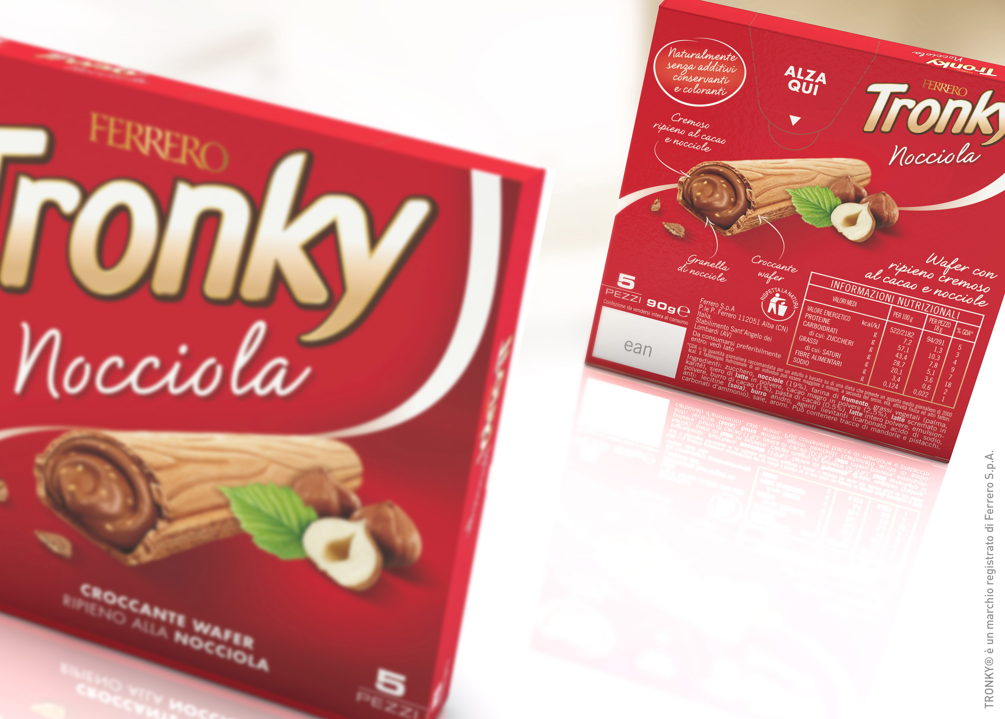
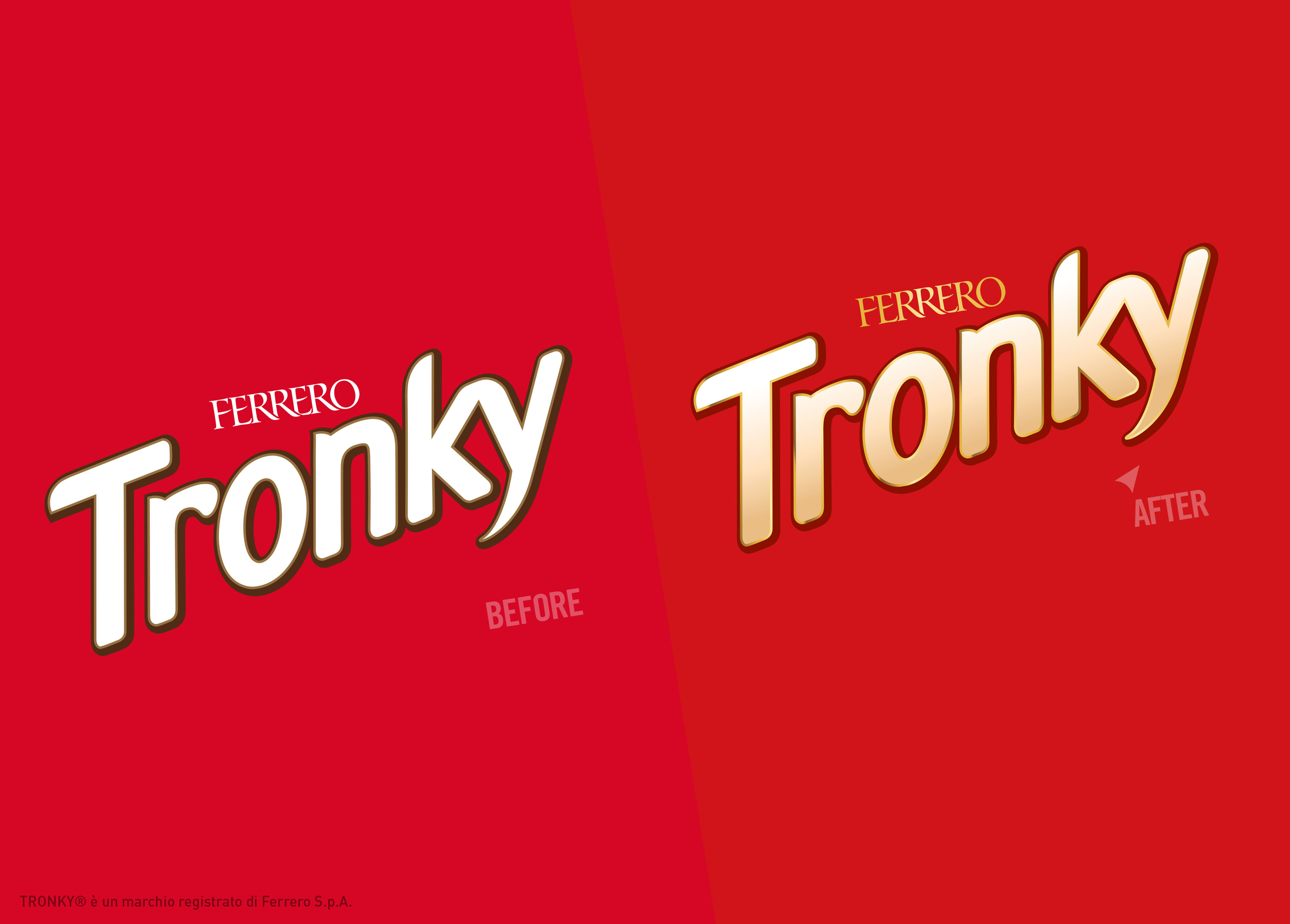
The Agency refreshed the brand identifiers, building over the assets that made the brand famous:
– the logo went through a soft restyling to feel more elegant and premium.
– packaging-wise, the wave sign (which was formerly present in the form of a window) evolved to a modern line that holds the product descriptor and helps the colour codes to convey the differences in flavour.
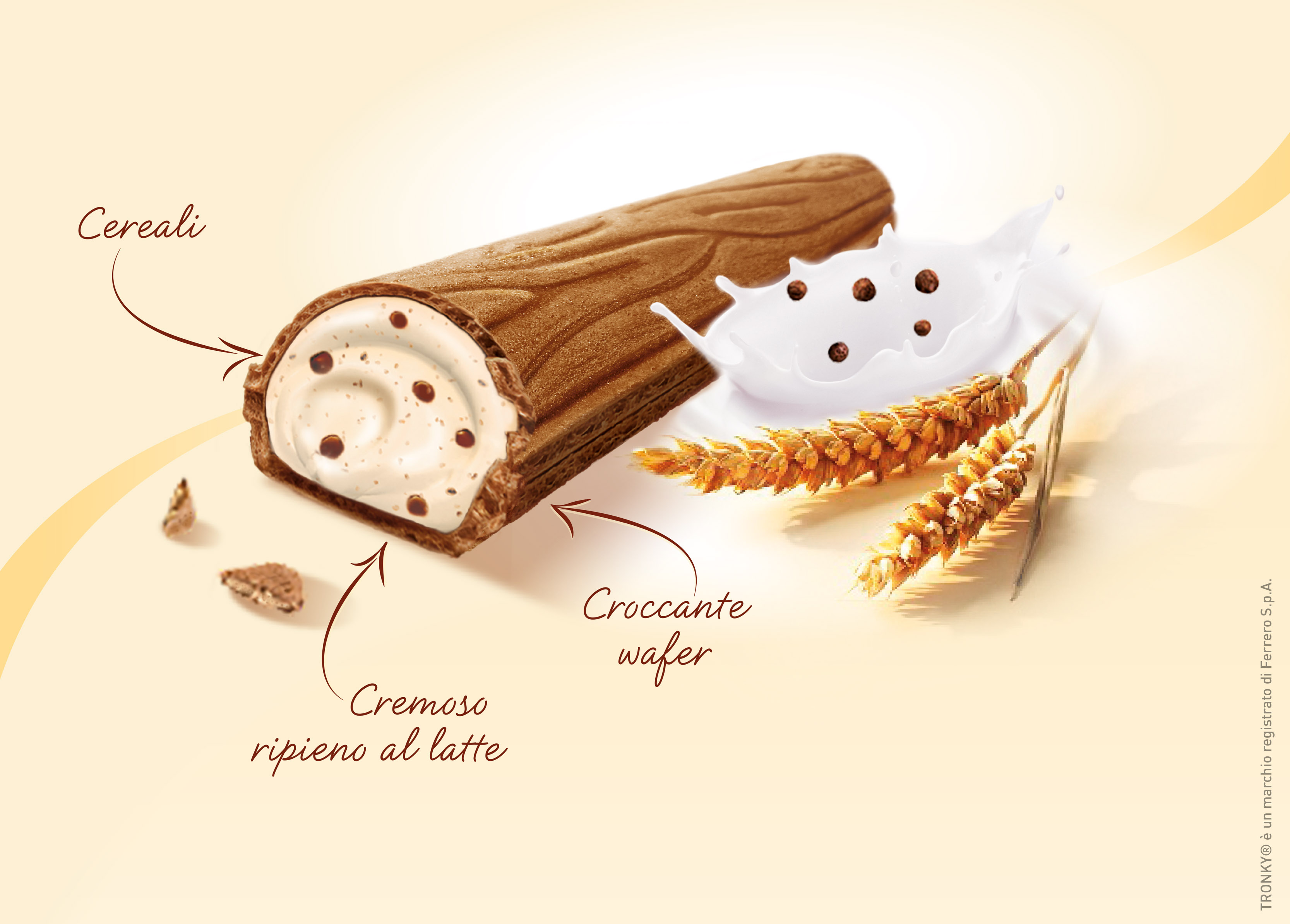
– the new key visual is of a classic type with a modern photo treatment that emphasises the quality of the ingredients.
P.IVA 08721430968 - Cap. Soc. €500,00 interamente versato - N° R.E.A. MI 2044407