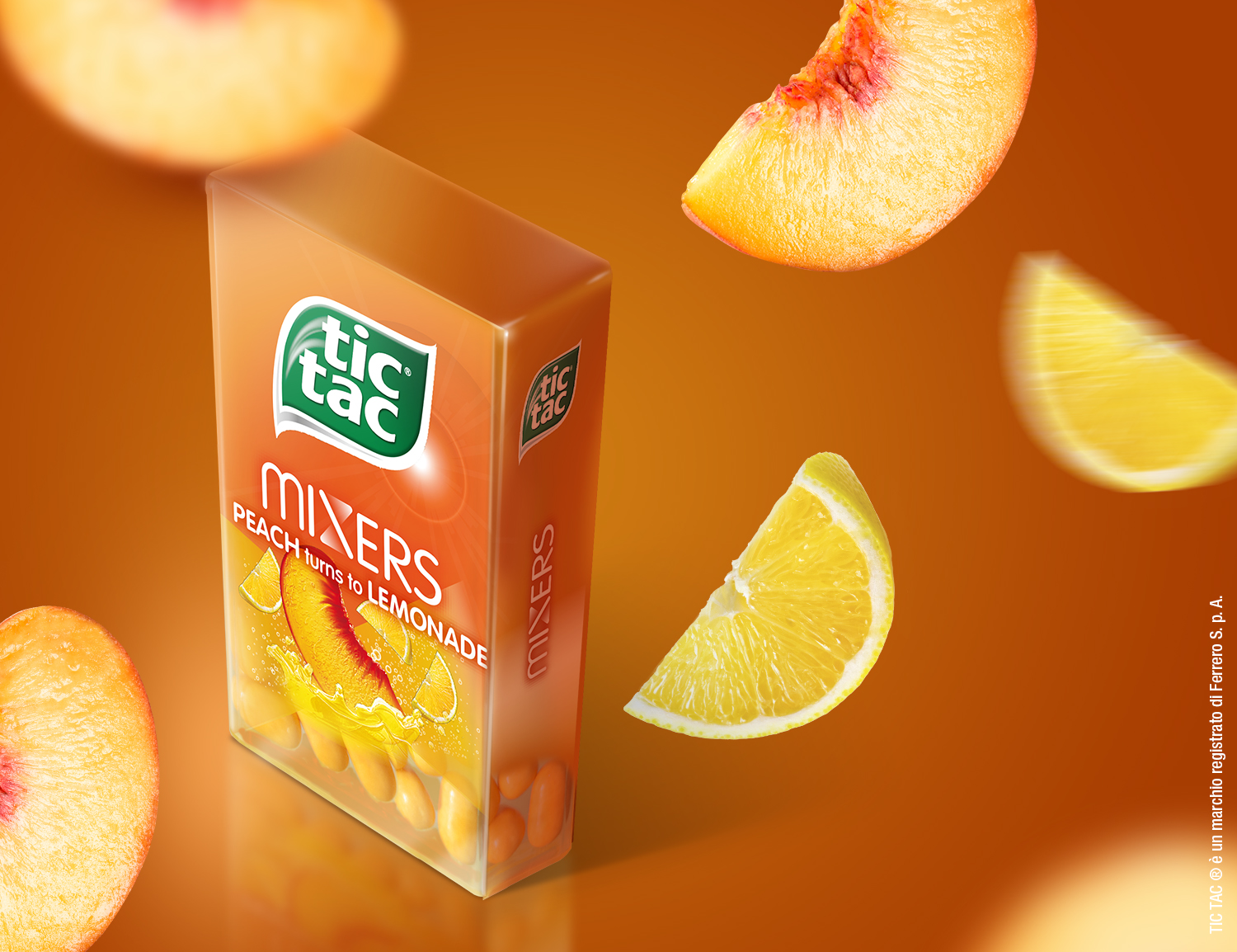
Tic Tac Mixers
Ferrero
SCENARIO
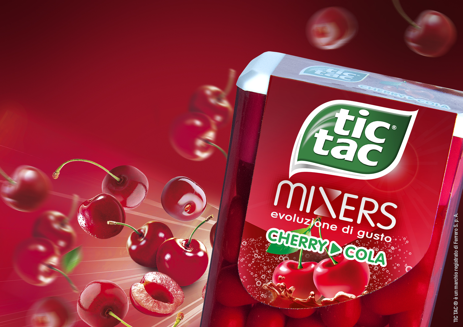
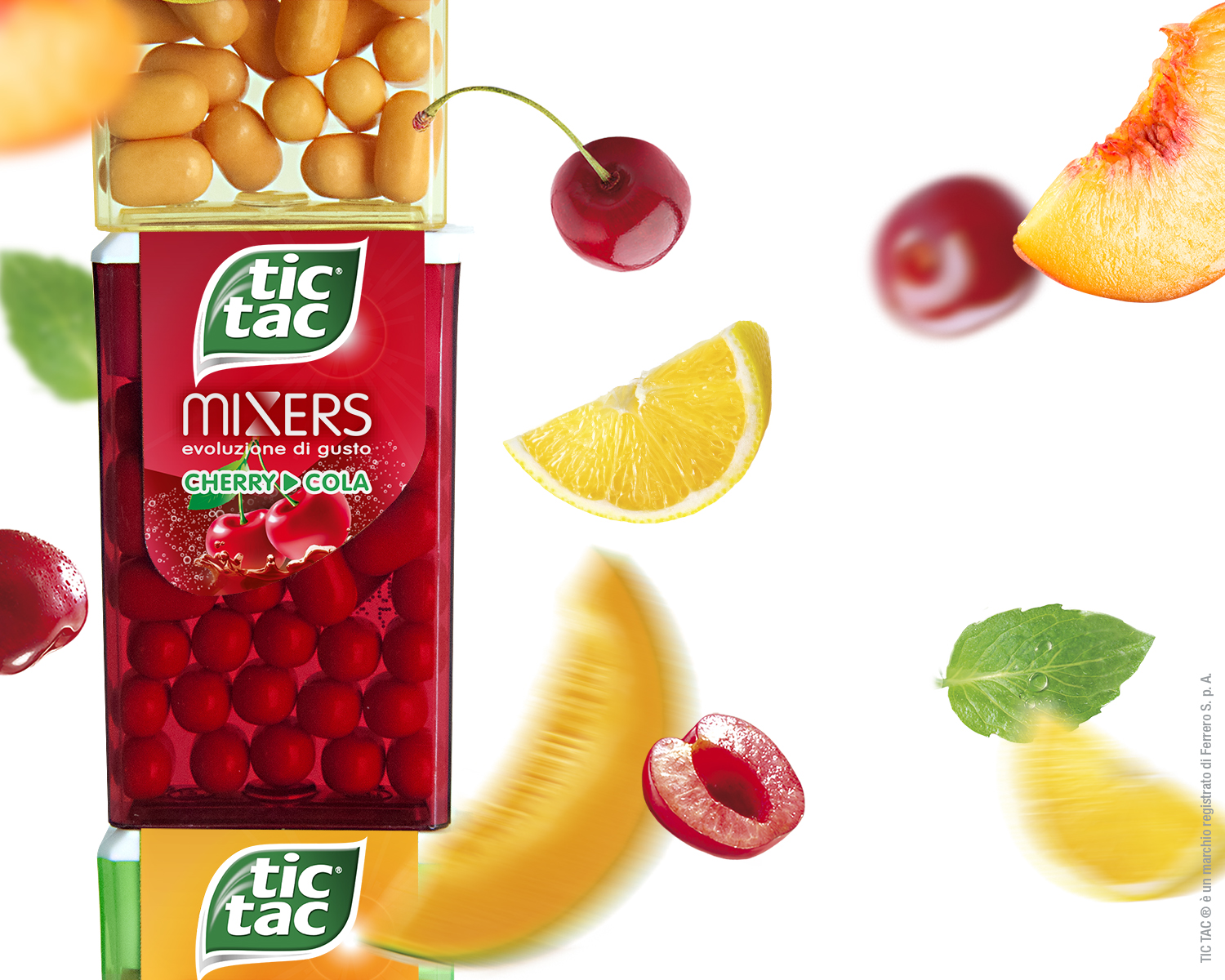
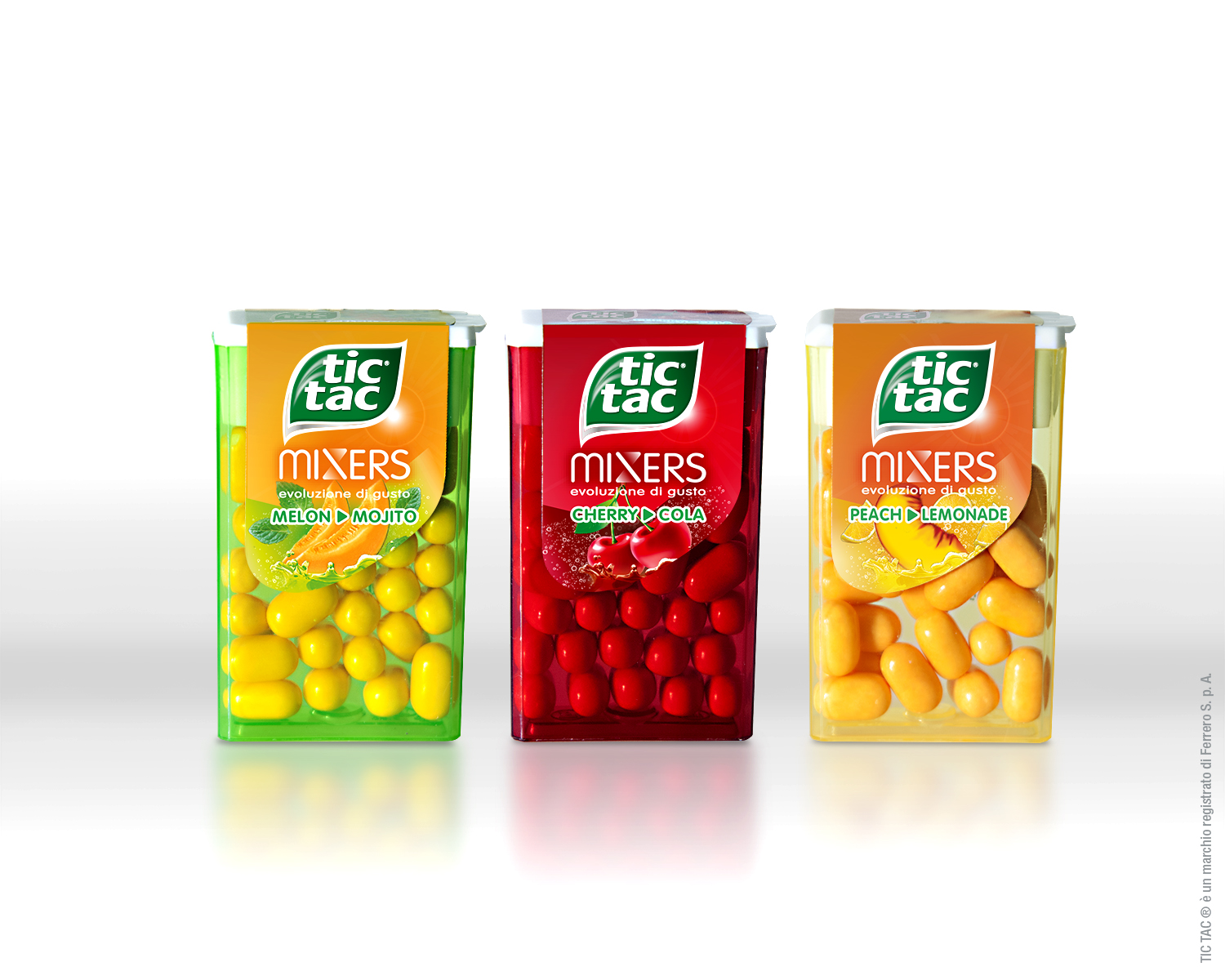
Tic Tac, the popular mint brand by Ferrero, launches a new product that brings a real innovation on the market: the first candy changing flavour as it melts in your mouth. 3 new combos of double flavoured candies will make for a separate line of products with future mixes and combinations.
OBIETTIVI DI COMUNICAZIONE
The Tic Tac target is that of millenials (an age group ranging from teenagers to people in their thirties), hence the brand communication style is minimalist, essential, unconventional and iconographic. It is necessary to communicate the new product line consistently with the brand’s voice and target.
SOLUZIONE CREATIVA
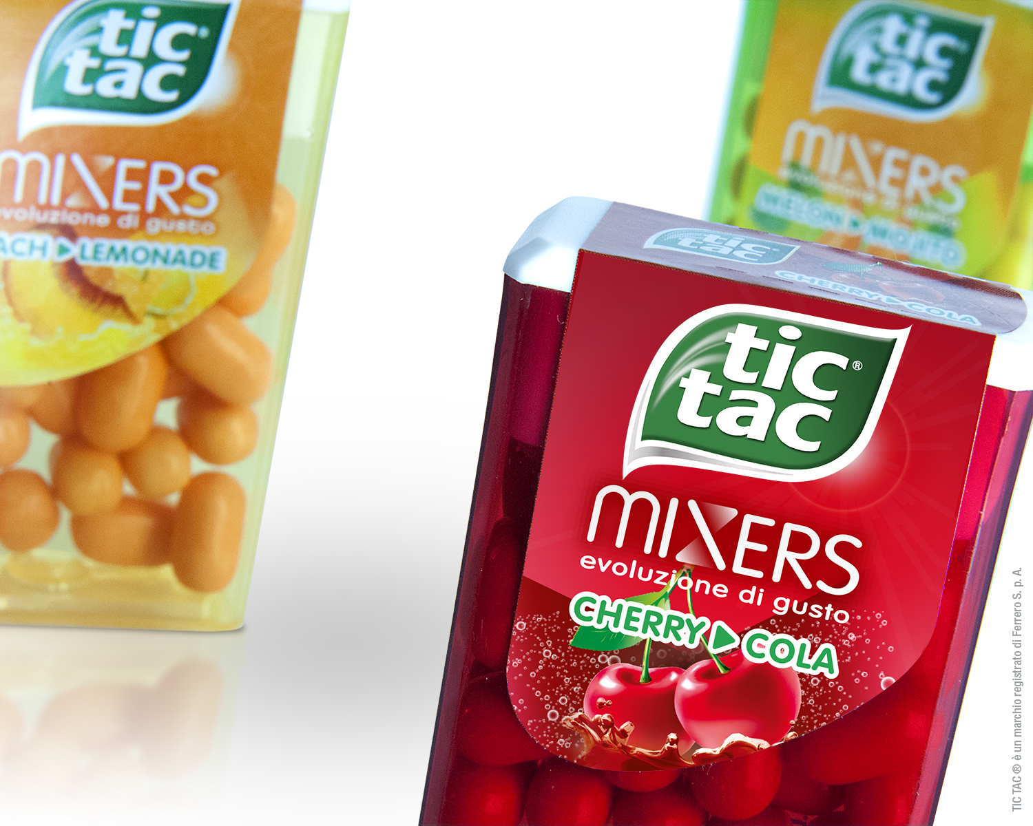
The name Mixer and the tagline Flavour evolution illustrate the product innovation. The X in the logo indicates movement and change.
The external fruit flavour is always on the foreground while an X shaped window on its background points to the secondary one – a beverage.
To keep the communication essential the caption connects the two flavours by a simple arrow, avoiding further words and matching the iconographic and minimalistic style of the brand.

 Torna indietro