Tibi
Bonbonetti
SCENARIO
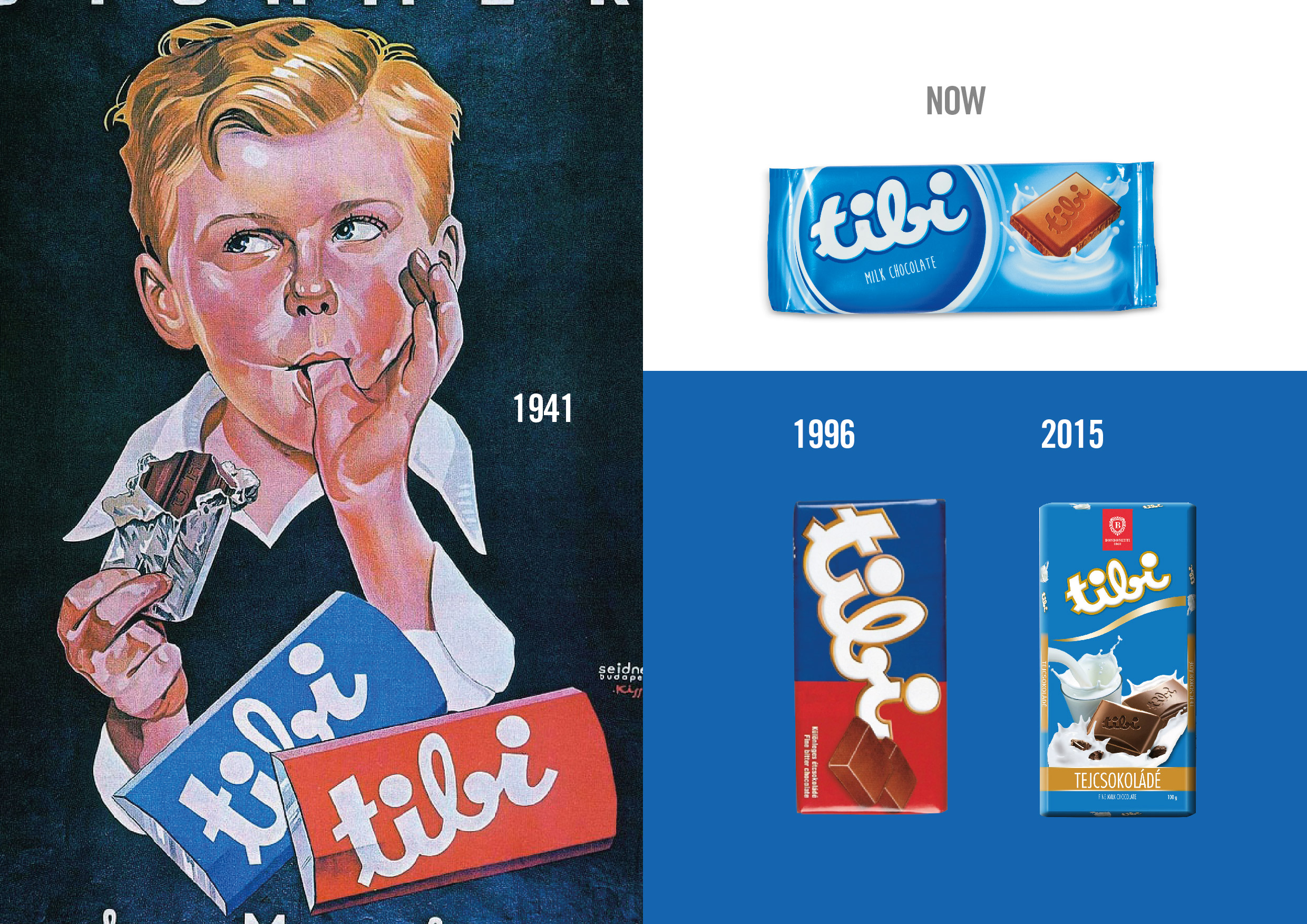
Bonbonetti Group, is the most significant confectionary corporation of Hungary. Its famous Tibi chocolate first appeared on the shelves in 1941 and today is one of the three major players in the market. Tibi is perceived as a traditional, old Hungarian brand. On one hand this strongly helps identify the brand, on the other hand it makes it less modern and appealing to a young audience.
OBIETTIVI DI COMUNICAZIONE
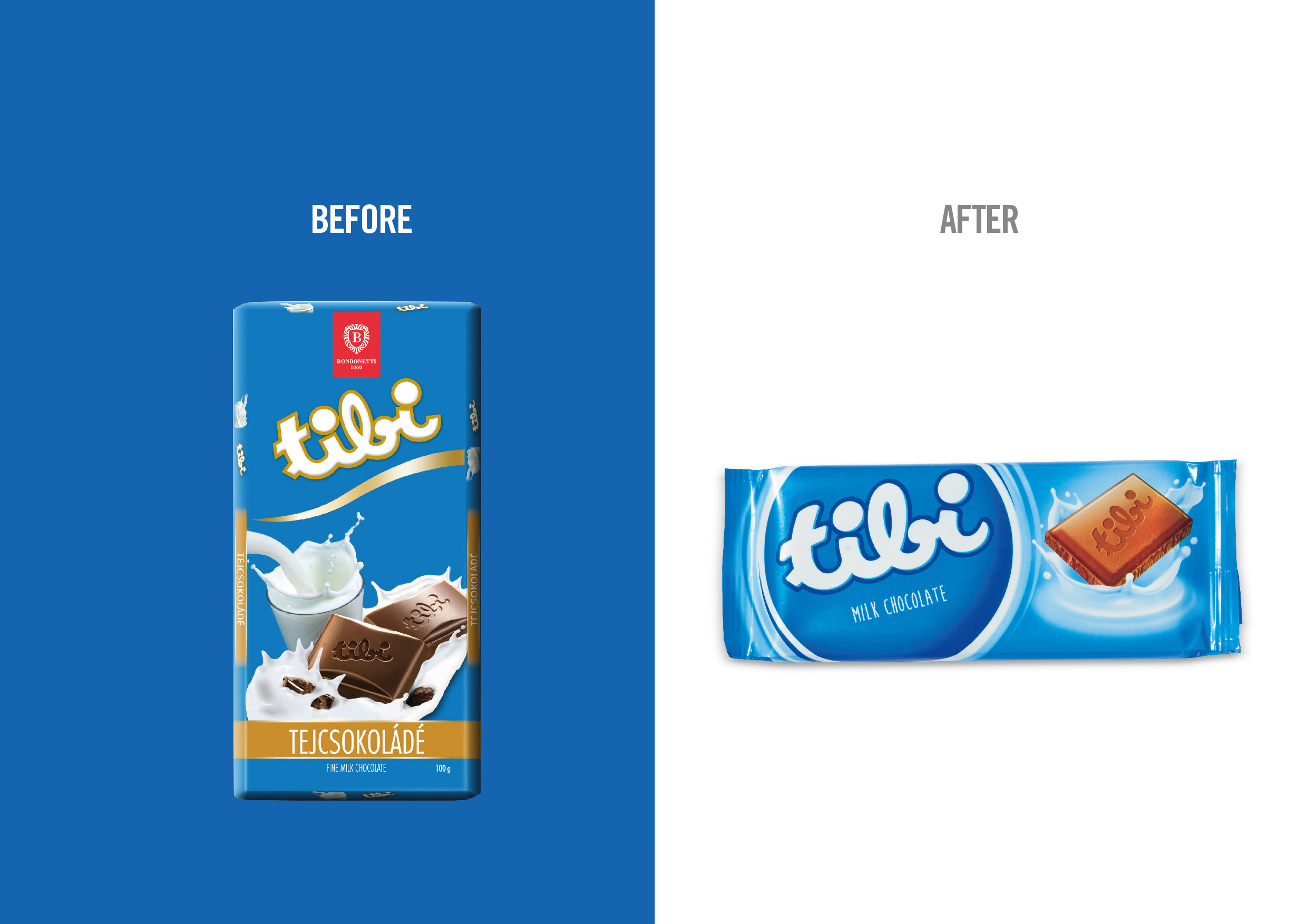
The agency was required to restyle the visual identity and packaging system. The overall objective was to make Tibi more trendy and up-to-date, preserving its retro appeal, which is the real distinguishing factor over its main competitors.
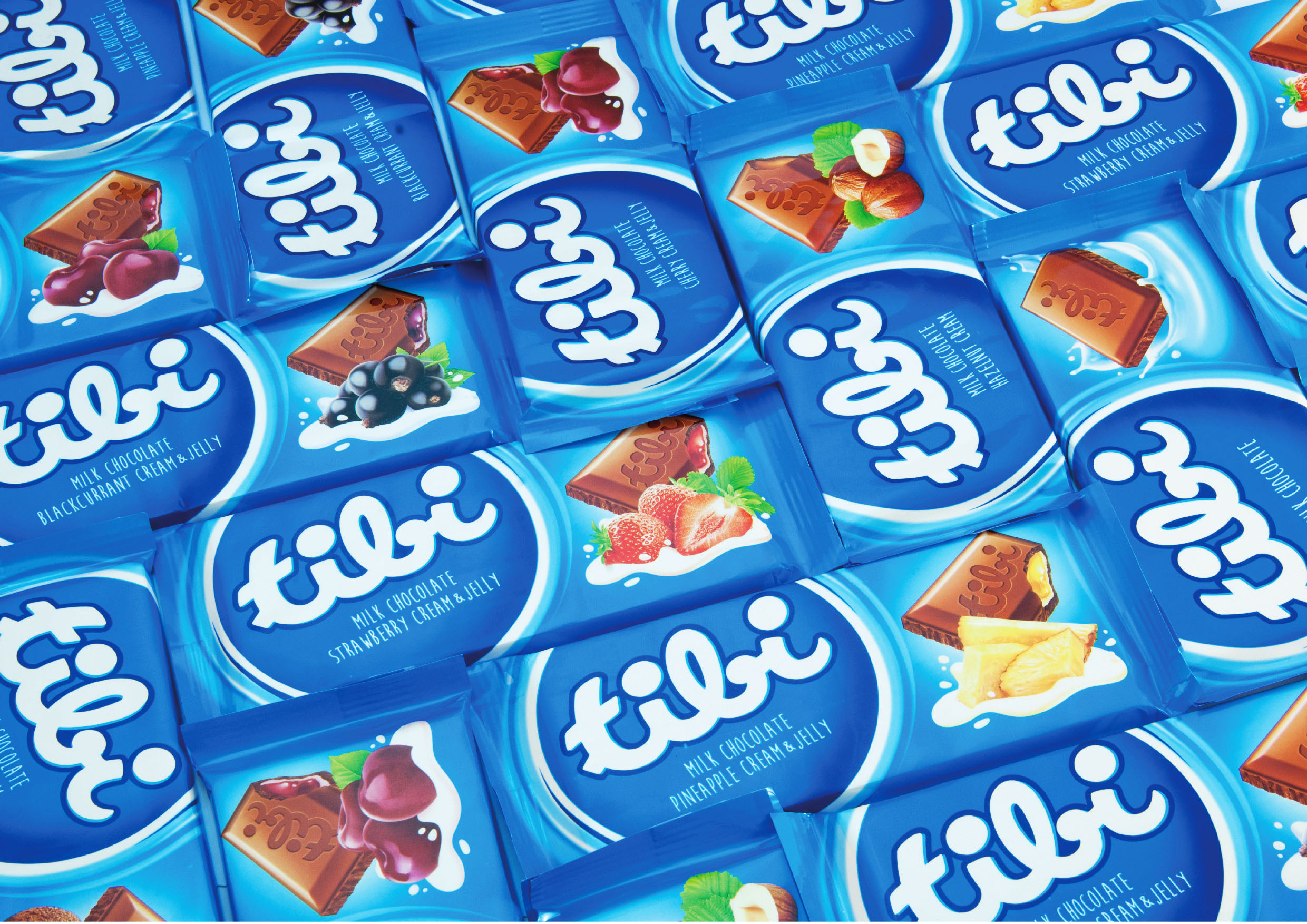
The new system will have to convey brand consistency while being able to differentiate the product range.
SOLUZIONE CREATIVA
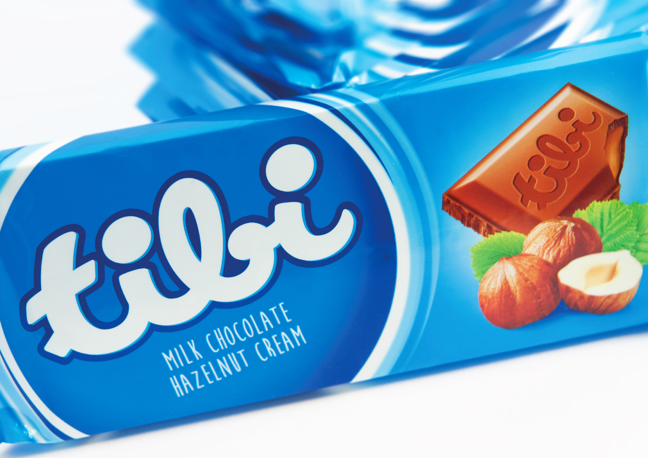
The Tibi logo remained unchanged for over 70 years, making it extremely recognizable and an exceptional brand asset. For this reason it was only softly retouched in shape and proportions, whereas its gold outline has been changed to blue, as this classic colour for Tibi packaging is the one that consumers really associate the brand with.
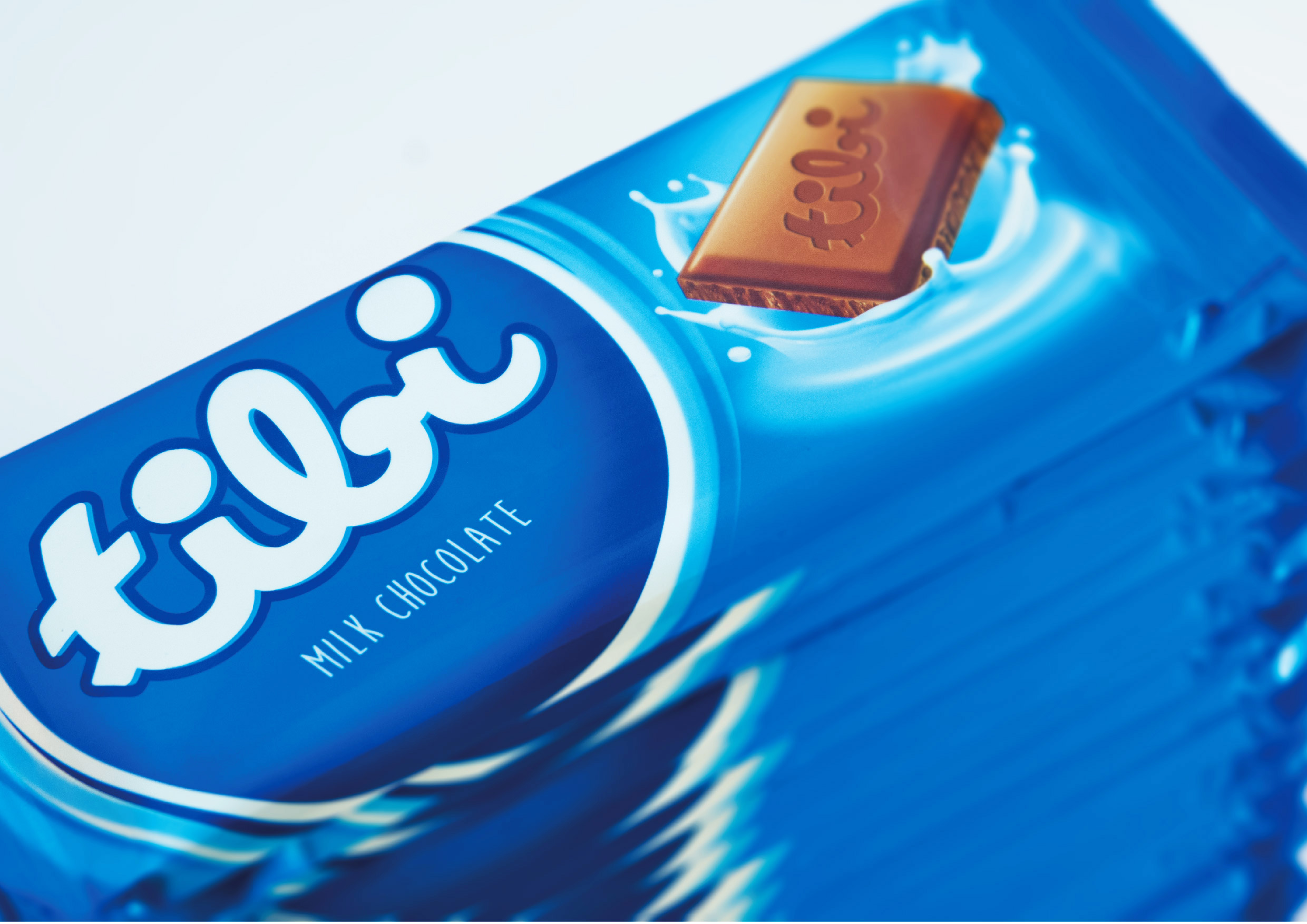
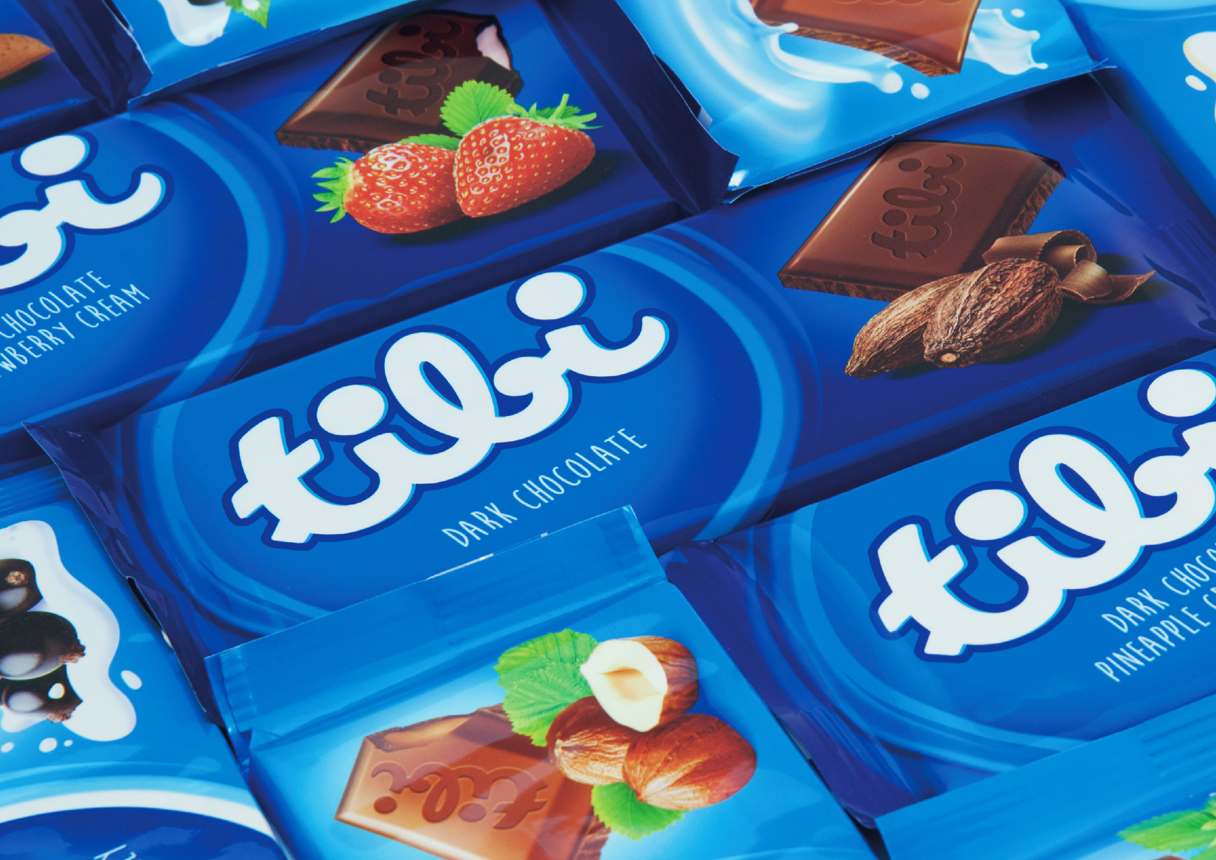
To further capitalize on the heritage of the logo, the whole new packaging system was designed around it, giving it a major role and placing it in a round seal that adds value to it. The descriptor has been placed under the logo, to let the consumer easily read it. The new horizontal layout adds modernity, and so does the new shade of blue dominating the pack. Product flavours and ingredients have been put to the fore and shown together with cut squares of chocolate that display their filling, to enhance both clarity and appetizing appeal.

 Torna indietro