Queen’s
Soleko
SCENARIO
Soleko has been operating in the optic and ophthalmologic field for 40 years and is a leader on the Italian contact lenses market.
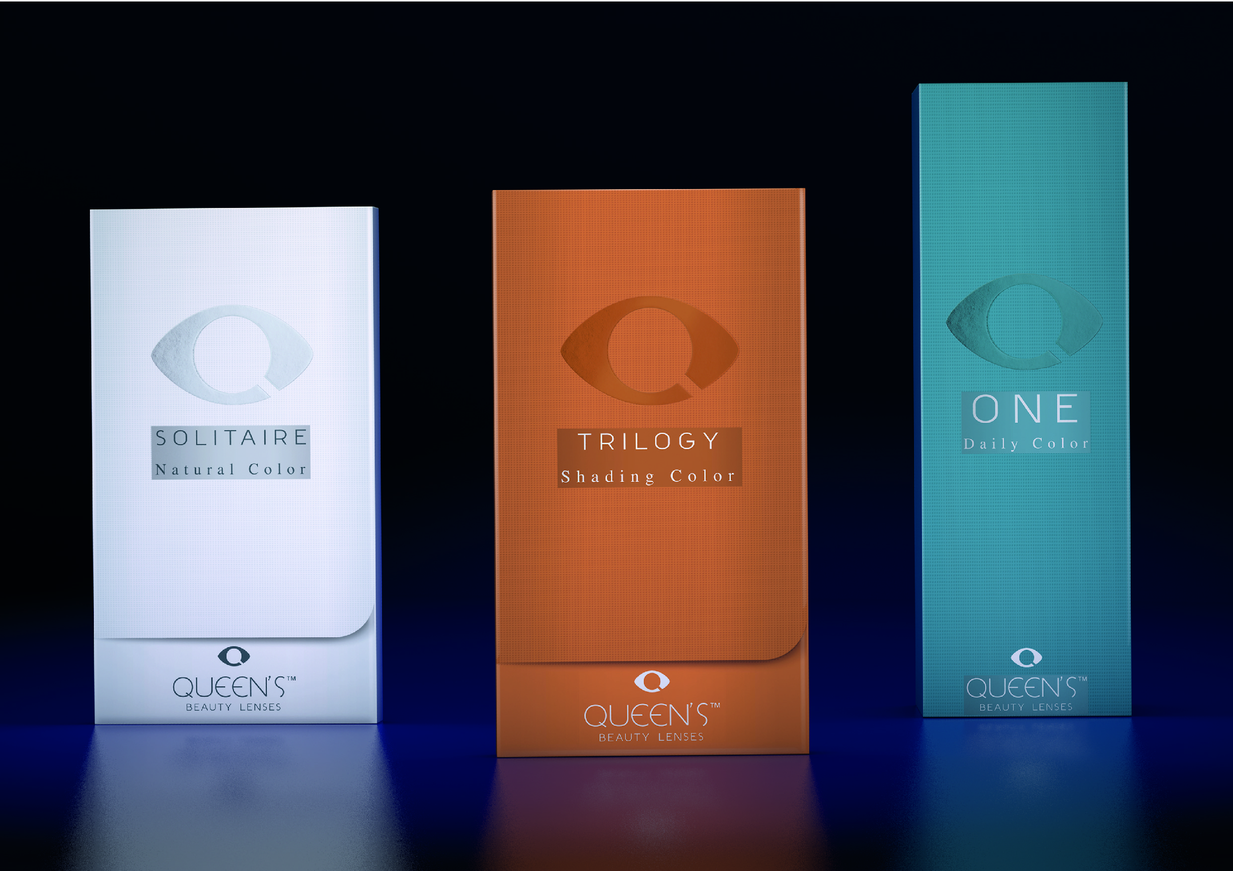
The company is launching 4 new lines of coloured beauty lenses, produced with its innovative technologies. Three of these are aimed at the European market (One, disposables, Trilogy with shading gradients; Solitaire with natural colors) and one at the Asiatic market (Oros, positioning itself as a luxury product).
OBIETTIVI DI COMUNICAZIONE
The agency was required to create all the communication tools needed to launch the new lines, from the structural design of the packaging to its graphic design, from the media material needed to set up exhibition booths to the launch brochure.
SOLUZIONE CREATIVA
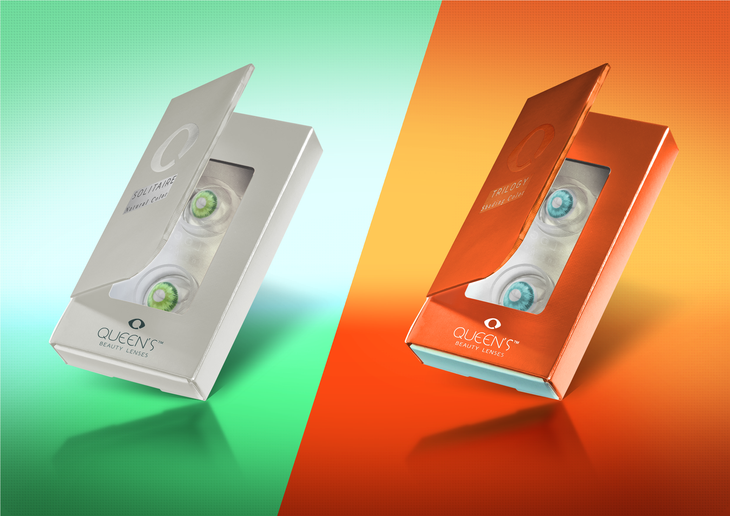
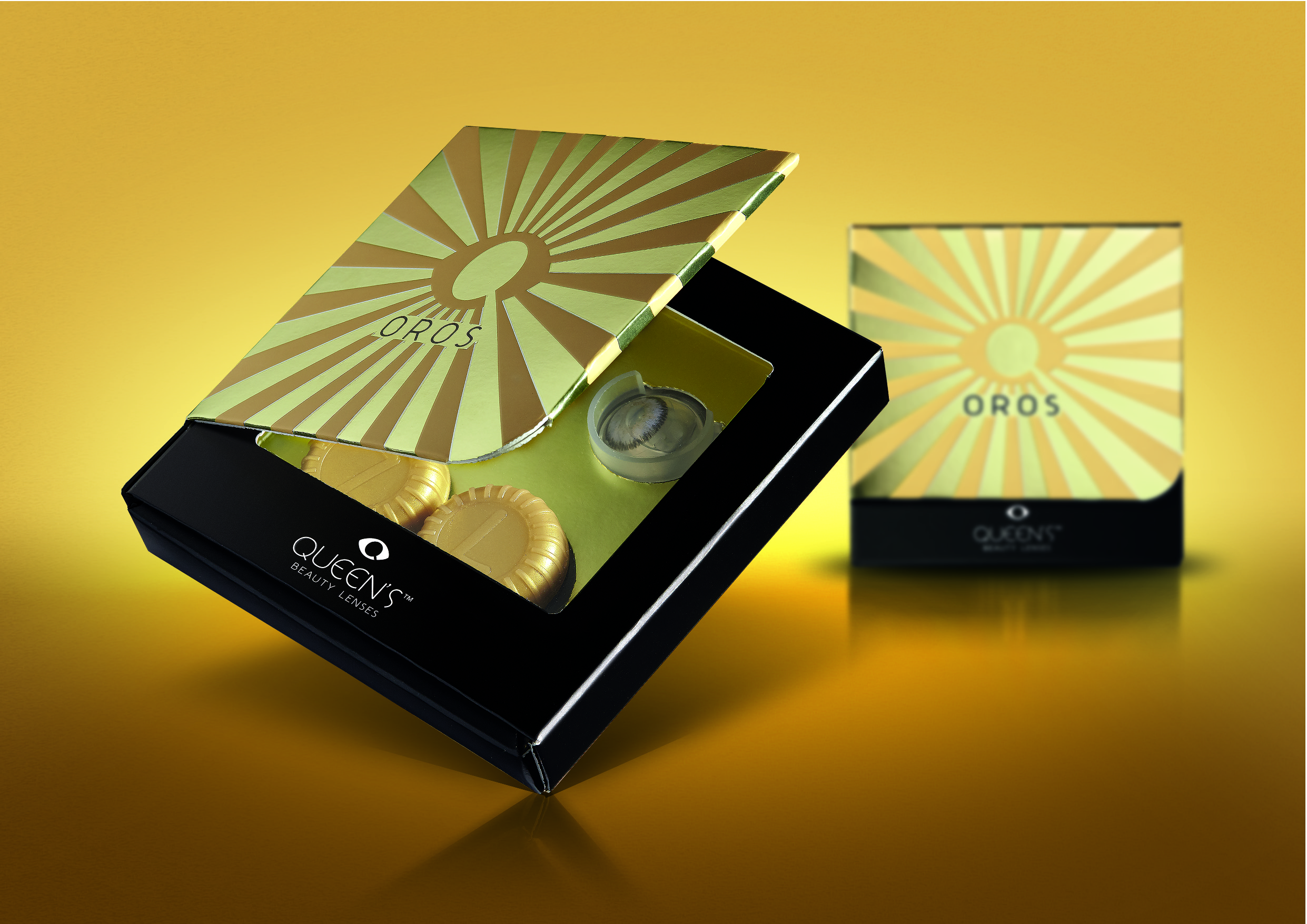
As the new lenses differentiate themselves by their colours and nuances, the challenge was letting the consumer understand at a glance what he was buying. The most effective solution was showing the product directly. To do so, we designed an innovative packaging featuring a cardboard panel (a magnet inside holds it still) that can be opened to show a window. Inside the window, some transparent lens cases are displayed. As a result, contact lenses can be seen for the first time without opening the packaging.
On the graphic side, every line comes in an essential design with metallic colours, except for Oros, which was designed in black and gold to look more glamorous and meet the taste of the Asian luxury market.

 Torna indietro

