
Perugina Nero
Perugina
SCENARIO
In a crowded and competitive market, Perugina achieved a high rated awareness, however counterweighted by a not elevate perceived quality: many consumers exclusively identify the brand identity with the world of Baci, the company’s long-selling product.
OBIETTIVI DI COMUNICAZIONE
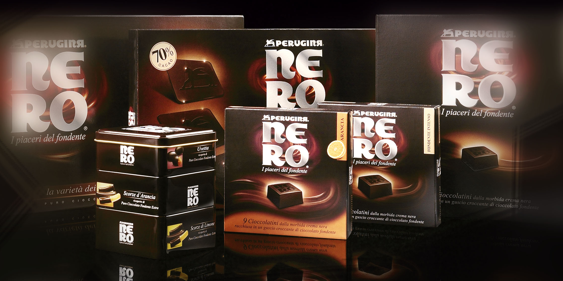
Relaunching the brand perception through a new large retail line riding the new dark chocolate market trend: a premium selection of the finest chocolate, repositioning Perugina as a top quality player.
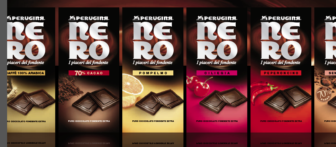
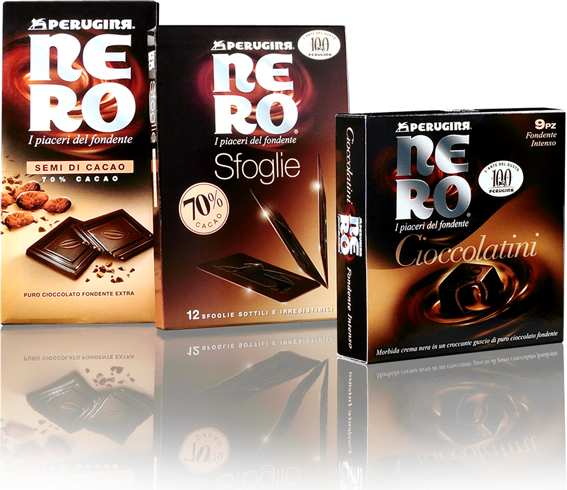
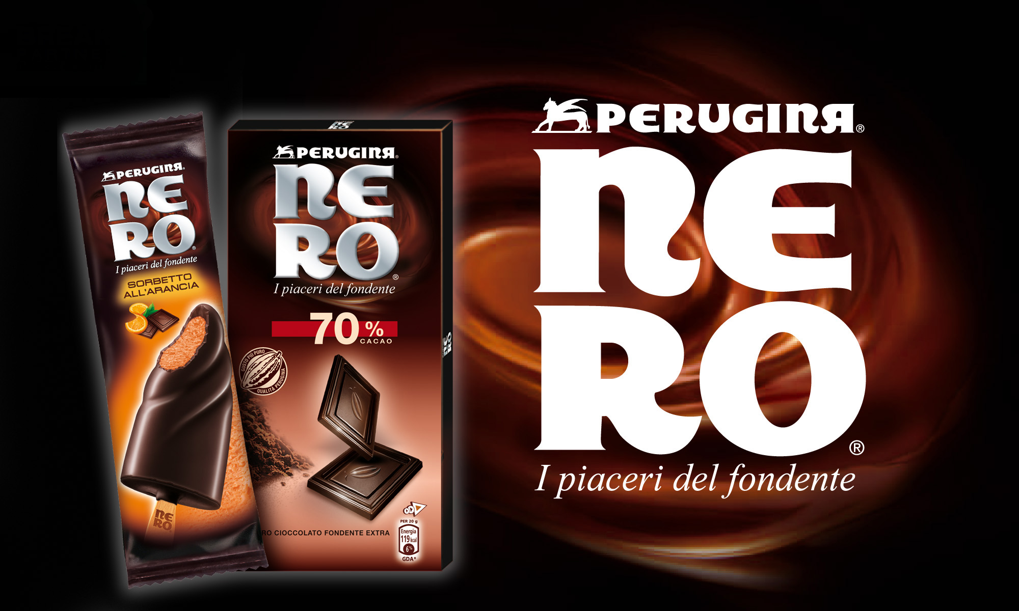
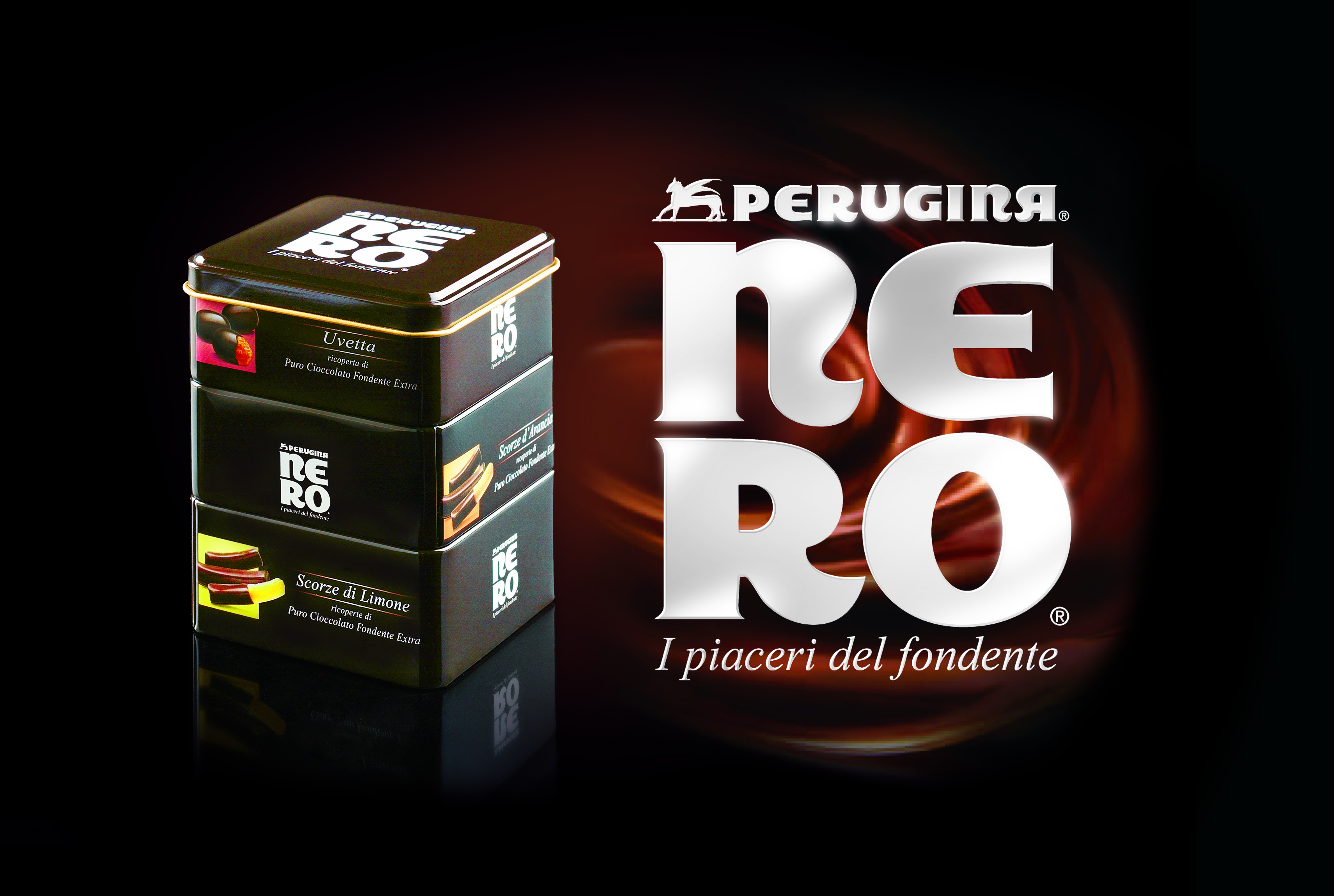
SOLUZIONE CREATIVA
Naming was the first step: “Nero” (“Black”), a strict, impactful and memorable solution, drawing inspiration from the raw matter itself. The typeface was developed from the original lettering of the mother brand, and obtained the highest visibility on the package to unleash the brand potential at its best.
P.IVA 08721430968 - Cap. Soc. €500,00 interamente versato - N° R.E.A. MI 2044407