Oxy Esthétique
Oxy
SCENARIO
Since 25 years, Oxy is synonymous with experience and professionality thanks to its innovative product for discoloration and hair removal.
OBIETTIVI DI COMUNICAZIONE
The brand image has aged throughout the years. A restyling is needed, keeping in mind that the product range will soon be extended.
The new line will have to talk to consumers with a very high and professional tone of voice.
SOLUZIONE CREATIVA
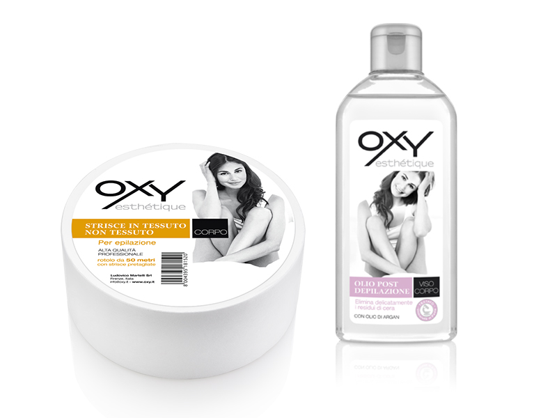
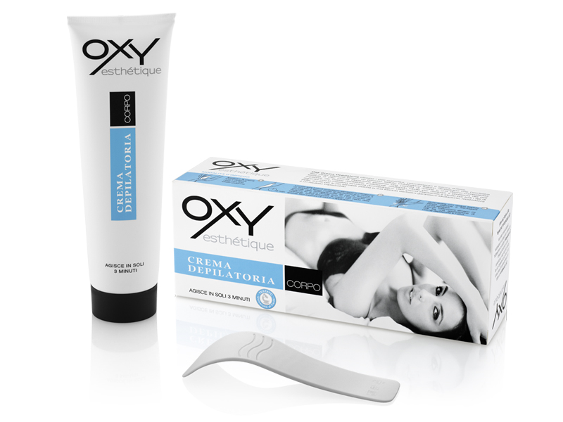
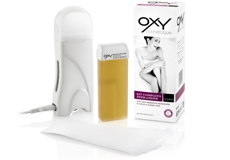
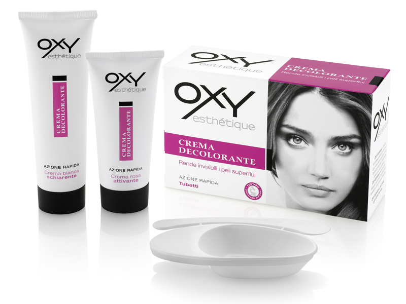
The logo becomes more modern and essential in style. The sub brand esthétique makes it more mild and emotional, reassuring about the product performance. The whole range has a more rational look due to a schematic graphic system that can be easily adjusted to different packaging requirements. Colors, images and guidelines complete the visuals and clearly differentiate each product according to the end use it is intended for.

 Torna indietro


