Nutella – B-ready
Ferrero
SCENARIO
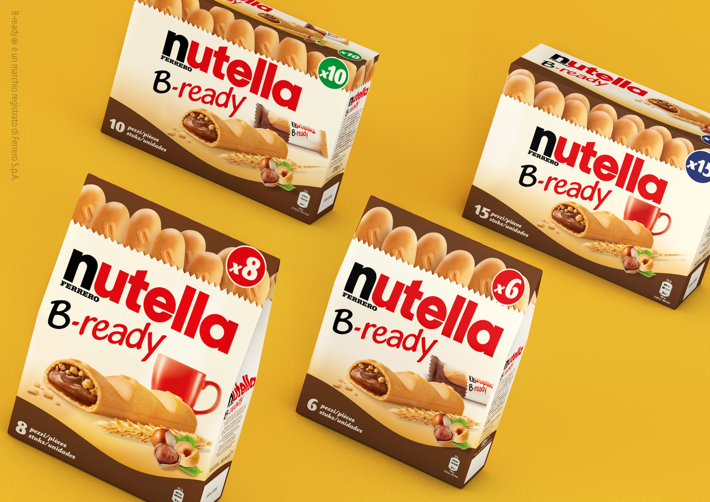
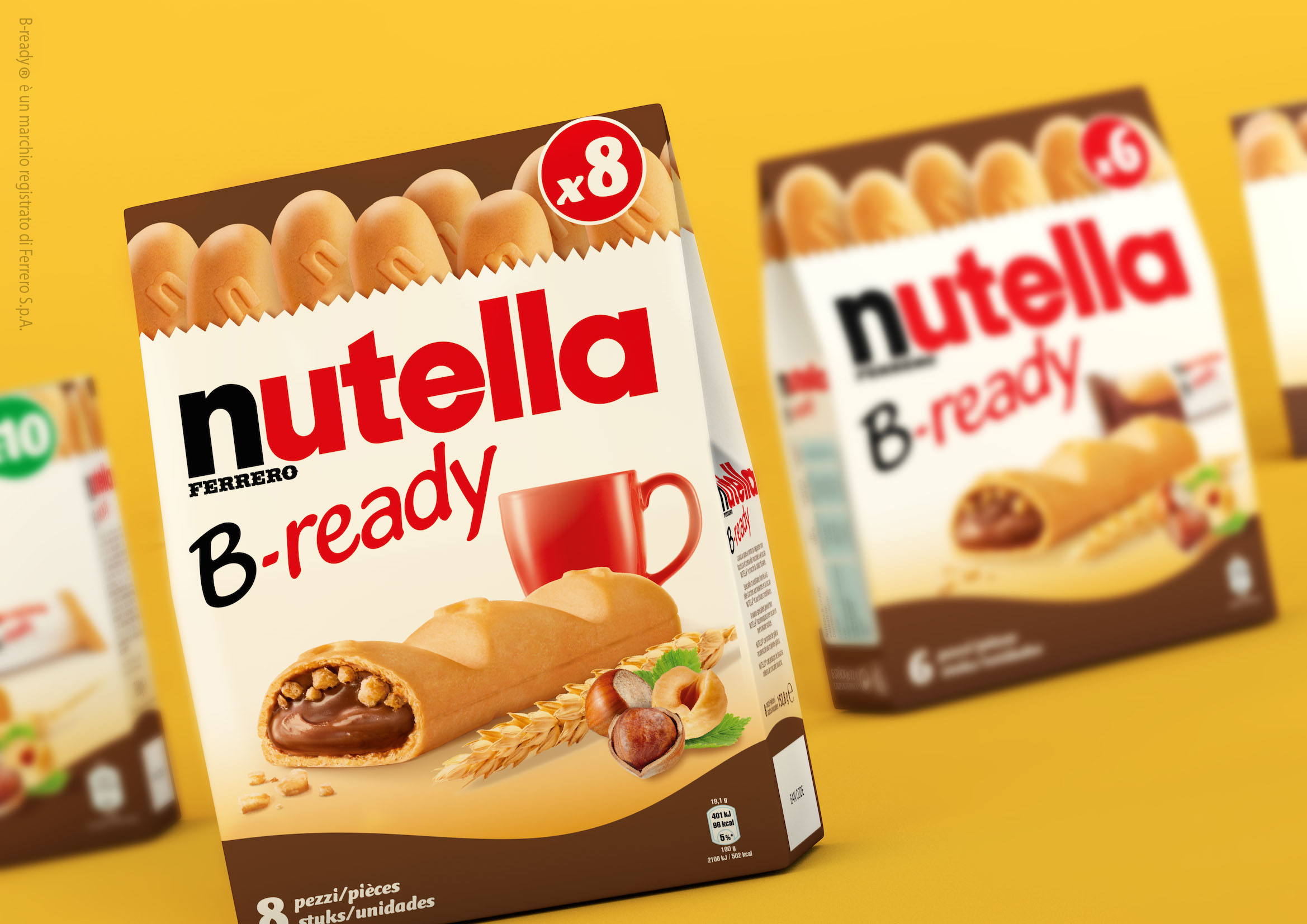
Nutella is known all over the world as a chocolate spread to be enjoyed with a slice of bread. The two ingredients are so closely related that some of the features of bread became part of Nutella’s brand values (which is appetizing but also simple, pure and nutritious). In 2014, after a long research, Ferrero introduced B-ready, the first sub-brand of the famous spread. It’s a product to be enjoyed on its own, but still being strongly connected to its origins: its crunchy, naturally leavened shell is prepared with the same ingredients as bread while its fill consists of creamy Nutella. It also looks like a baguette, an internationally known bread shape. It was first tested on the Italian market two years ago and it was positioned as a morning and mid-morning snack (the pack featured a shining sun and a milk bowl) strongly relating to the world of bread (thanks to the background colours and the image of a traditional bakery bag).
OBIETTIVI DI COMUNICAZIONE
It was necessary to restyle the pack created for the test on the Italian market in preparation for the international 2016 launch.
SOLUZIONE CREATIVA
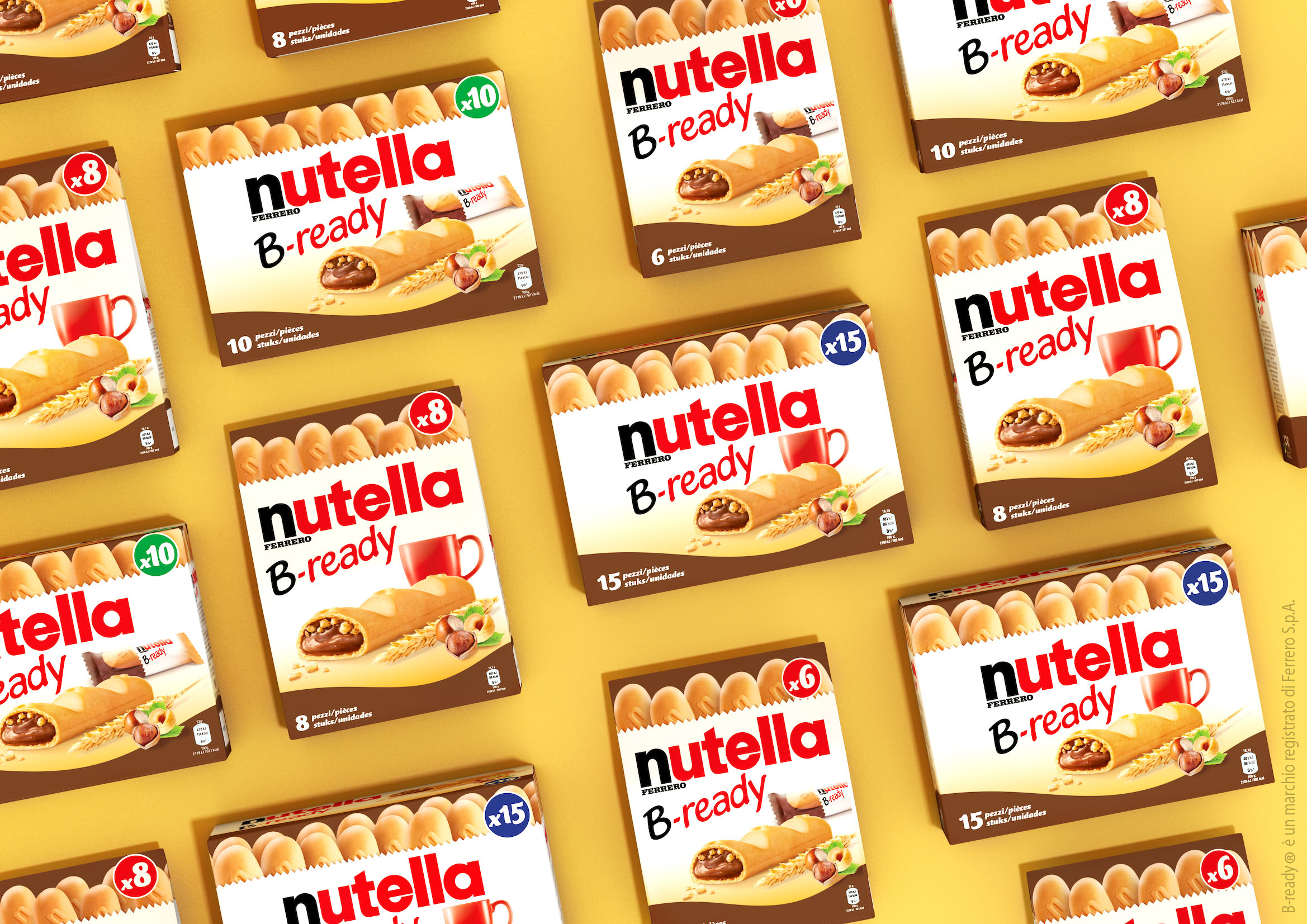
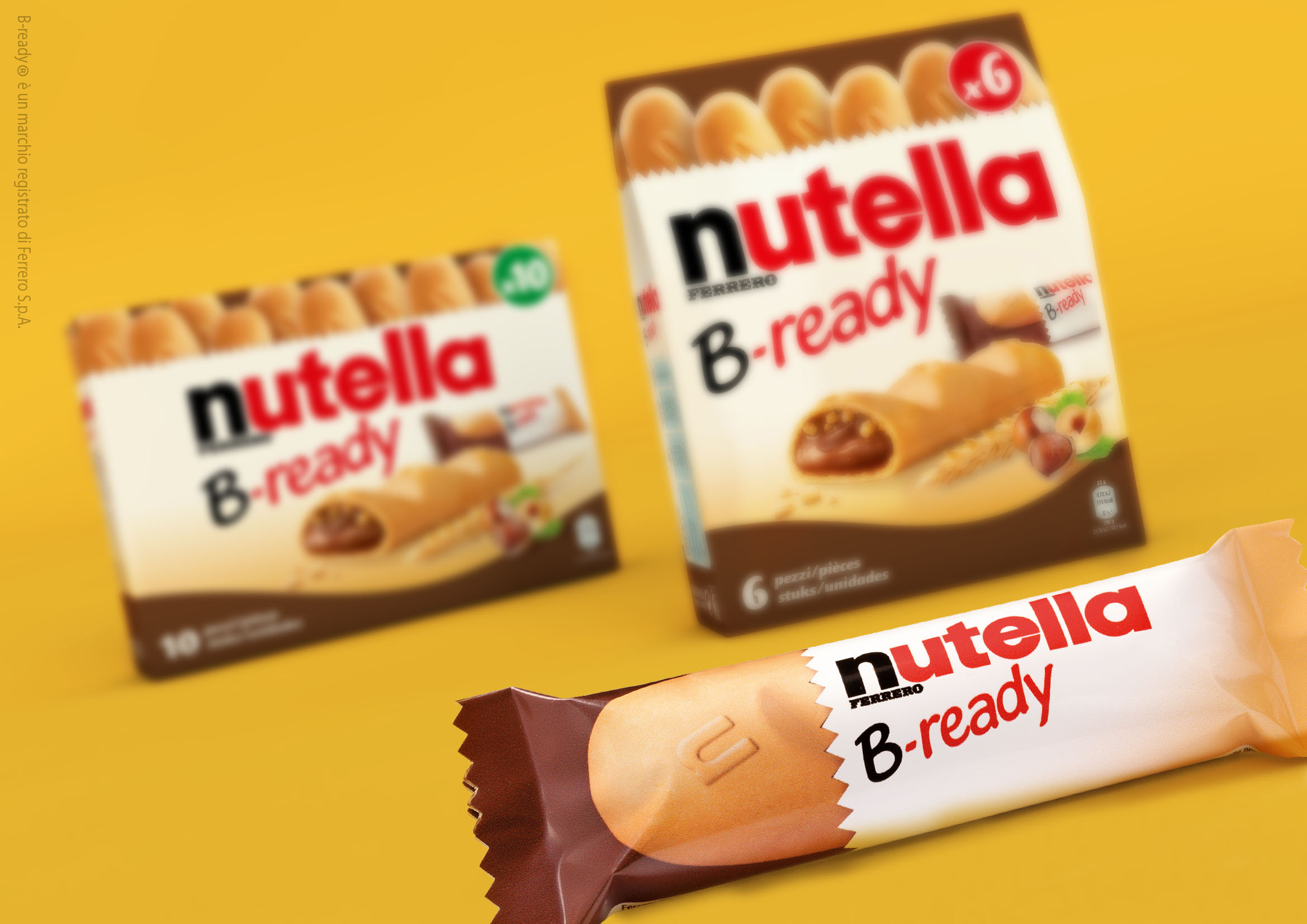
If you take a look at the traditional Nutella pot, the two main colours are white (the background of the label) and chocolate-brown (the product showing through the glass). These two colour were used to strengthen the link between B-ready and the mother brand, to yield on communication synergies. The background of the pack became then white and a brown strip appeared on the bottom, creating a system. The sub-brand font became more modern and happier while the “crunchiness” appeal of the visual was improved. On a first phase the milk bowl became a mug to make it look more international. On a second phase, the mug itself was replaced by the visual of individually packed snacks, to suggest an on-the-go consumption.

 Torna indietro


