Molino Filippini
Molino Filippini
SCENARIO
The history of Molino Filippini begun in the beginning of the 20th century in the heart of the Italian area called Valtellina, where it started processing buckwheat and making typical products of the local tradition. With time it enhanced its offerings with quick and easy-to-prepare flour products.
OBIETTIVI DI COMUNICAZIONE
It was necessary to recreate a brand image to convey the plus of the company on the market, such as the ability to combine innovation with its territory and traditions.
SOLUZIONE CREATIVA
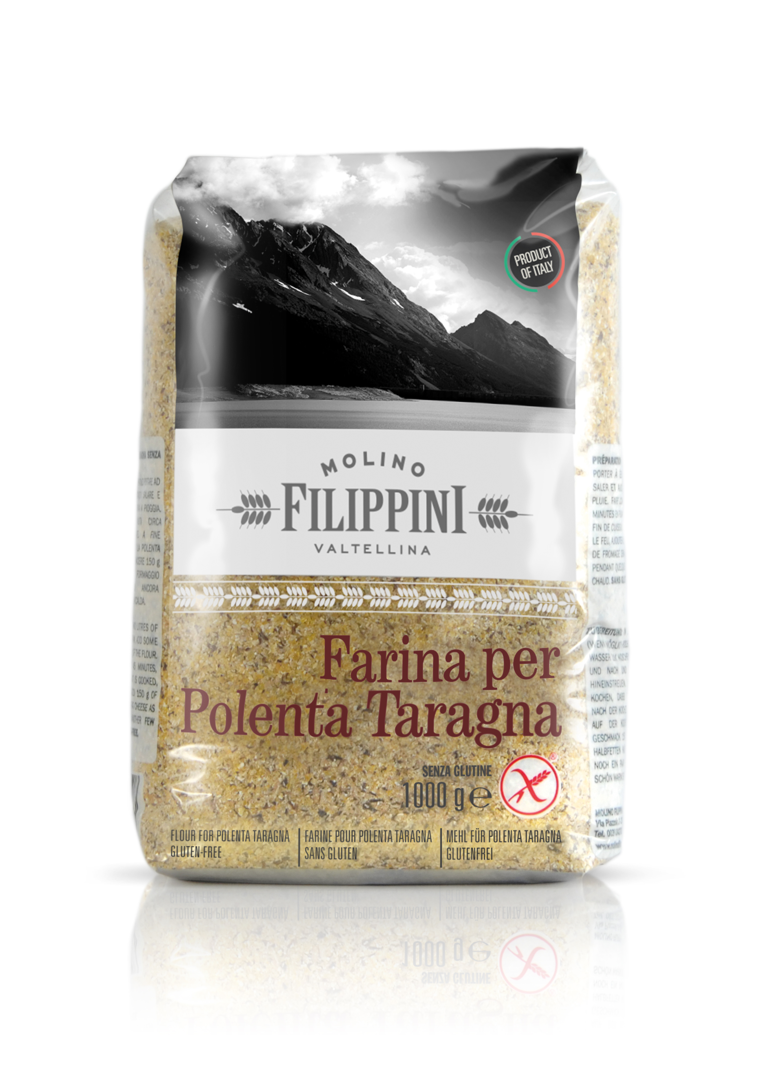
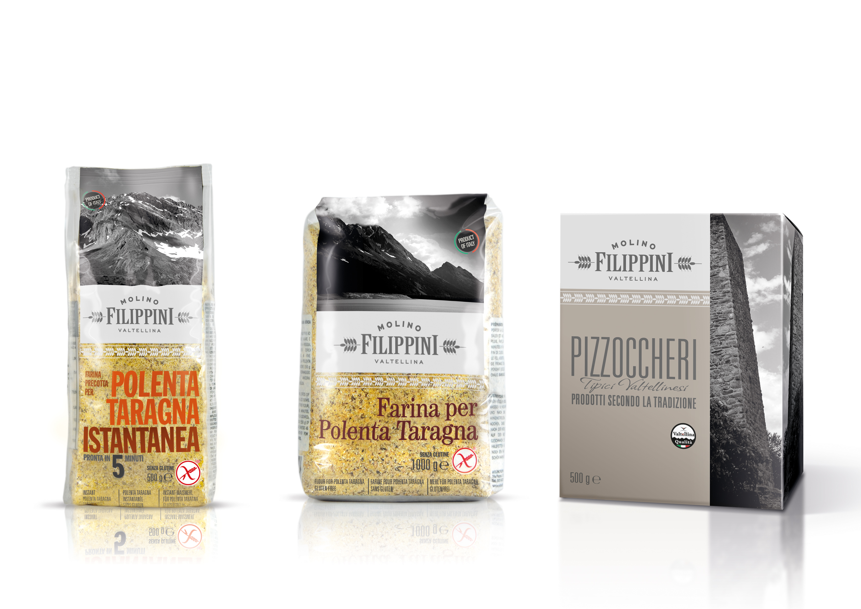
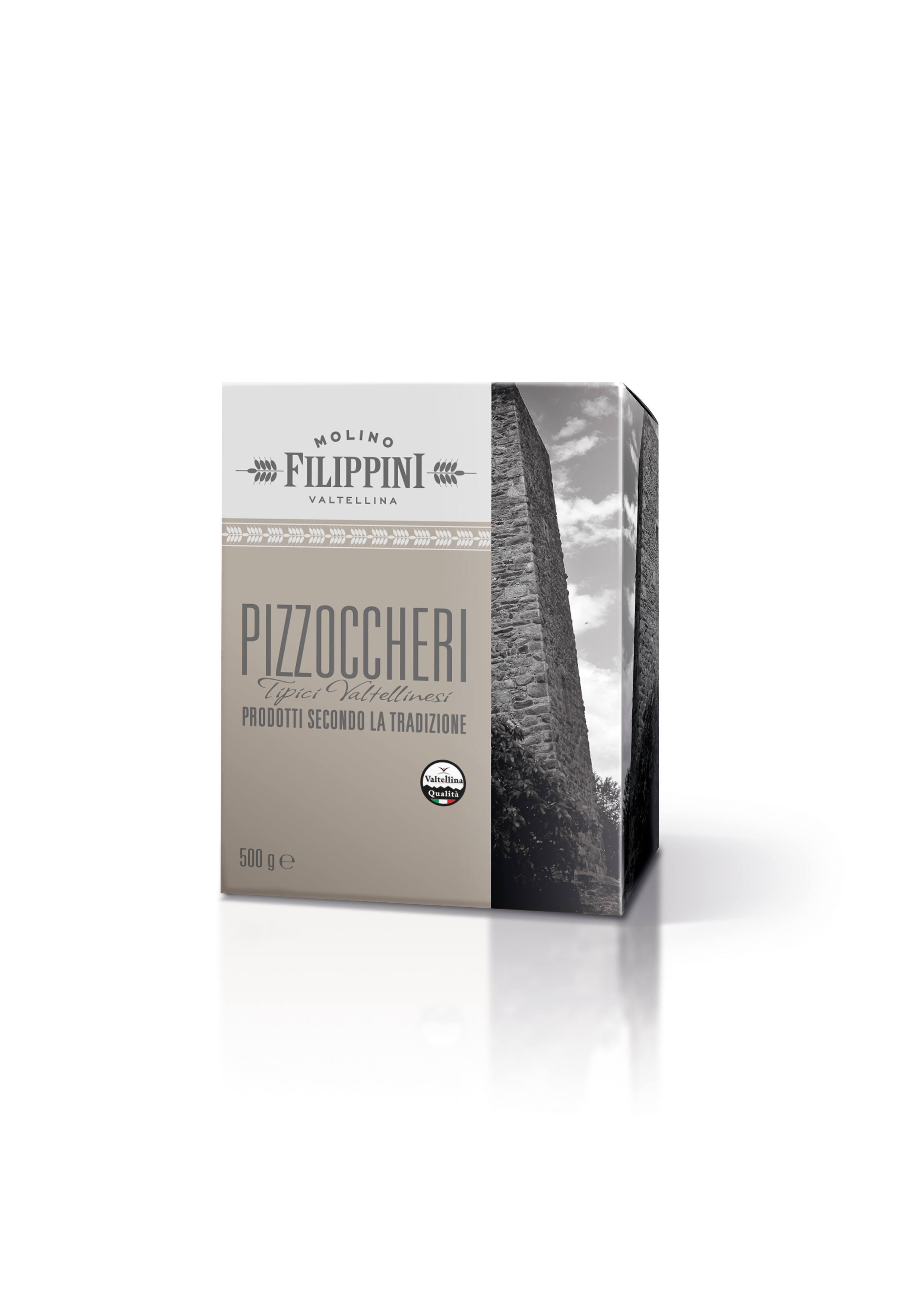
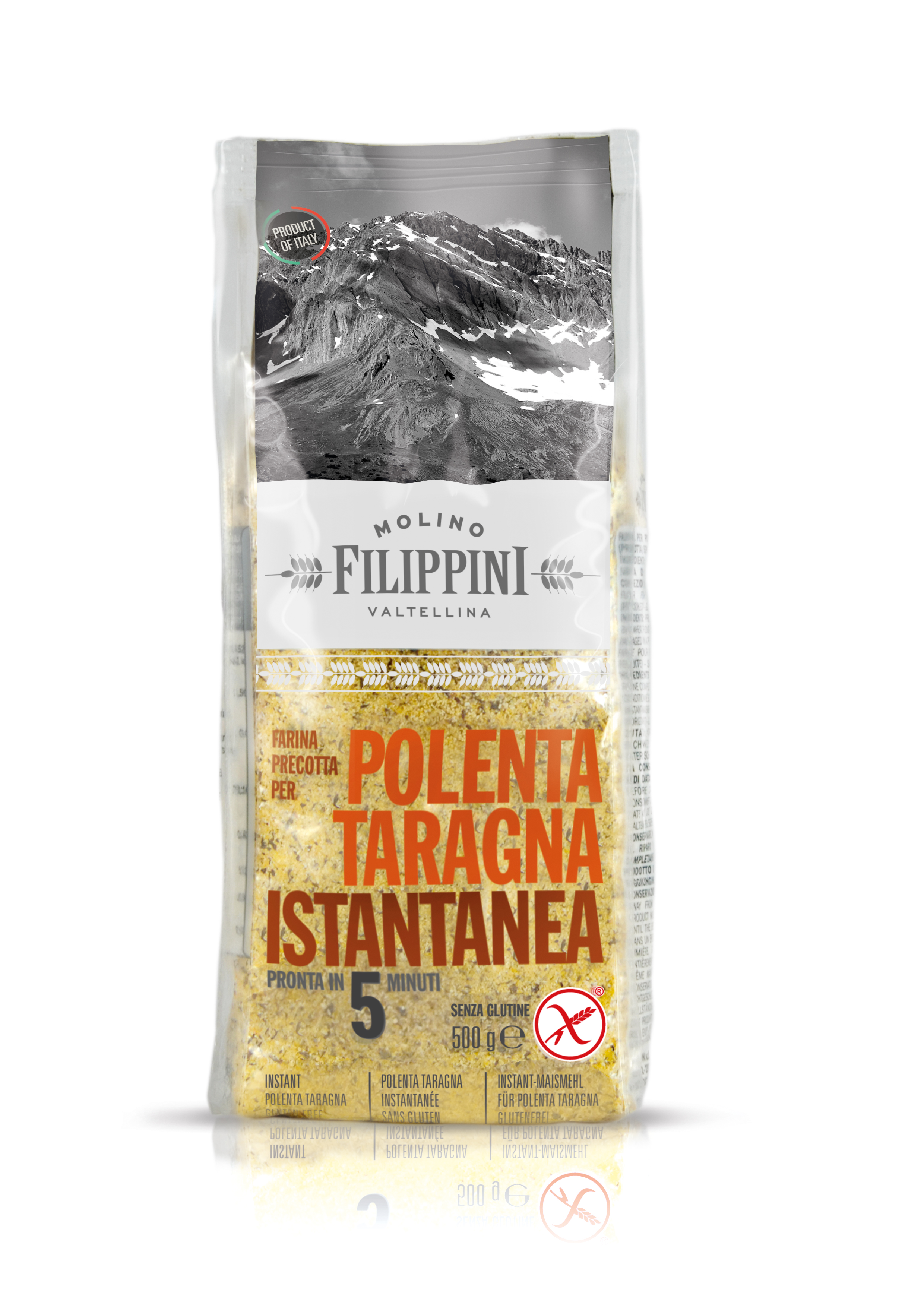
To give a premium feel and stress its belonging to the highly praised area of Valtellina, the brand has been differentiated by using some black and white photographs representing those valleys. These photographs are inserted on the packaging in a rational grid, witnessing the combination of tradition and innovation. The logo has been redesigned with colours that could raise the perception of the firm. The use of typography adds a touch of vintage.


 Torna indietro


