Lavazza Food Service
Lavazza
SCENARIO
Lavazza has been the market leader for 110 years and is today synonymous with Italian Coffee. The brand needs to restyle its Professional line aimed at the HO.RE.CA. channels worldwide.
OBIETTIVI DI COMUNICAZIONE
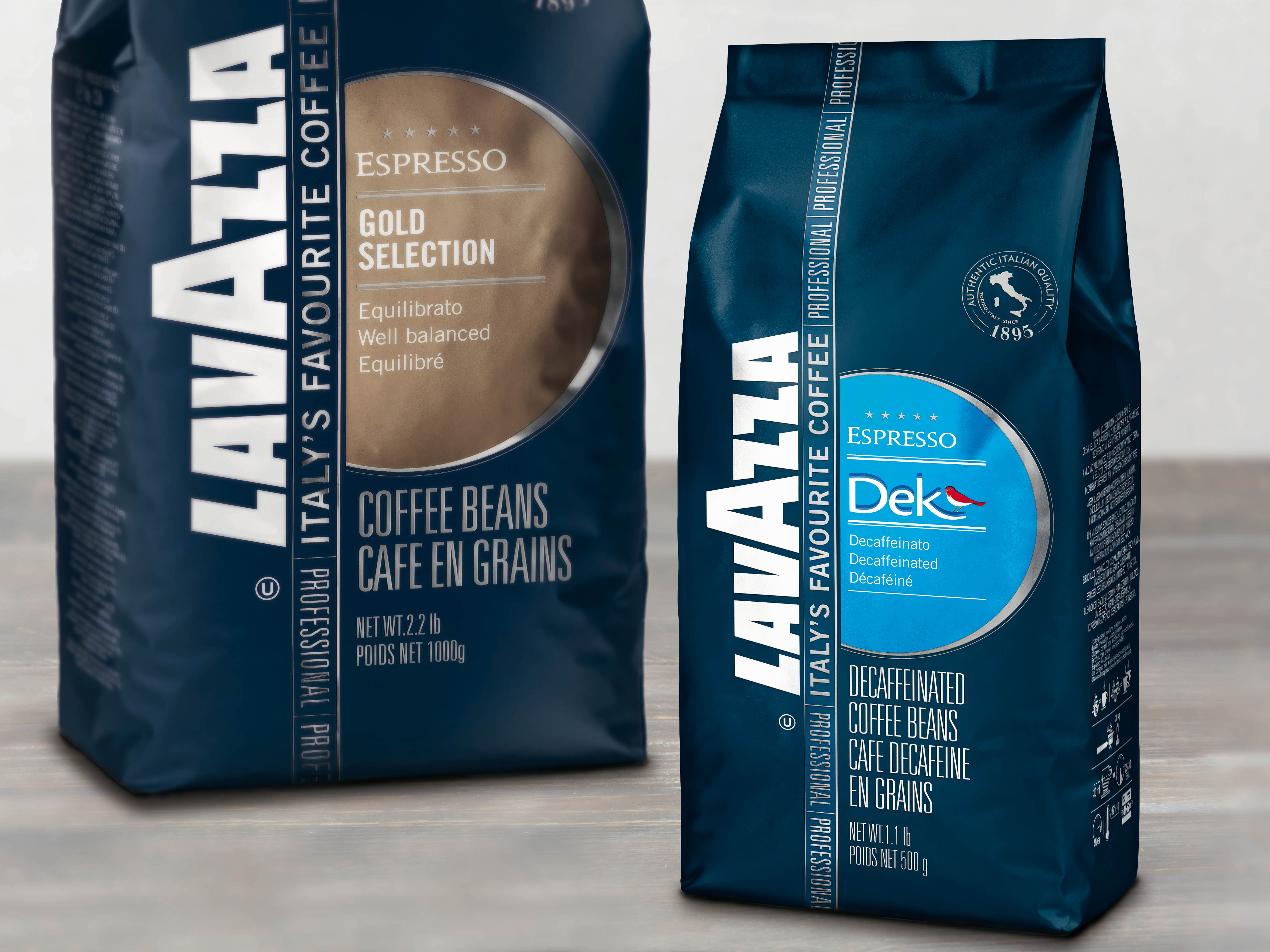
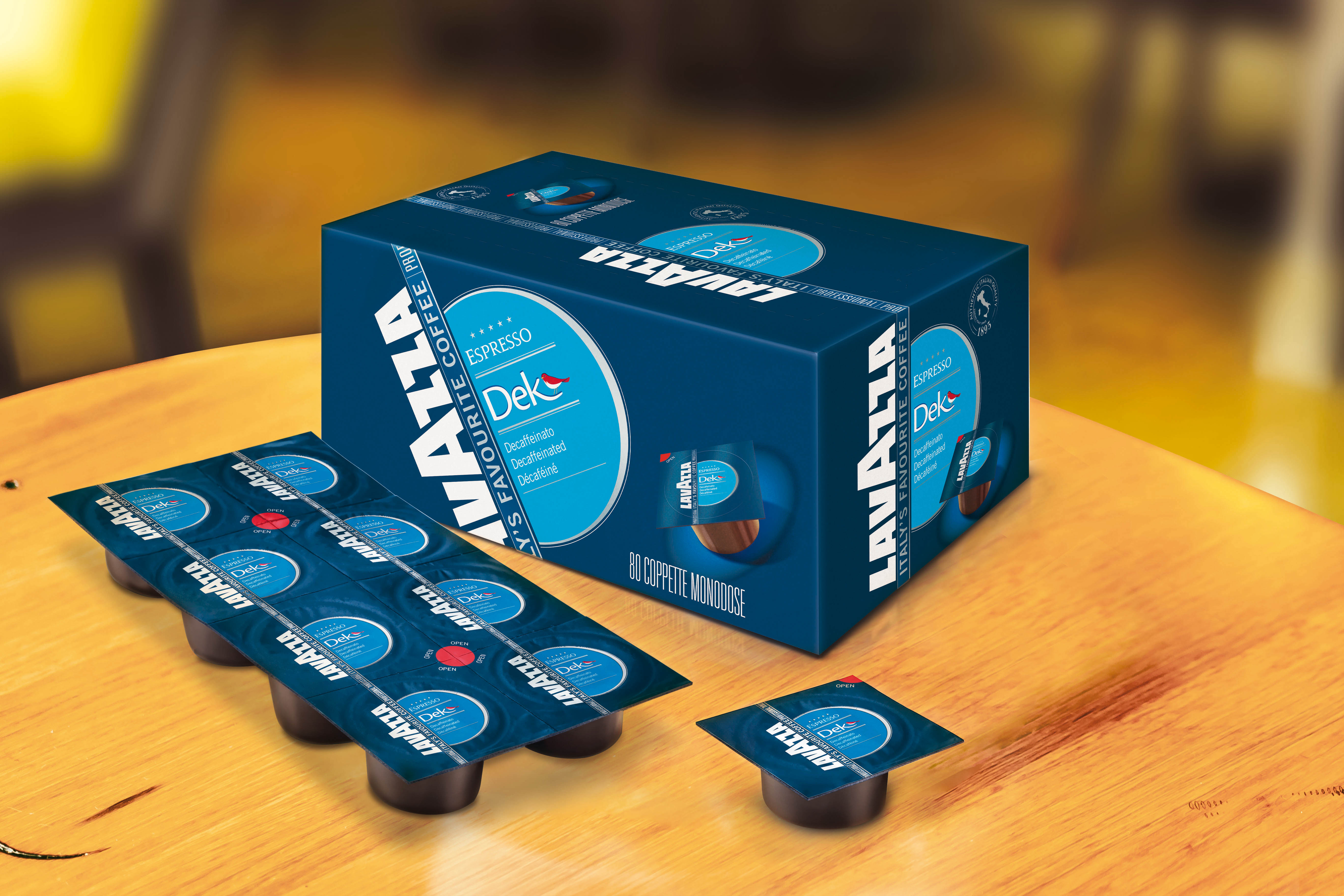
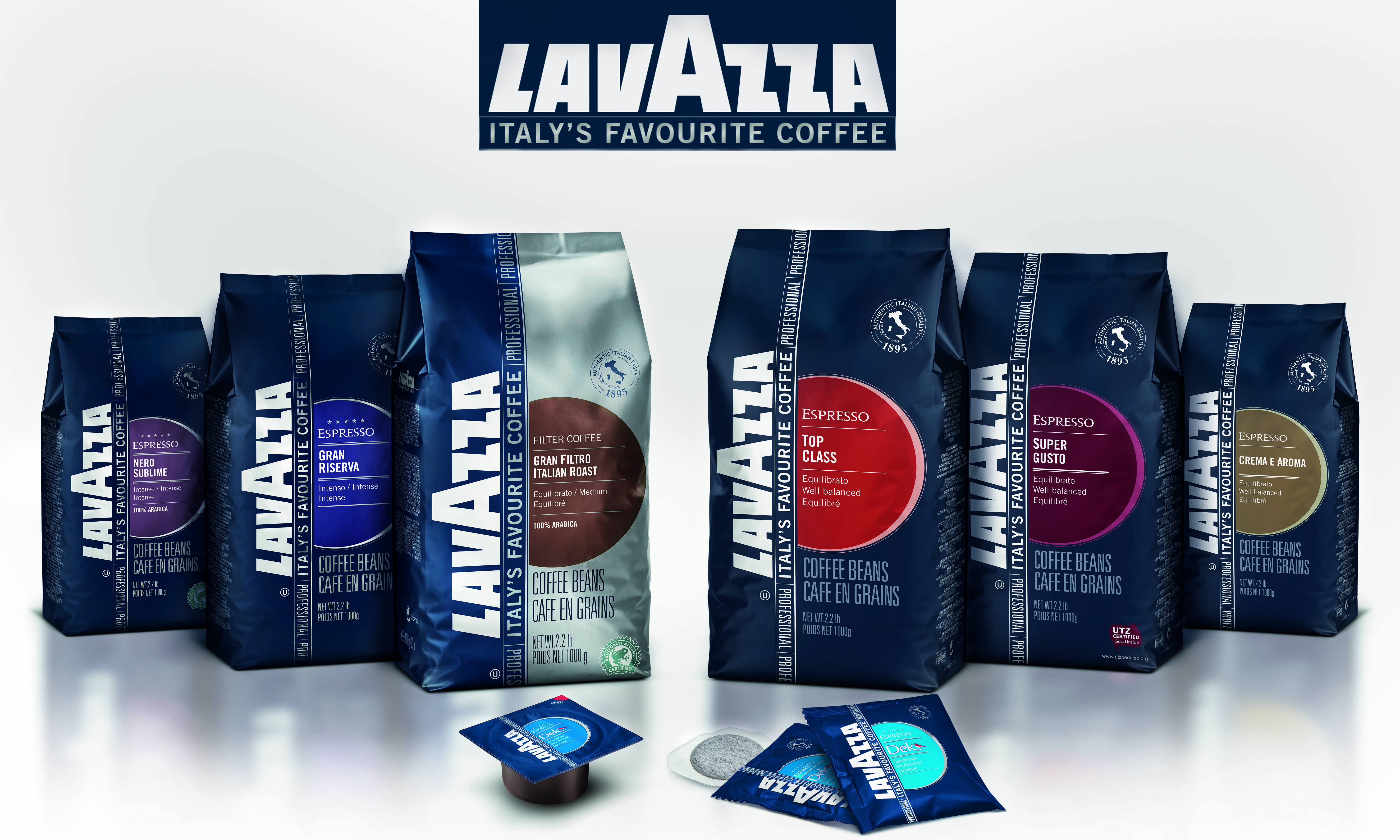
The agency was required to restyle the packaging and give a fresh appeal to the whole line, while distinguishing its offerings: expresso, filter and decaf coffee, in their standard and premium versions.
SOLUZIONE CREATIVA
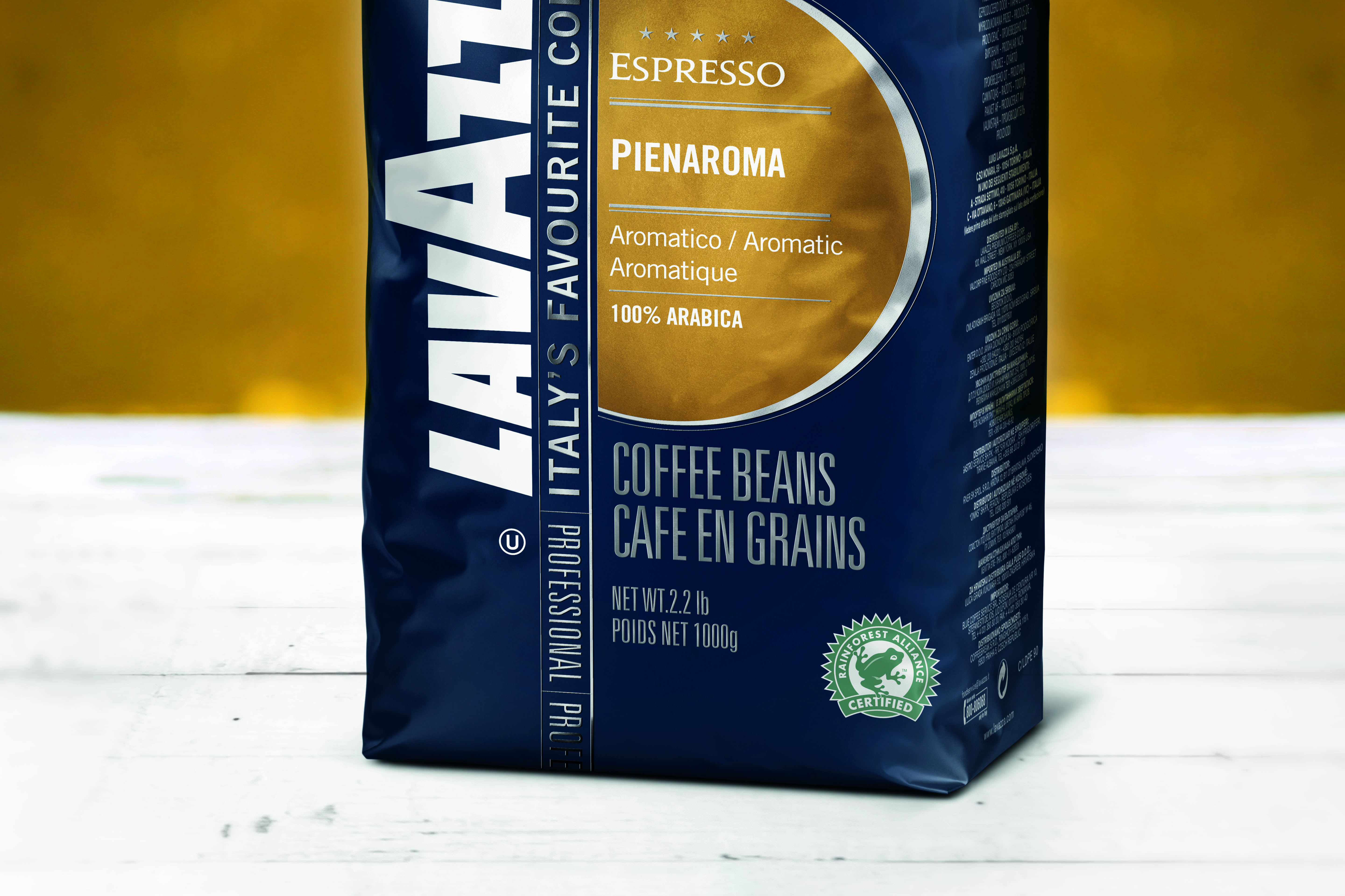
The whole line has been made more modern by using matte materials which give a natural feel to the touch and hint to a natural product. The Lavazza Logo is vertical to ease its readability even when the pack is placed upside down on the coffee machine. To add Premiumness the line name has been changed to Professional (was Bar e Caffetteria). The institutional Lavazza blue serve as the background of the packs for the whole line, whereas the expresso and filter coffees have been differentiated by a large use of silver for the latter. A large use of colours has been made also to group the offering in 3 flavour areas (equilibrato, intenso, aromatico). The premium version of each coffee has been marked with five stars and set apart with premium, metallic colours.

 Torna indietro


