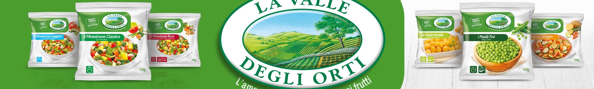
La Valle Degli Orti
Frosta
SCENARIO
Valle degli Orti, historical brand in the frozen food, is still strong and present in consumer mind, but now is lacking of saliency. Strongly positioned on naturality and Italianity, It has great opportunity as modenity and innovation.
The actual visual design is outdated and has a diluted visibility on shelf.
OBIETTIVI DI COMUNICAZIONE
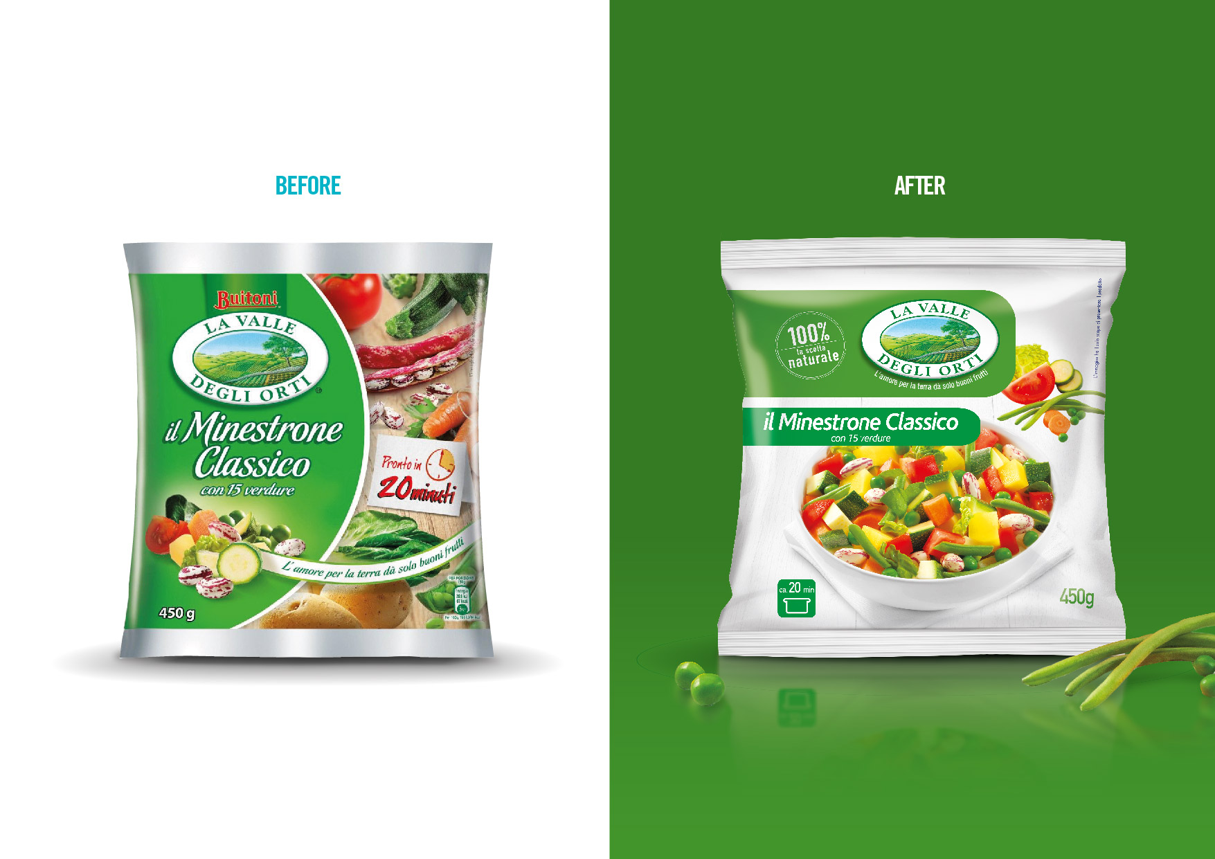
To create a new visual identity and Brand architecture for Valle degli Orti, in order to add modernity and appetite appeal, to increase visibility on the shelf with a strong Brand Color Code. The new solution will be also leveraged for future Innovations.
SOLUZIONE CREATIVA
The new visual design highlights in a very effective way both emotional and functional attributes of the Brand:
the historical logo is reinforced as visibility, by putting on the top close to the new main Brand Benefit %100% natural choice”.
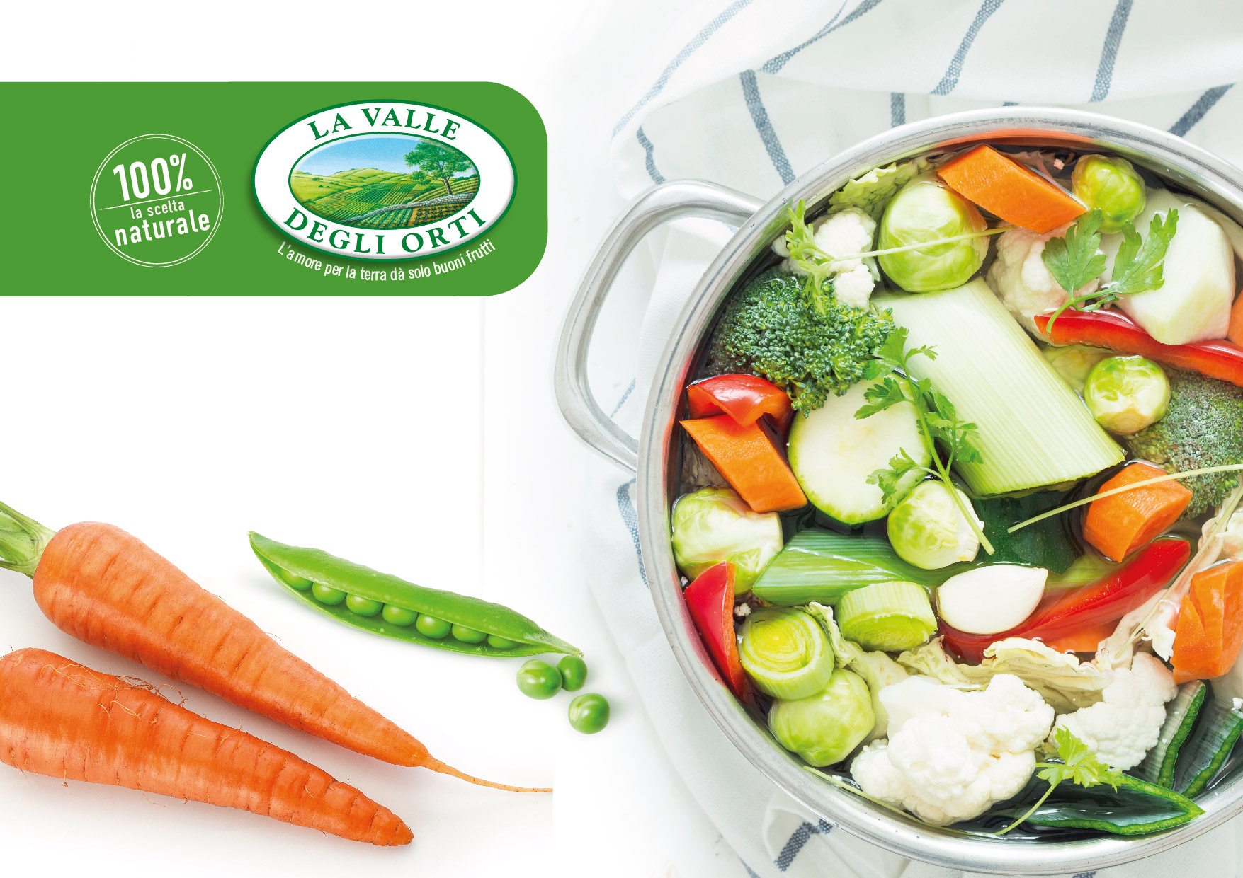
The background is a white wood table, able to create a strong color code, by reinforcing at the same time the natural positioning.The product is the hero on the pack, presented in an appetite way with its ingredients.
Very clear information system for the shopper, both on FOP and on BOP.
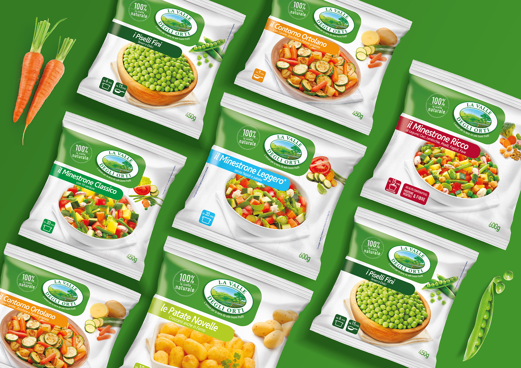
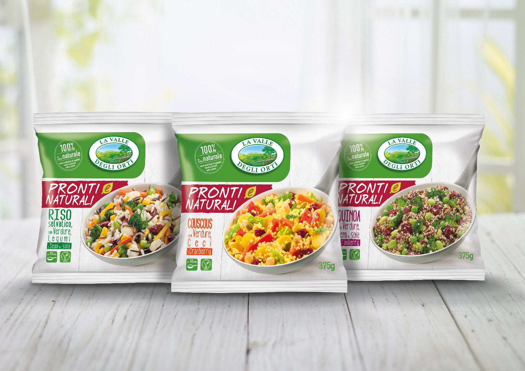
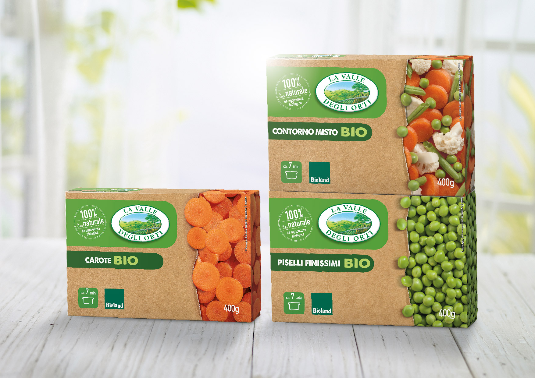
Very effective segmentation of the different skus and product categories, thanks to a dedicated colour below each name and specific plates. The new visual design has been also implemented on 2 important Valle degli Orti Innovations, like the Bio range, highlighting the organic provenace, and the new range of complete meals Pronti & Naturali, highlighting the pan preparation.
P.IVA 08721430968 - Cap. Soc. €500,00 interamente versato - N° R.E.A. MI 2044407