Kirieshki
KDV
SCENARIO
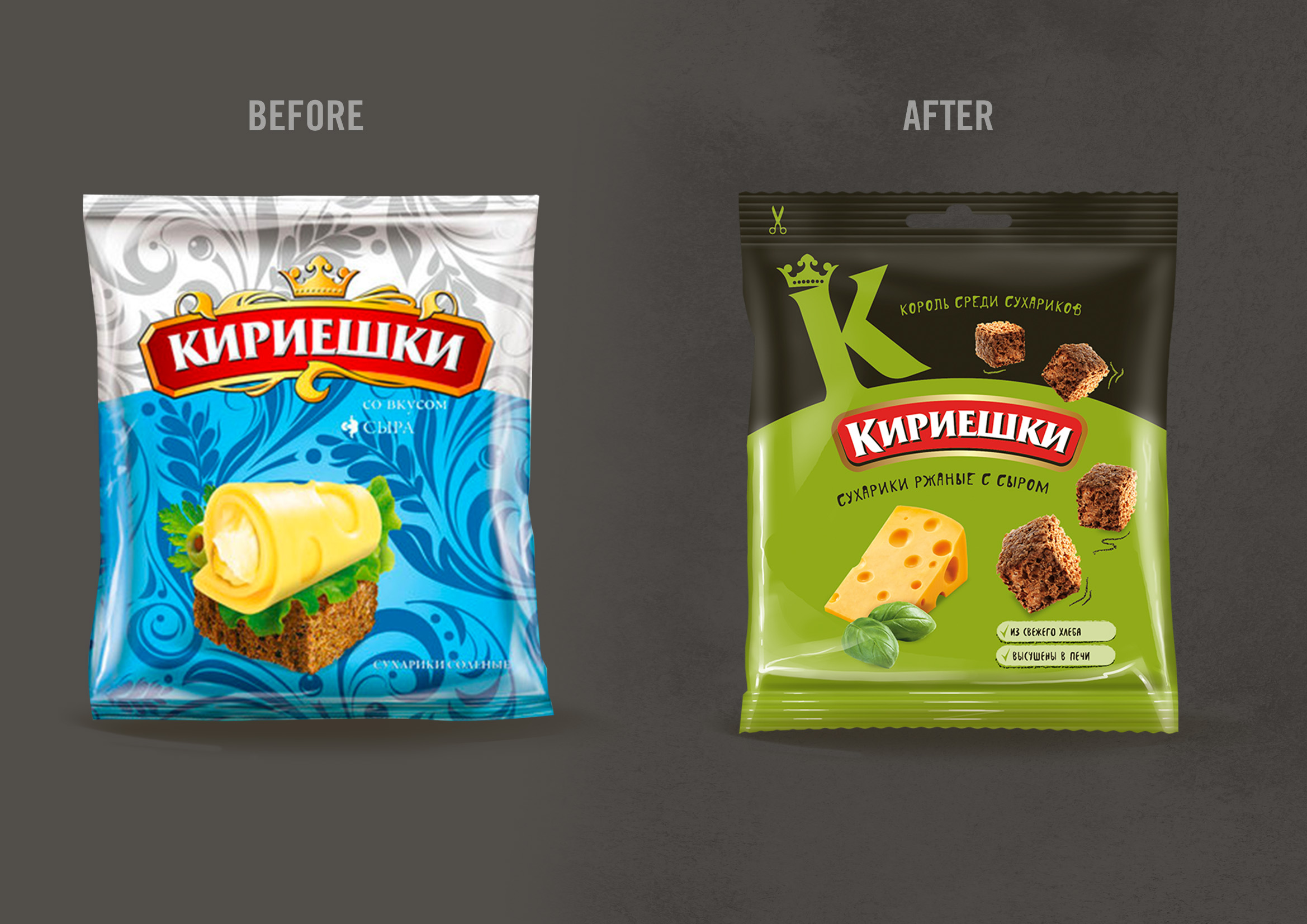
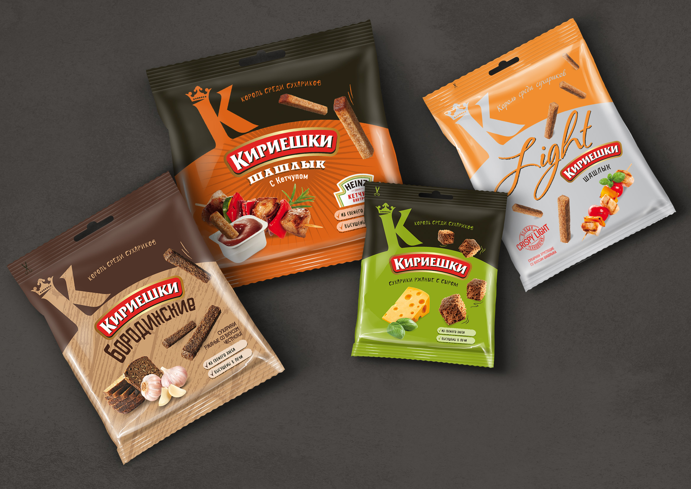
Part of the KDV group, Kirieshki is one of the most well-known croutons brand on the Russian market. It is mostly aimed at a target audience of young consumers and snack lovers. Over the years, the Kirieshki’s portfolio has significantly expanded. However, it did so in a fragmented way and now every line has its own identity. This lack of harmony affects the brand’s impact on the shelves and undermines the consumer’s confidence in it.
OBIETTIVI DI COMUNICAZIONE
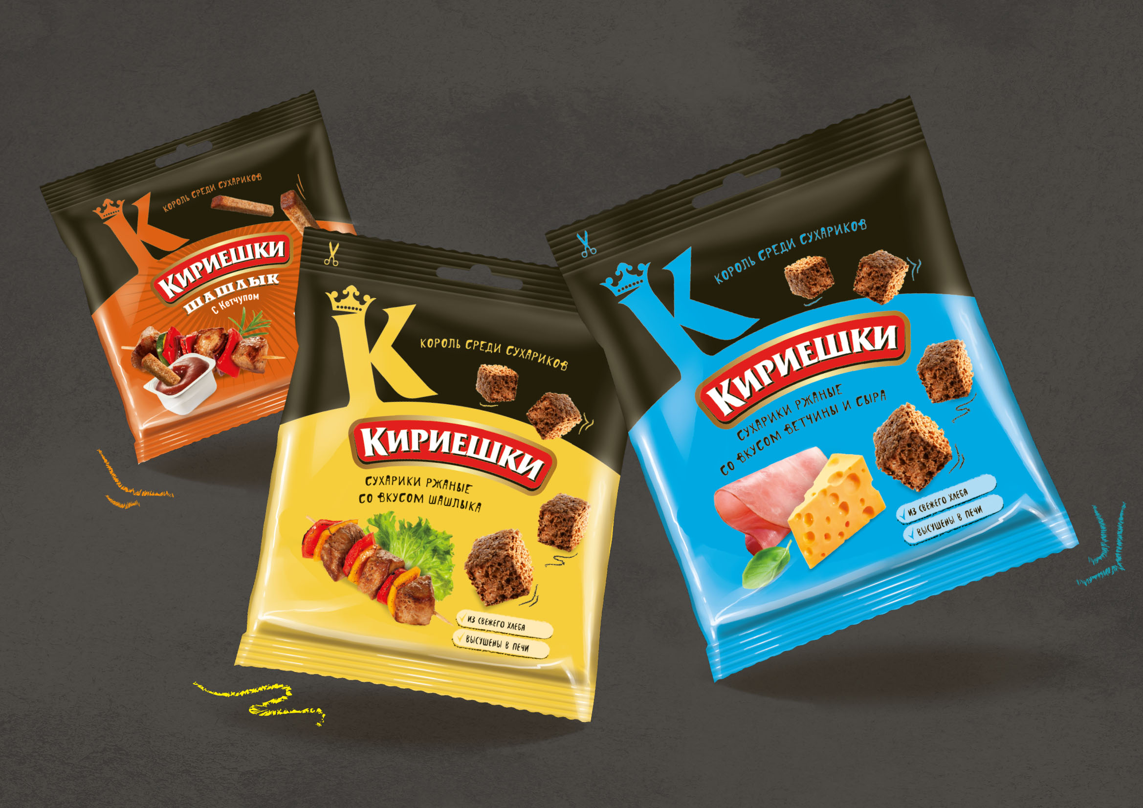
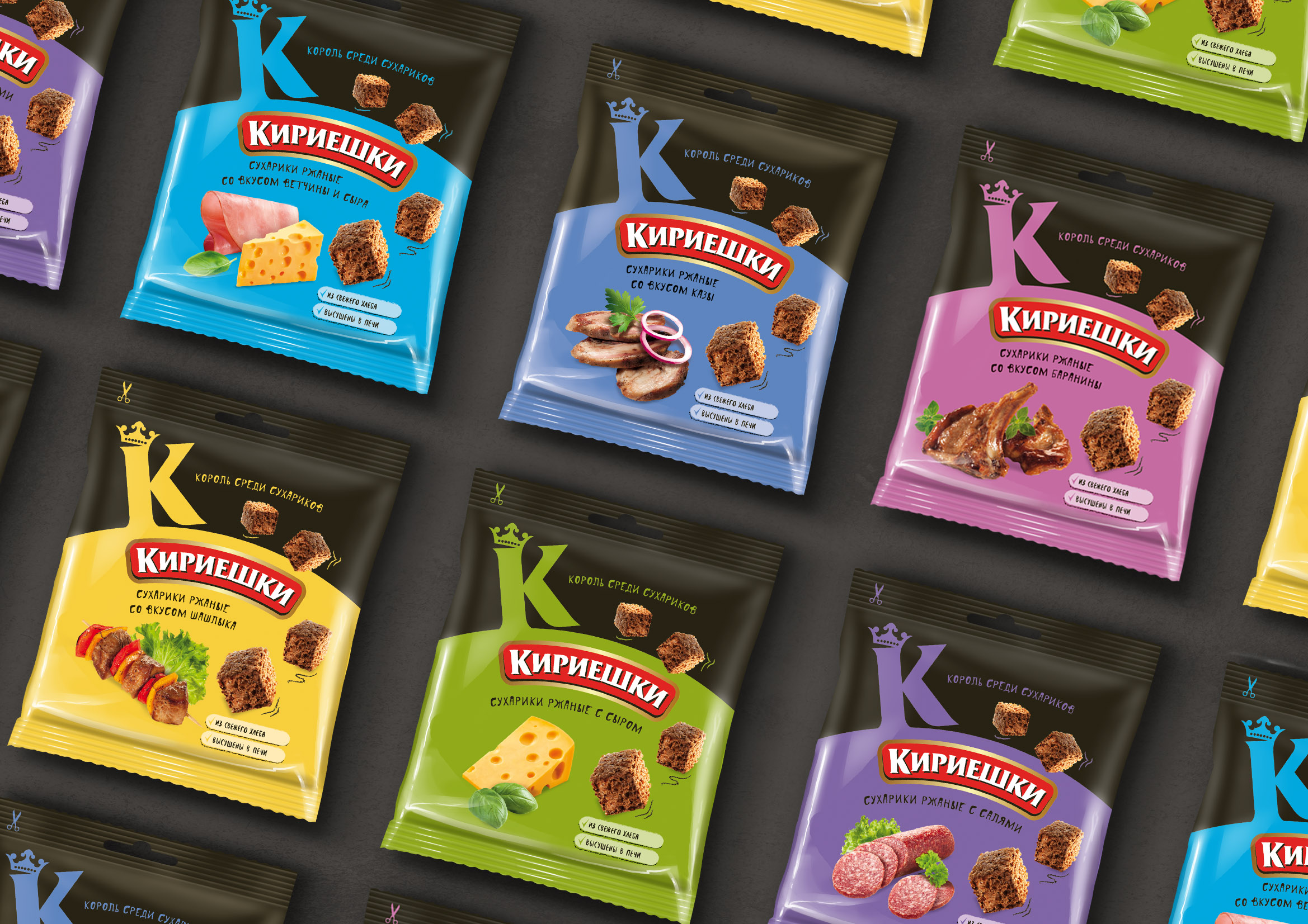
A new packaging system needs to unify the brand message across every line. The design structure will have to leave room for future development, maximise shelf impact and appeal to the target audience, being dynamic, modern and simple (standing out in an otherwise coloured and flashy competitive scenario).
SOLUZIONE CREATIVA
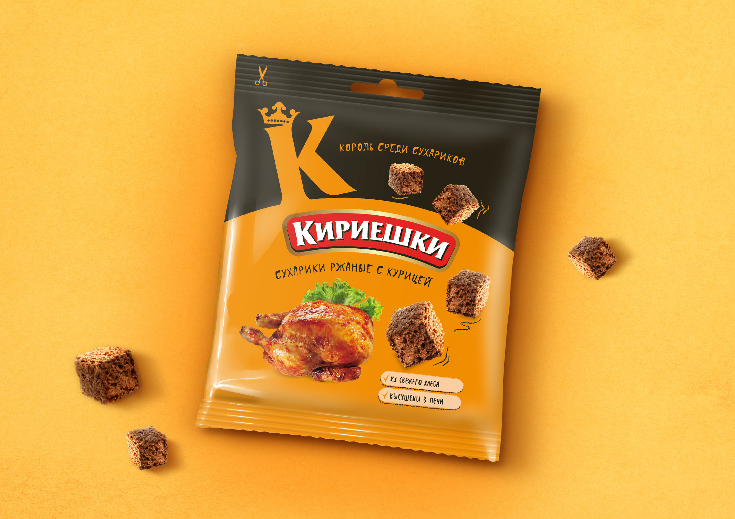
A first change was made on the logo, which was simplified and purged of its twirls and crown. In the upper part of the pack are all the elements that mostly characterize the new system, such as the K of Kirieshki: a simple, recognizable sign that gives a lot of impact on the shelves. It is capped by a crown (previously on the logo), and followed by the new pay off “The King of Croutons” supported by the fact that the brand accompanied the debut of this type of product on the Russian market. The top black band is consistent throughout every line (except for the light version where it is coloured). On the lower part of the pack, two clear images show the croutons and their flavour. Below them, two dedicated labels mention the product pluses (made from fresh bread and then oven dried).

 Torna indietro