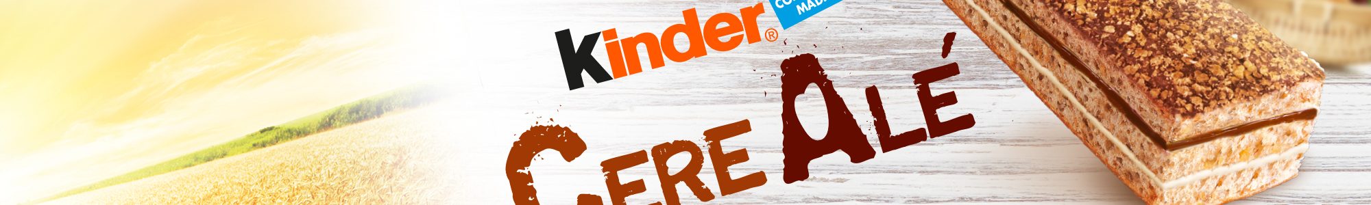
Kinder CereAle
Ferrero
SCENARIO
Packaged cakes make up for one of the biggest markets in Italy. Consumption mostly takes place at breakfast and the most avid consumers are adults, not children. Kinder, one of the main players, is a brand that was created by Ferrero with children in mind. The brand can boast excellent selling figures in some areas, however its products do not appeal to an adult target as desired. For this reason, during EXPO 2015 the company seized the opportunity to test the palate of adults from all over the world. The preferred flavours where the most simple and genuine ones. From here, Ferrero created a new cake following the suggestions gathered. Today, after just a few months from its launch the product has been received very well on the market, even beyond expectations.
OBIETTIVI DI COMUNICAZIONE
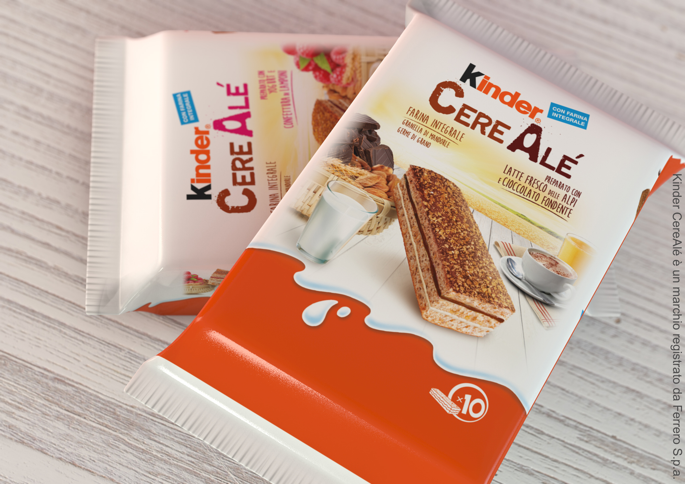
It was necessary to create a packaging that would convey the genuine and adult taste of Cerealé the cake conceived during Expo 2015. Its ingredients are sane, real and unrefined, to meet the most recent consumption trends.
SOLUZIONE CREATIVA
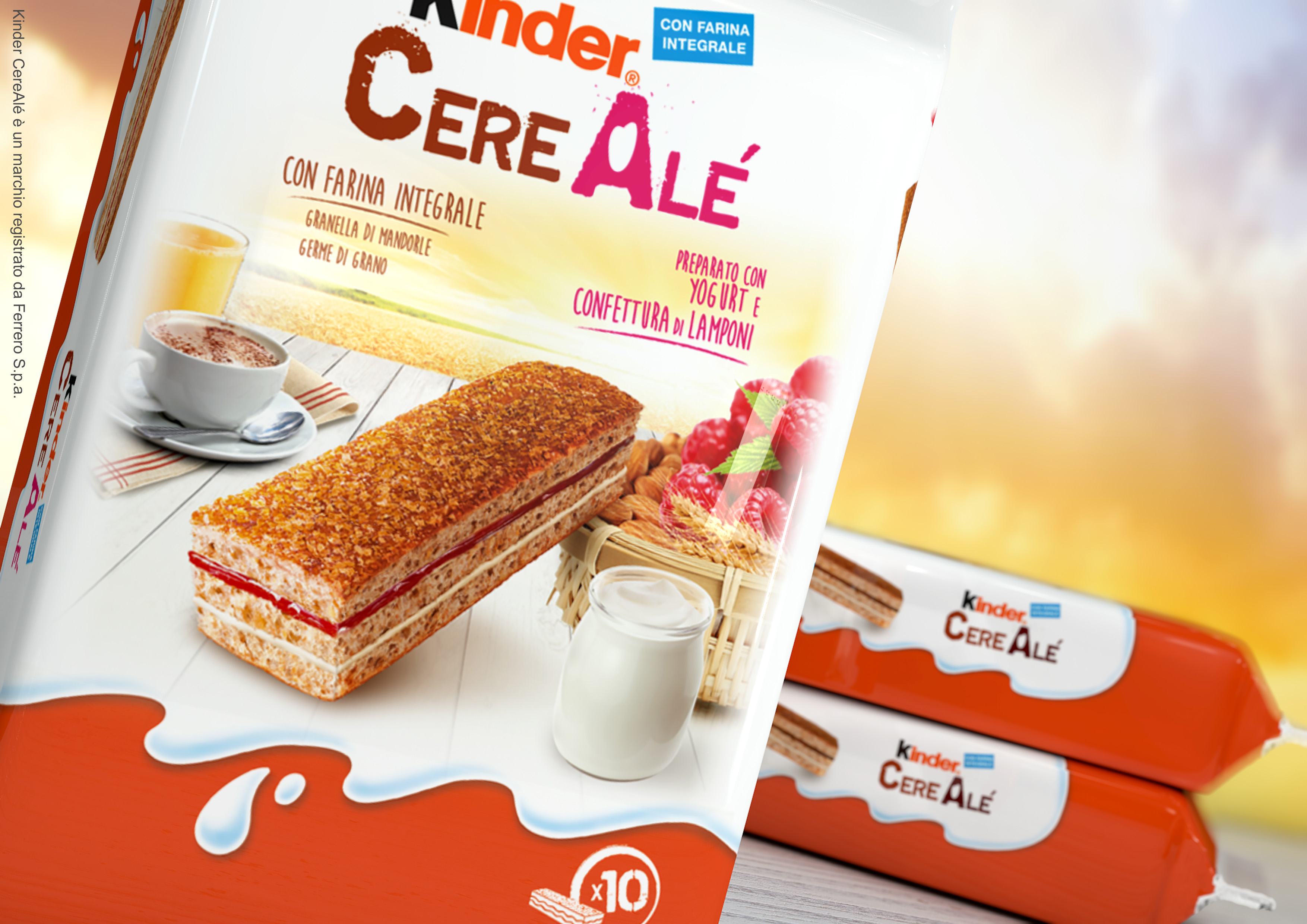
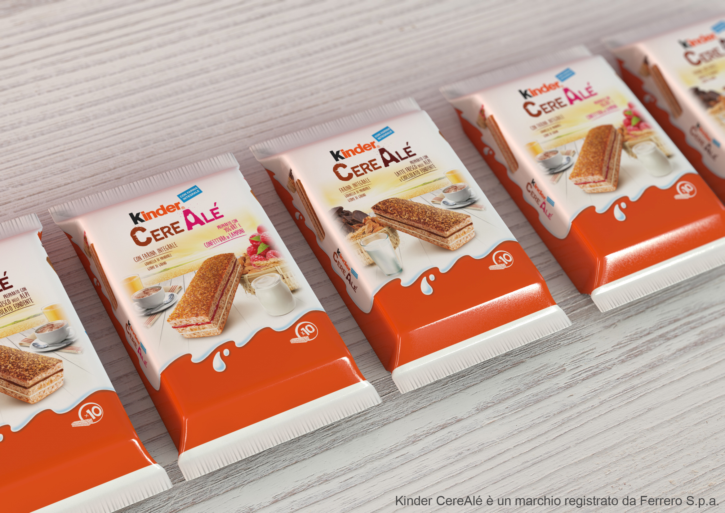
The logo immediately conveys the feel of unrefined cereals: the type font used looks raw and suggests natural, whole ingredients. Moreover, the shape of a grain has been inserted in the A letter in CerAlé. The descriptions of the ingredients have been given plenty of room and written with adult handwriting. This should emphasize the appeal of the product to the target. The main visual -al fresco breakfast- shows the way of consumption while conveying a genuine and positive, energy. Kinder packaged cakes are generally portrayed laying on a table, however CereAlé is unconventionally leaning on a basket full of natural products in order to strengthen the link between the product and its new, natural ingredients.
P.IVA 08721430968 - Cap. Soc. €500,00 interamente versato - N° R.E.A. MI 2044407