
Friliver
Dompé
SCENARIO
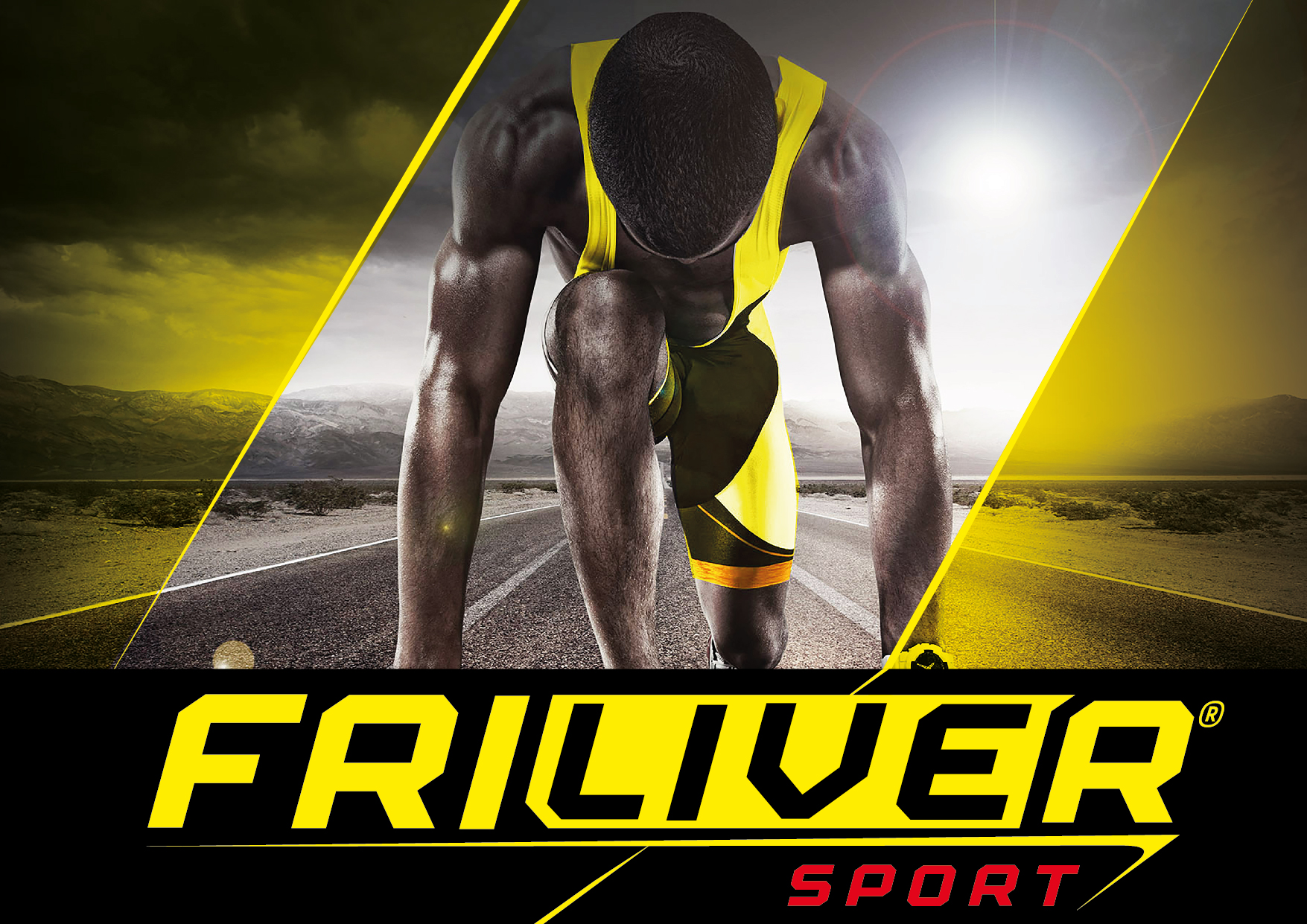
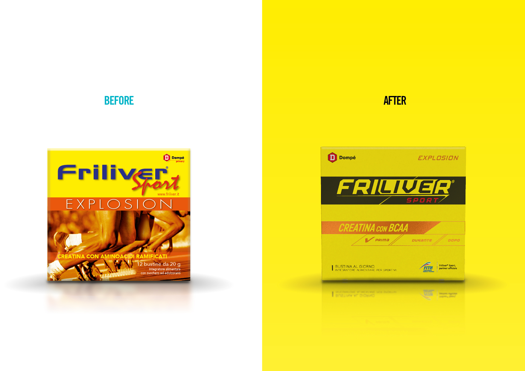
Friliver is a brand of nutritional supplements of the Italian pharmaceutical company Dompè. It targets sportsmen and sportswomen who constantly exercise and make use of supplements. Despite a well-defined positioning (the supplement for those who want to challenge their own limits), a specific target and a premium offering, the brand image does not convey the personality and determination needed to resonate with its potential customers.
OBIETTIVI DI COMUNICAZIONE
A new logo and visual identity must convey a winning, expert and self-confident brand personality.
SOLUZIONE CREATIVA
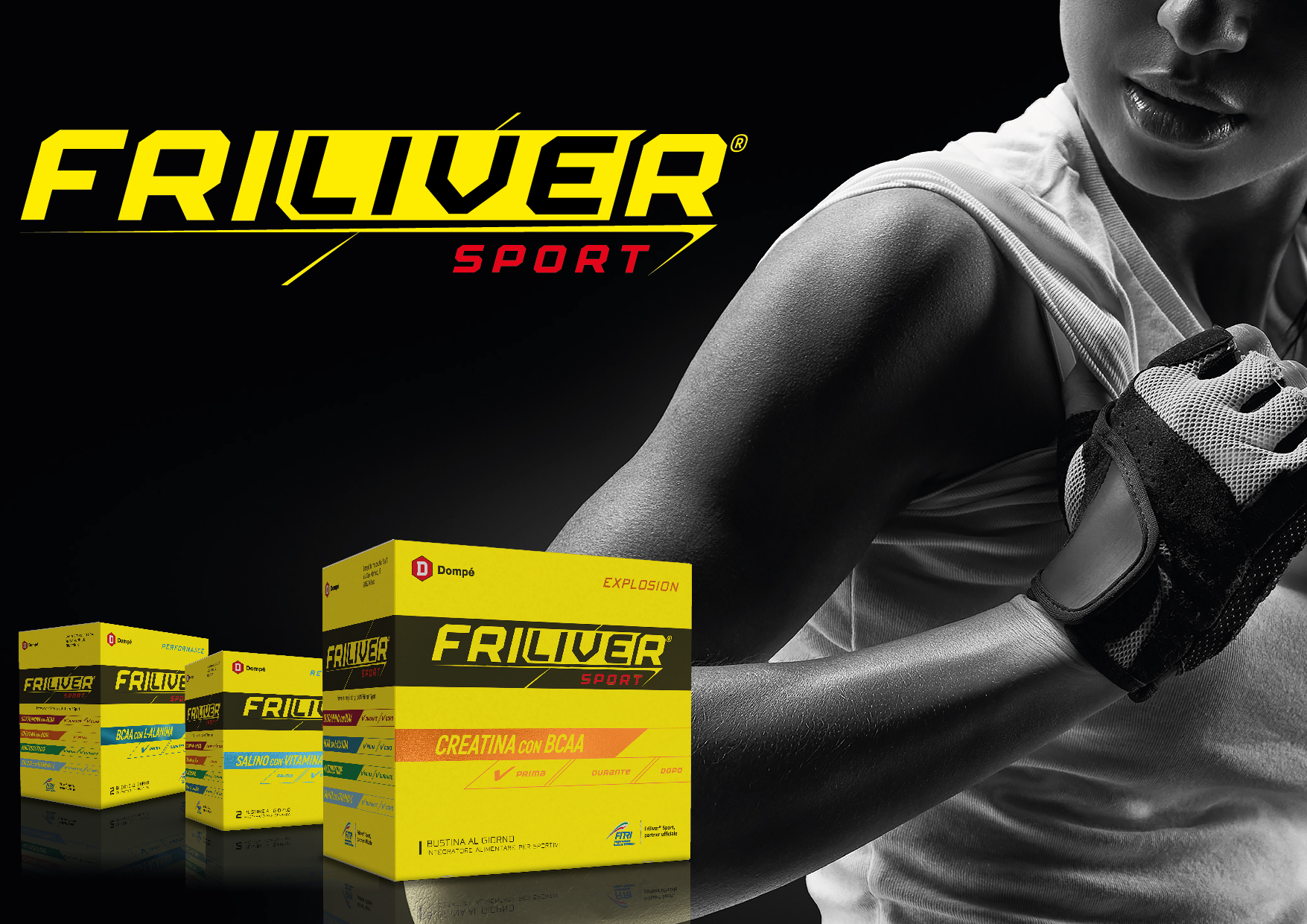
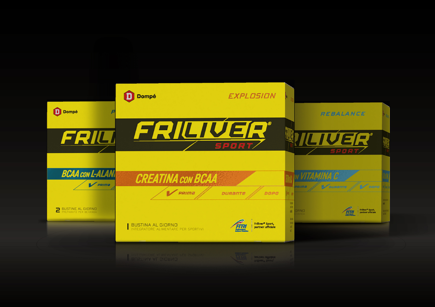
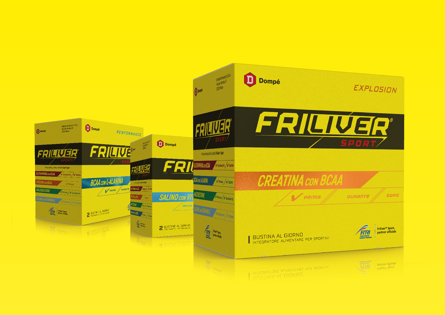
The new logo is more assertive both in lettering and colour (from blue it has been turned to black). The word “live” within the name has been stressed to add dynamism.
On the graphic side, the all-around use of yellow – the brand identifying colour – communicates strength and self-confidence while the total lack of images on the packaging points to a minimalistic and technical approach.
Since the target is well informed and knowledgeable, the new system gives more visibility to the active ingredient rather than the sub brand, which has been repositioned in the upper right corner. The system also educates the consumer as to when each supplement is supposed to be used, giving at a glance all the technical information needed, in a direct communication, from sportsmen to sportsmen.
P.IVA 08721430968 - Cap. Soc. €500,00 interamente versato - N° R.E.A. MI 2044407