
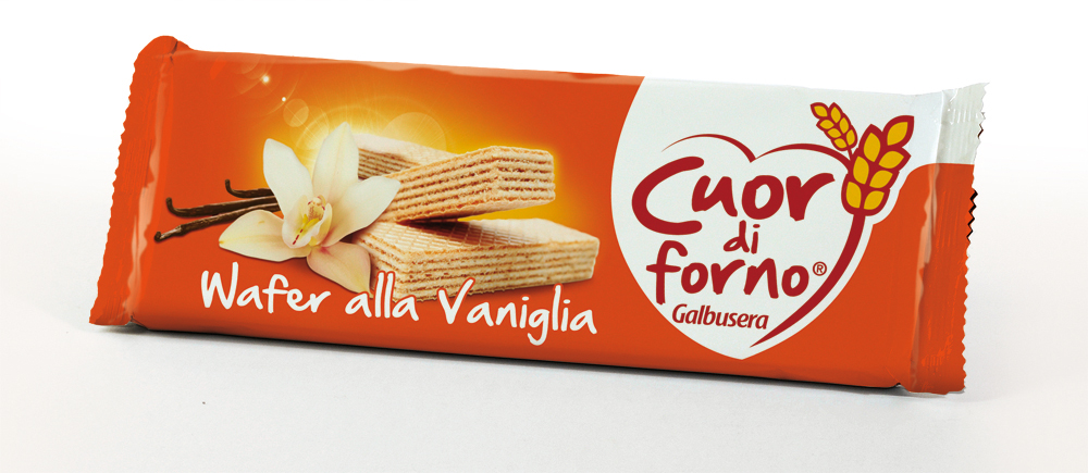
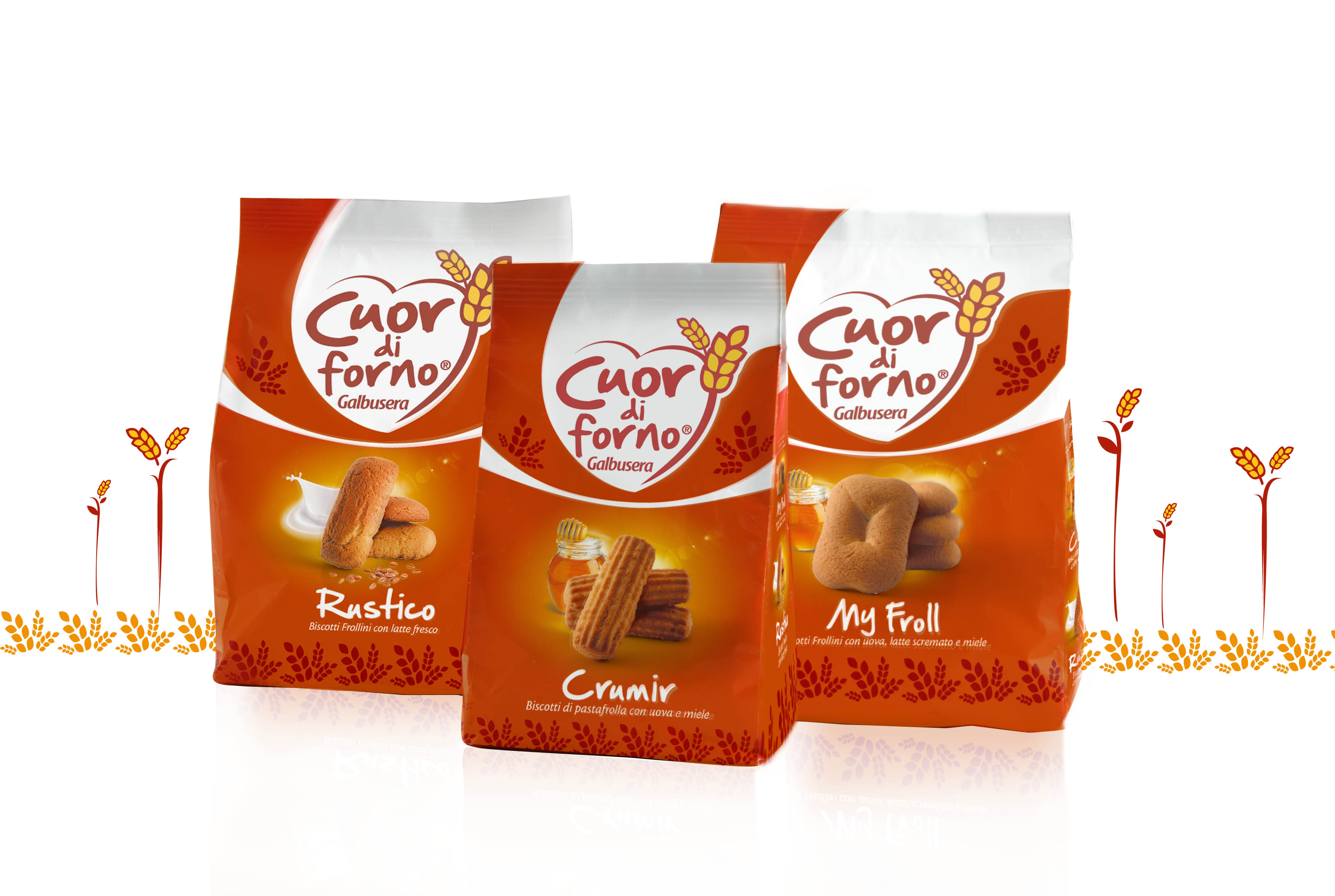
Cuor di Forno
Galbusera
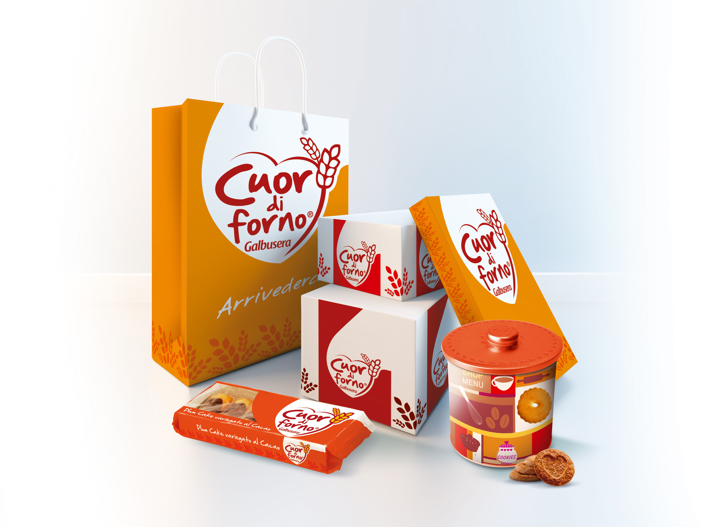
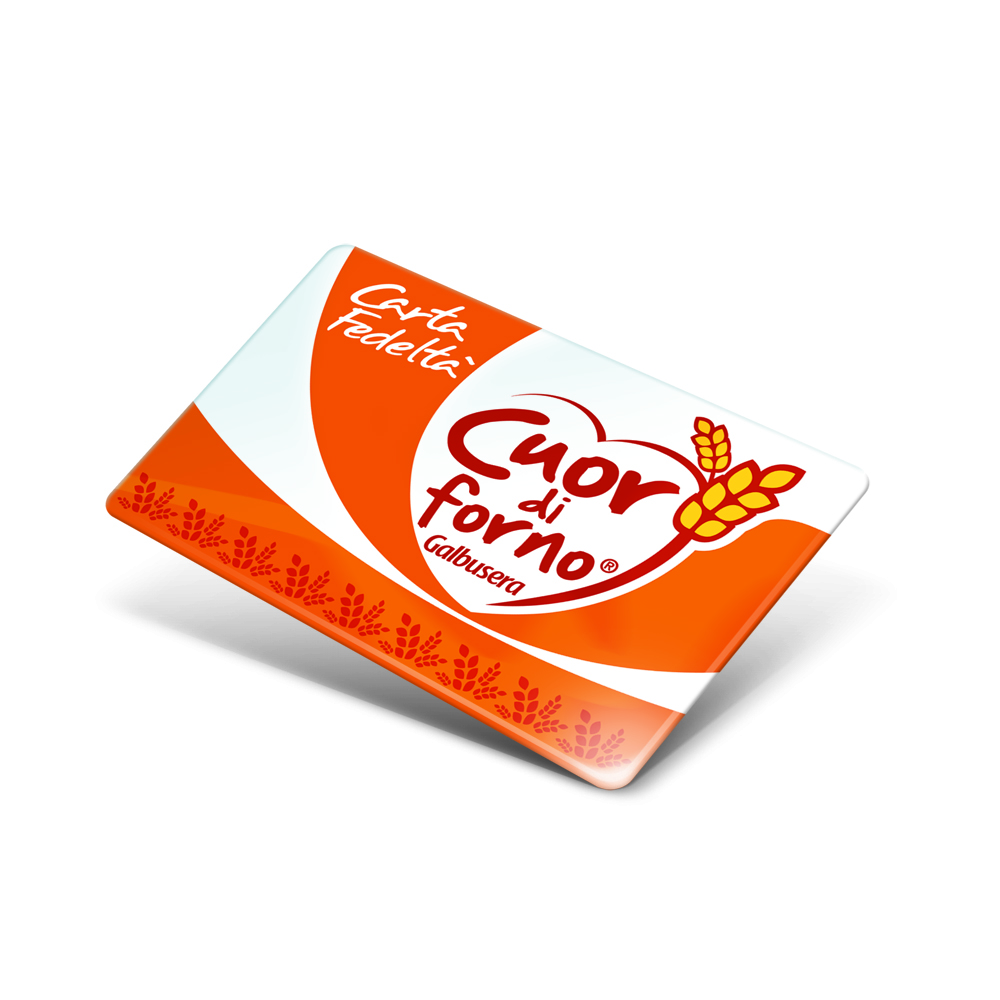
SCENARIO
A historic brand in the Italian food market, Galbusera launched a dedicated brand expressly tailored for company shops.
OBIETTIVI DI COMUNICAZIONE
Although Galbusera was warrantor for the high quality of ingredients and production, the brand was supposed to live on its own, with a distinctive brand personality. The brand name “Cuor di forno” (literally “Heart of bakery”) evoked authenticity and an immediate, direct connection between product and consumer.
SOLUZIONE CREATIVA
A relevant graphic interpretation of the brand name, which both features a connection with the corporate brand and develops a personal, authentic image. A balanced use of different shades of color offered the chance for a chromatic segmentation of the products, which helped the brand achieving a solid and distinctive retail impact, with an immediate benefit for the brand awareness.
P.IVA 08721430968 - Cap. Soc. €500,00 interamente versato - N° R.E.A. MI 2044407