Clouds of heaven
Sweet nut
SCENARIO
Since its foundation in 2000, Sladkiy Oreshek (Sweet Nut) has been the most dynamic and fastest growing confectionery in Russia. In just a few years the company has earned a place in consumers’ hearts thanks to its offering of high quality products at an accessible price. The brand now extends its line with a traditional type of snack which is very well-known among Russian consumers.
OBIETTIVI DI COMUNICAZIONE
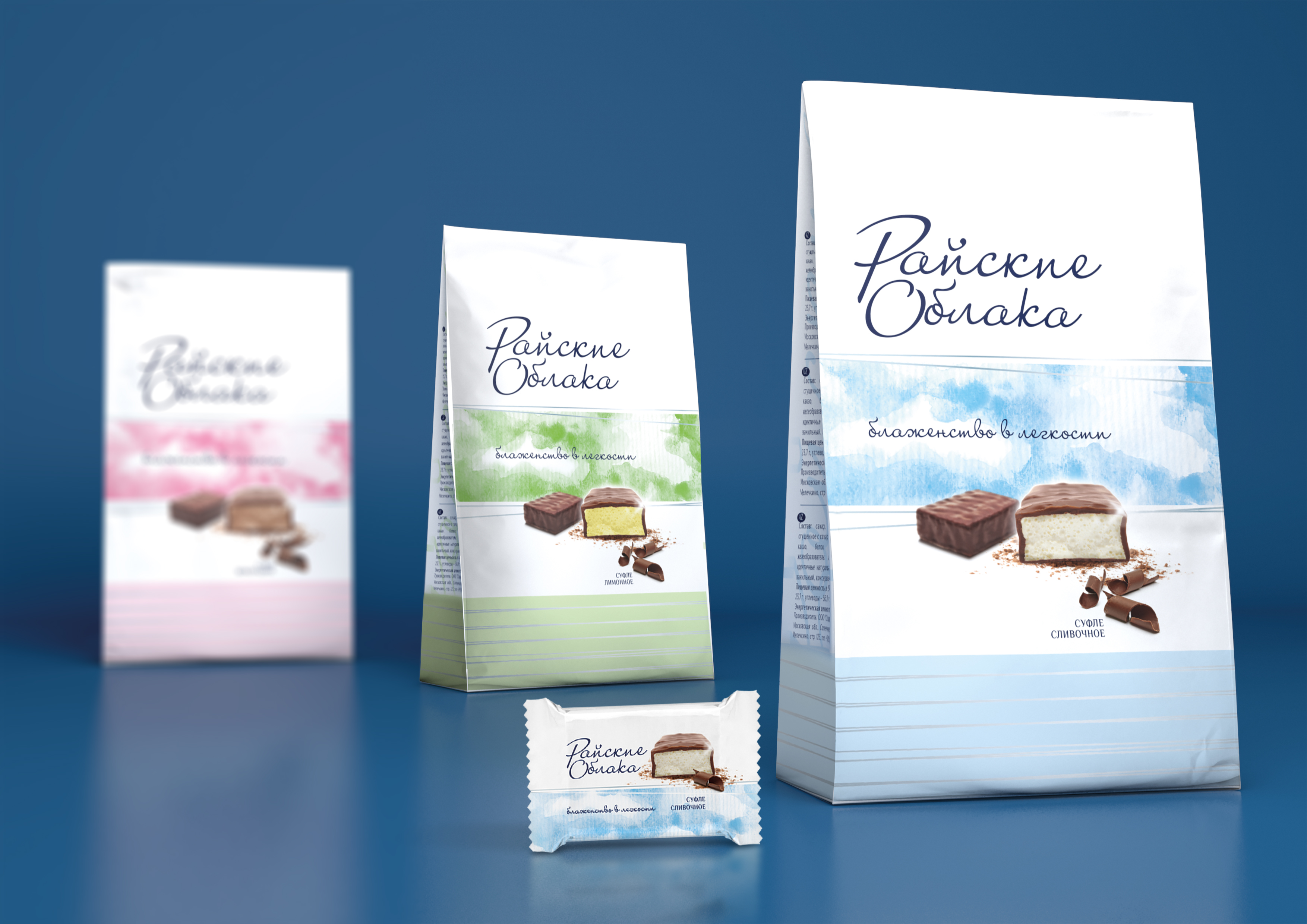
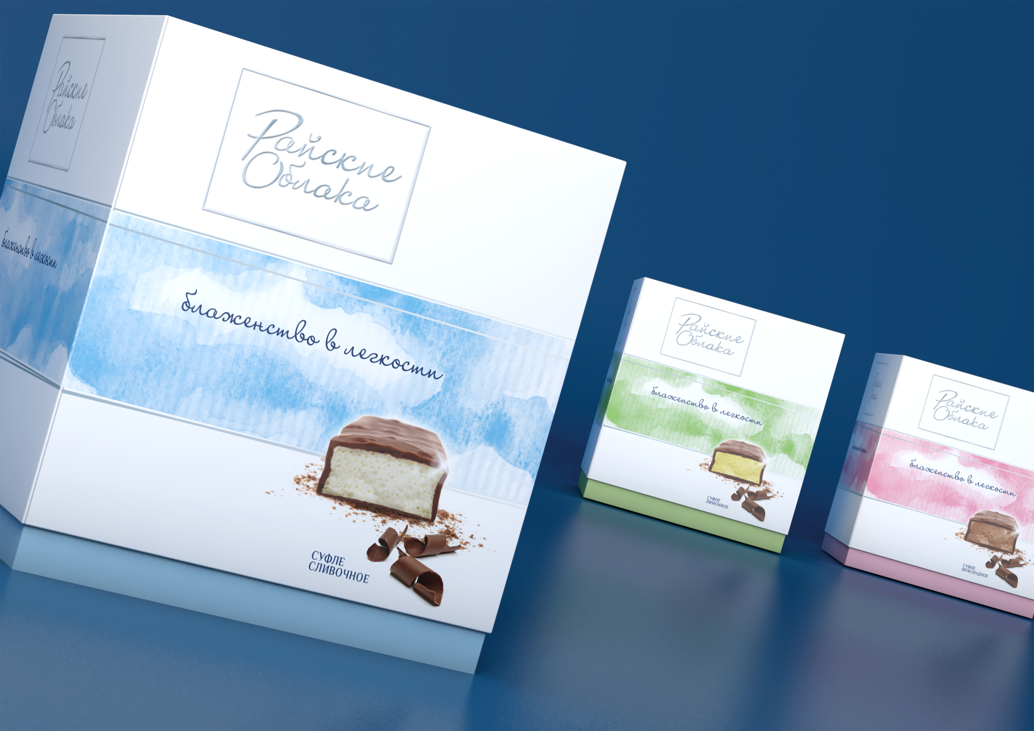
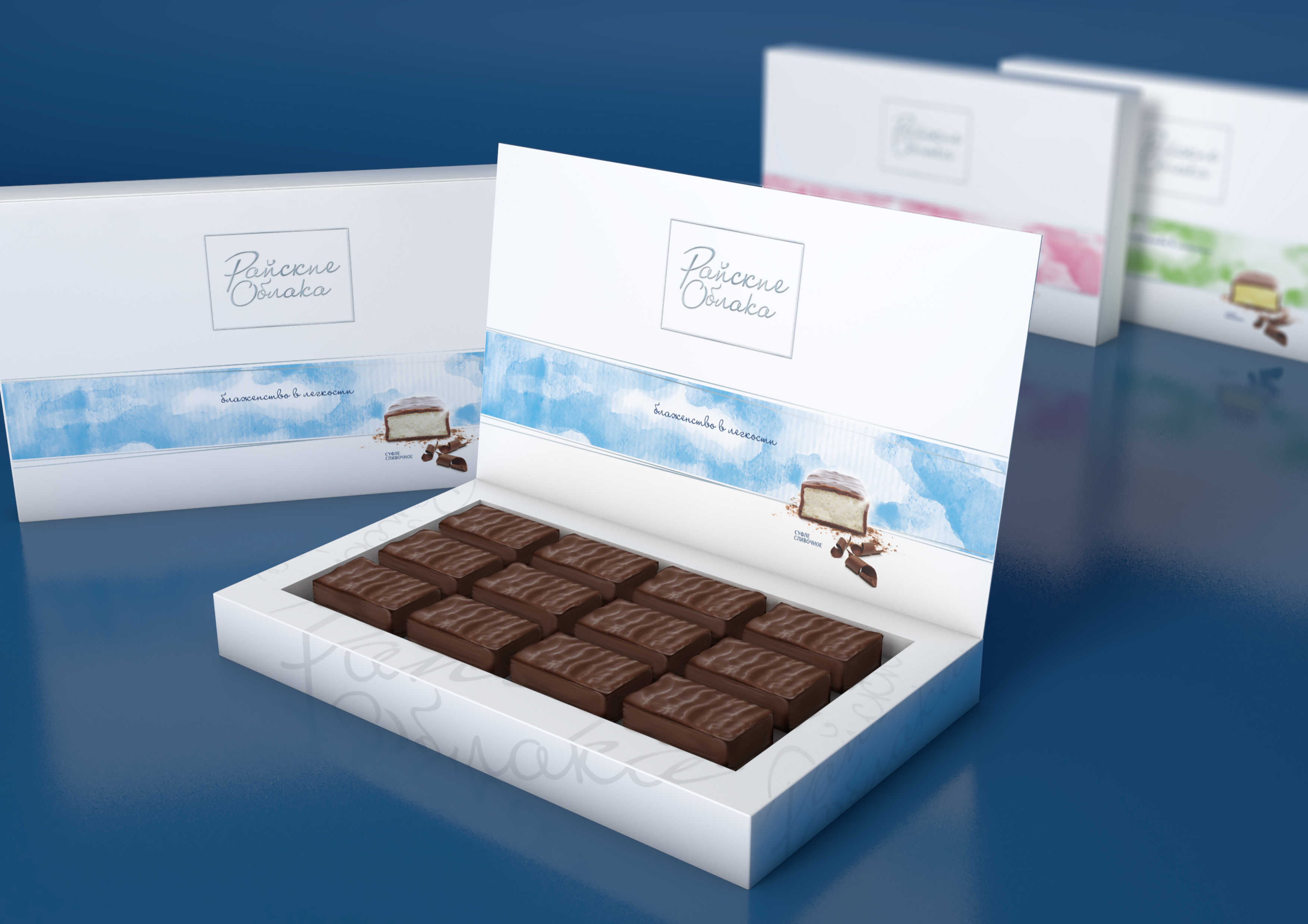
The agency was required to create the logo, the pay off and the packaging for Raiskie Oblaka (Heaven Clouds), the new product in the line. Being already present in competitors’ offering, the confectionery snack has to differentiate itself with a marked personality and a premium image.
SOLUZIONE CREATIVA
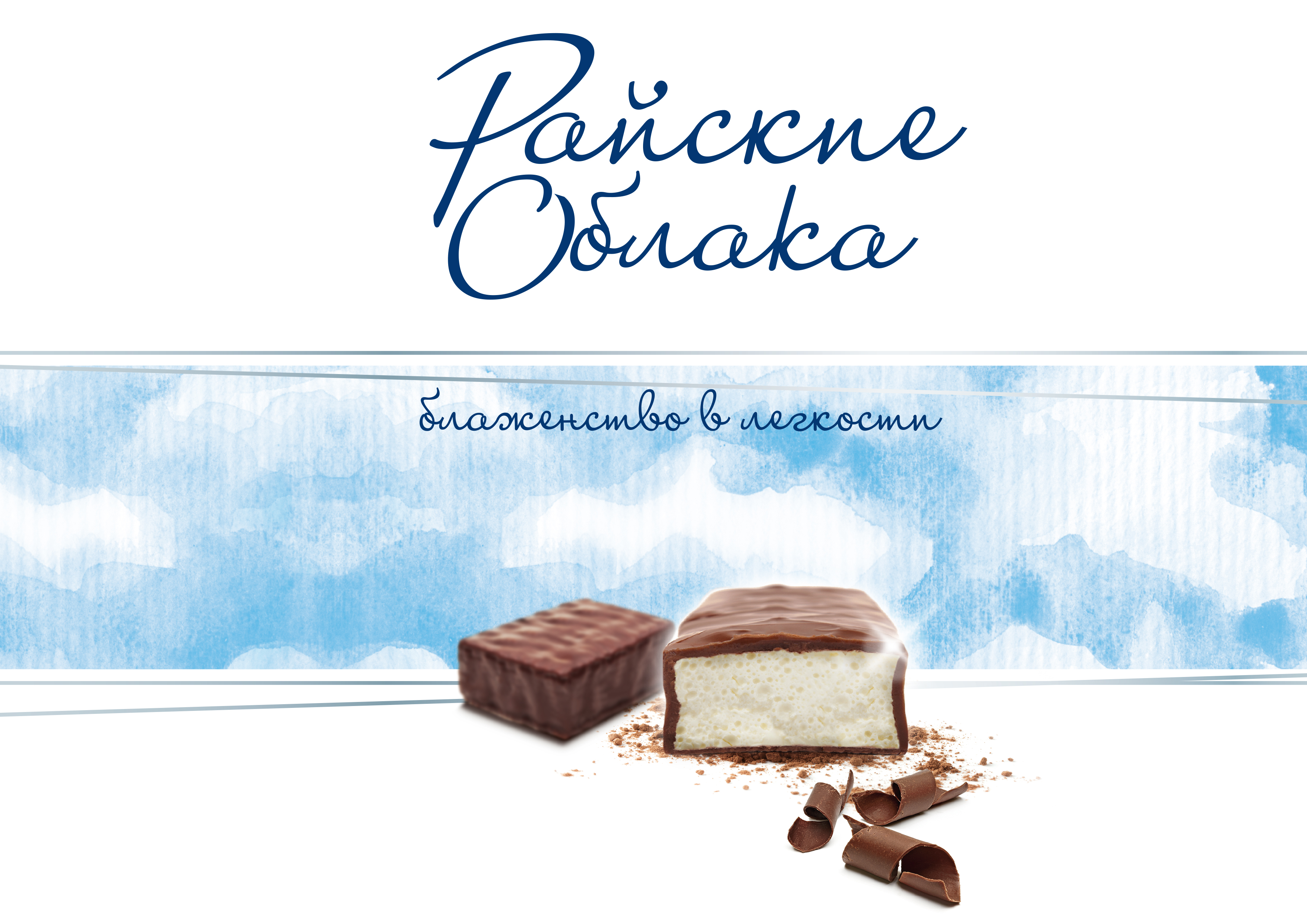
The name of the product was hinting toward pleasure and lightness (essential qualities for a puffed chocolate sweet), and the agency decided to further strengthen its personality in this direction. The tagline (Light Happiness) reinforces this proposition and the whole packaging has a fresh and delicate look. The logo has been kept extremely simple and a watercolor background has been specially designed by hand to reiterate the sense of lightness. Several fine silver lines softly add premiumness to the whole. The product picture has been enlarged both to improve the appetizing appeal and to let the consumer see the quality of the puffed texture.

 Torna indietro


