Centrale del Latte
Granarolo
SCENARIO
A solid brand, deeply linked with the local market, looking for a refresh to enforce its positioning as the milk of the city of Milan.
OBIETTIVI DI COMUNICAZIONE
A renew of the brand architecture to emphasize the strong local identity by acting on all the relevant traits of the brand.
SOLUZIONE CREATIVA
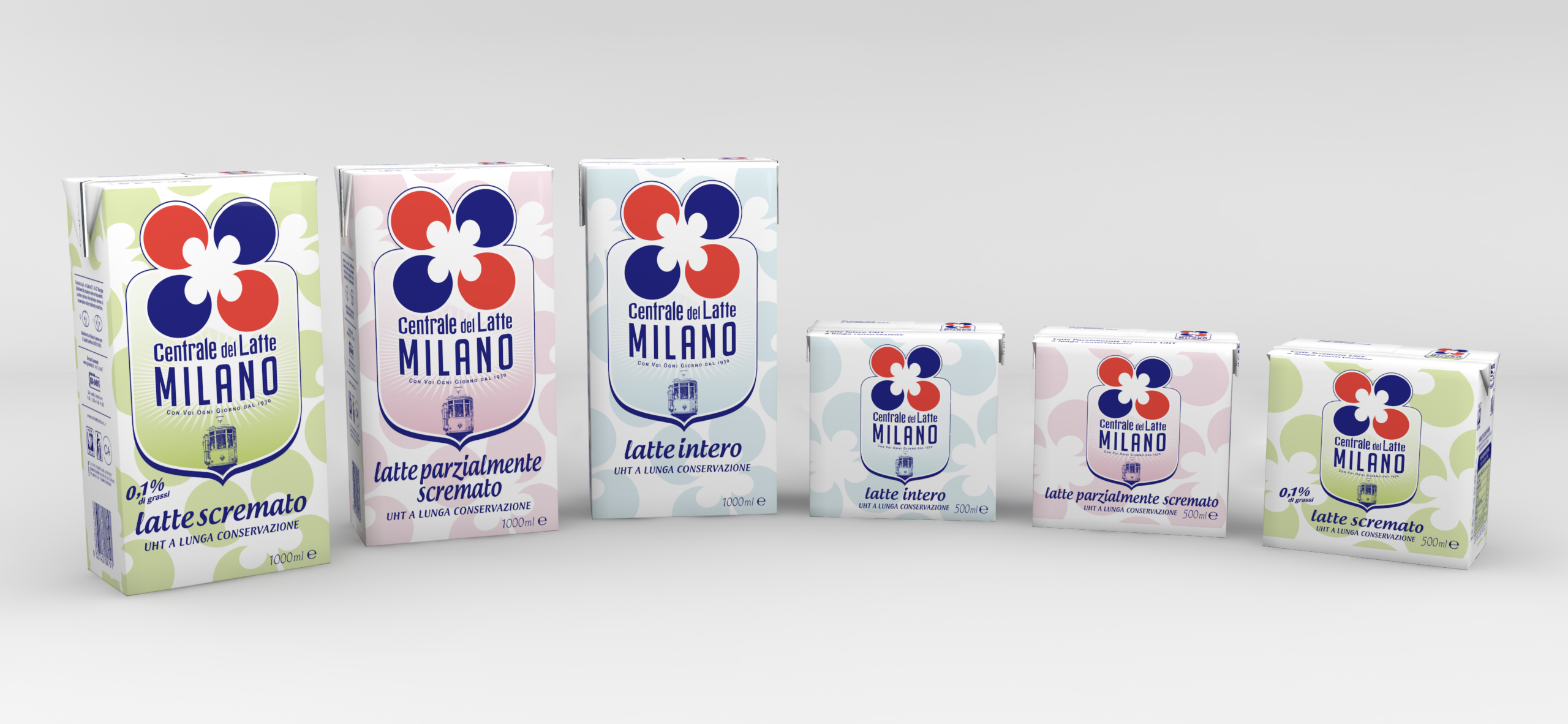
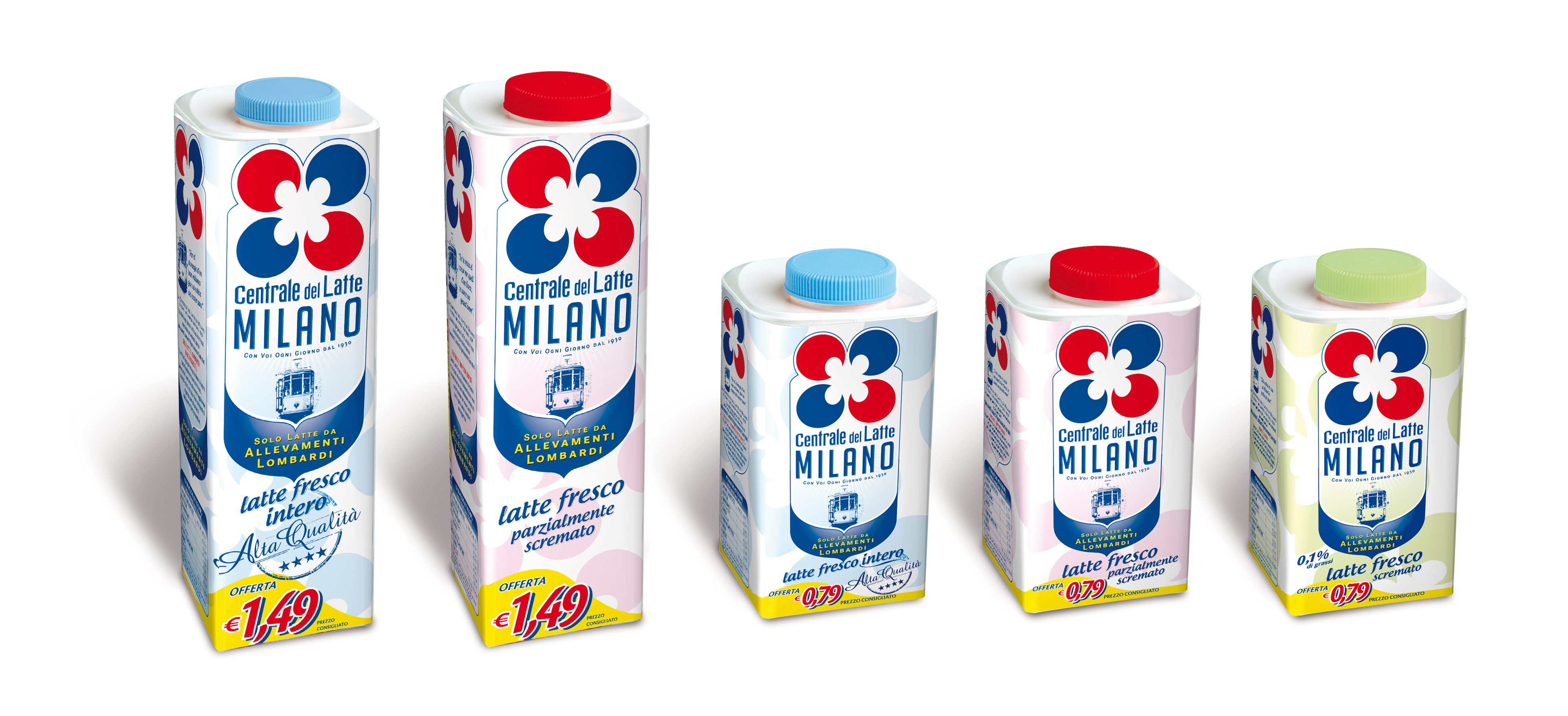
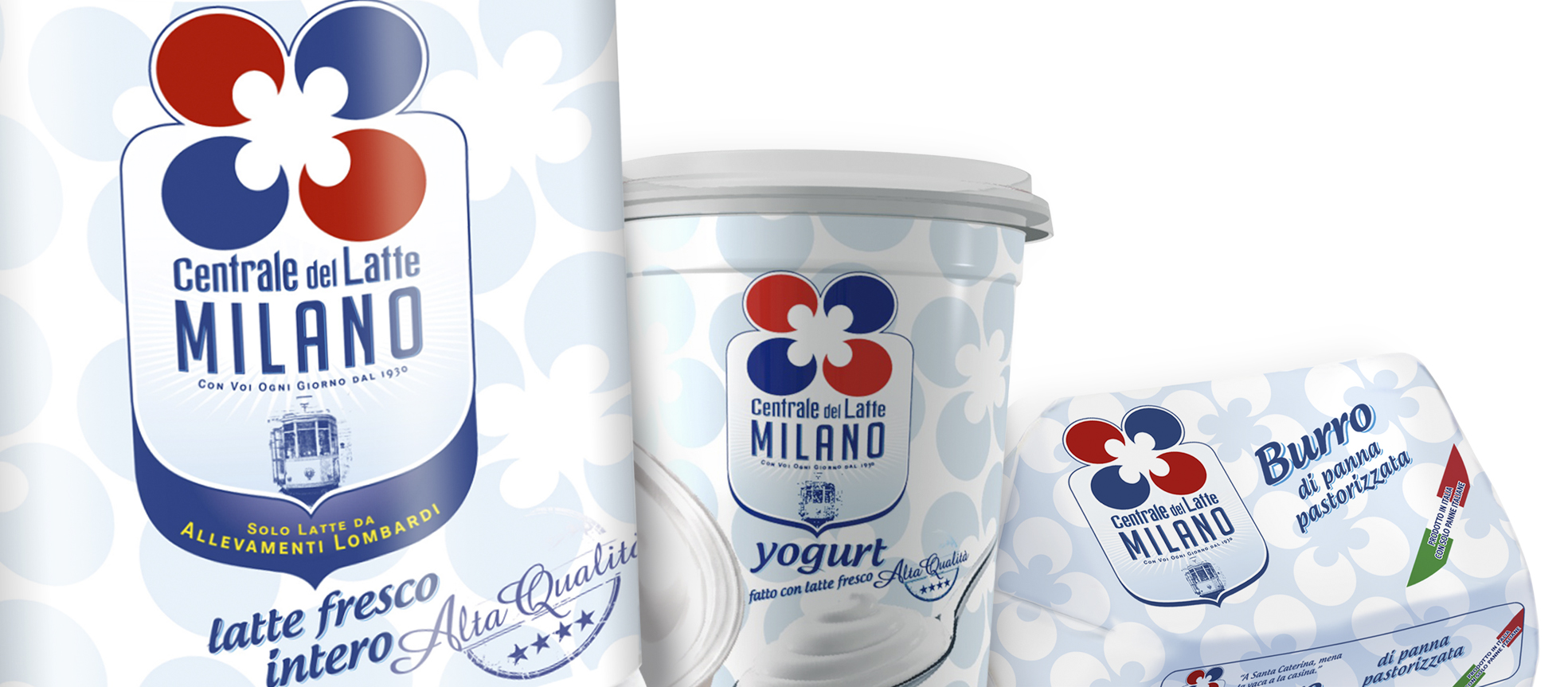
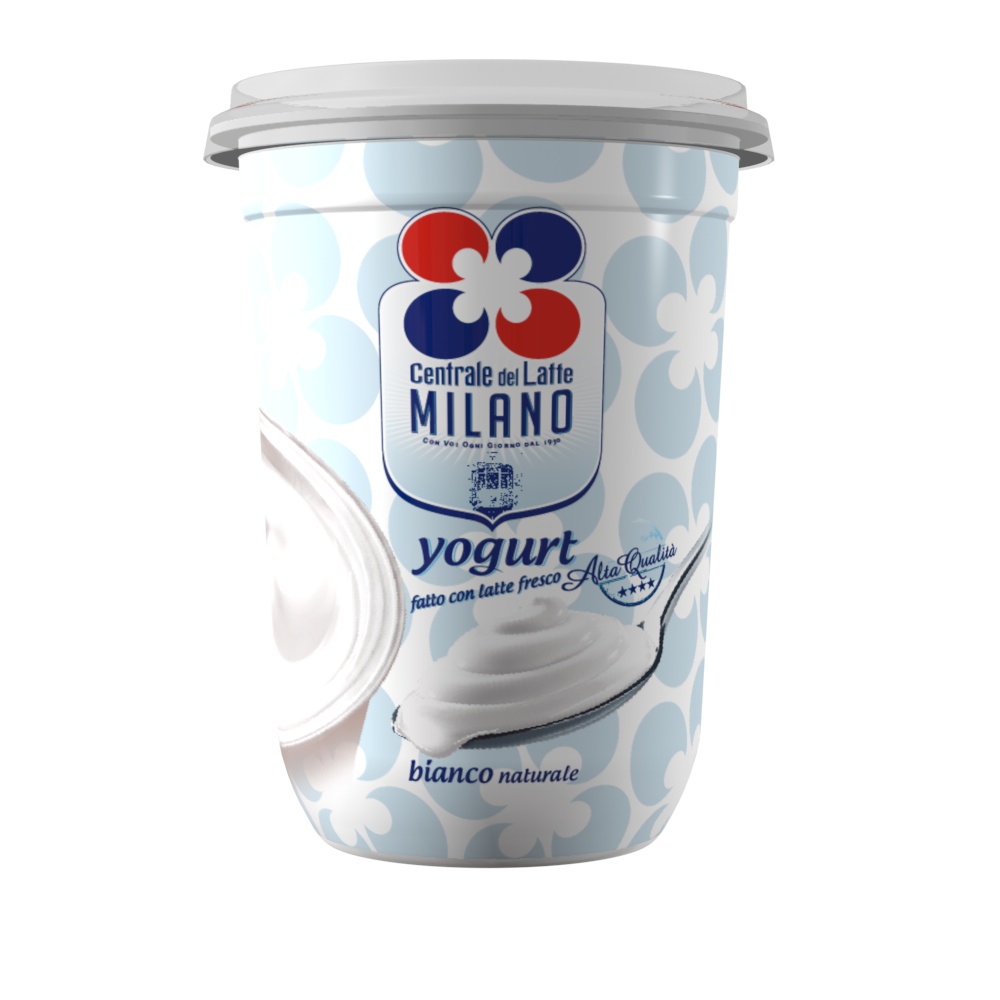
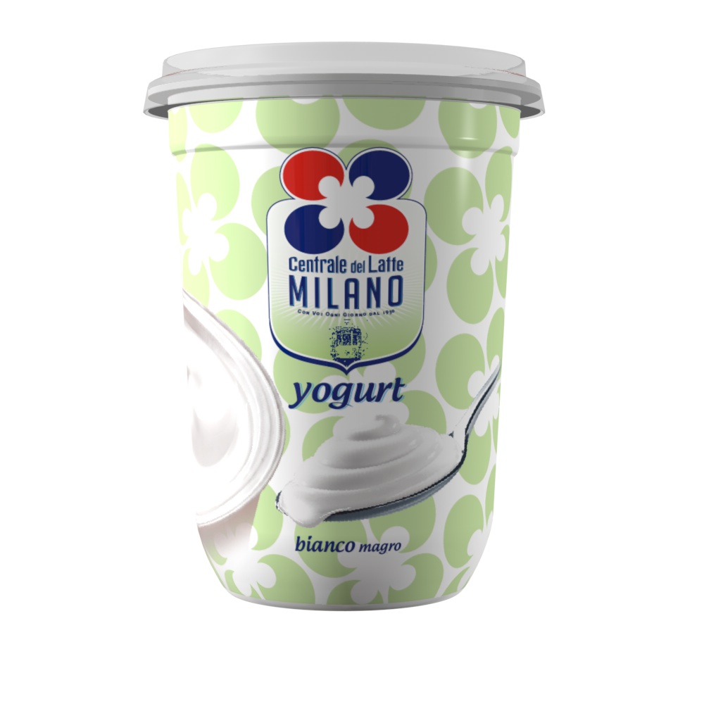
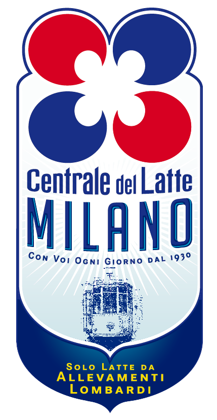
The restyling plays with the key elements of the brand heritage: the name of the city has the main role on the pack and is enforced by the tram in the visual, one of the undisputed icons of Milan. The graphic system is relying on fresh and soft colors, coherently with the product mood, allowing a flexible development on each different pack.

 Torna indietro