
Carrefour Urban Life Store
Carrefour express

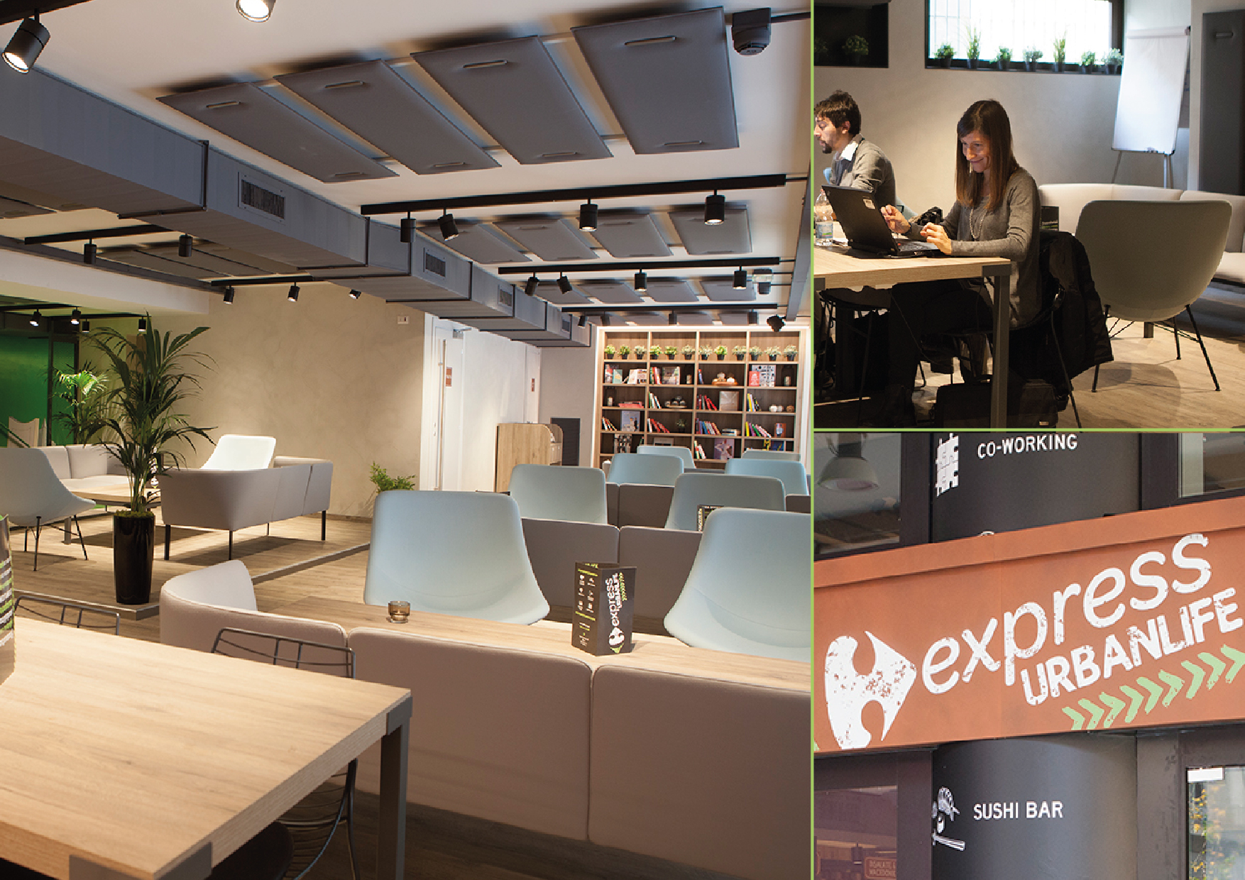
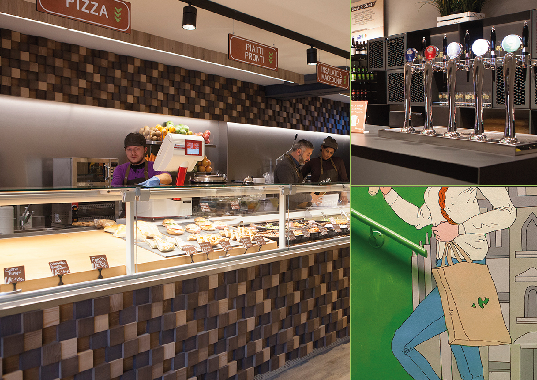
French retailer Carrefour chose Milan to launch a new multifunctional store: a place where customers can eat, work, relax or socialize. It is divided into different food courts (sushi, vegan corner, delicatessen, home made ice cream, beer hall) a café, a lounge bar and a (co)working area with recharging facilities and free Wi-fi.
The agency was required to create all the in-store communication and a name. The new venue had to look modern and urban.
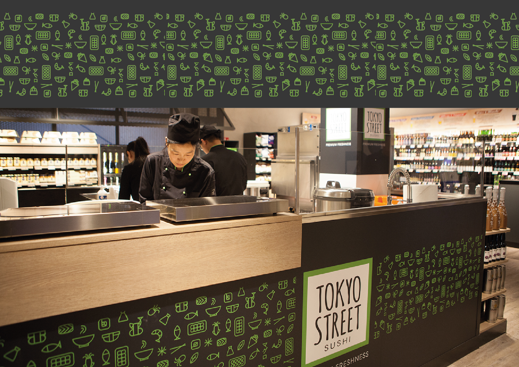
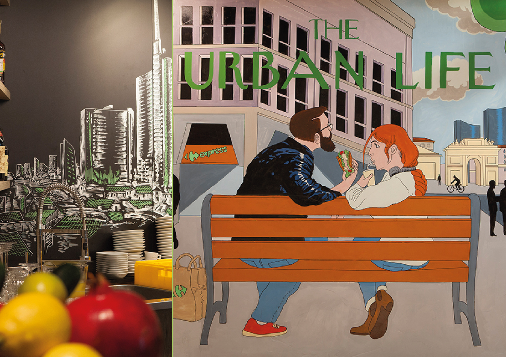
The Urban Life name communicates the philosophy of the store and its ability to meet the needs of a modern lifestyle. The graphics of the main sign refer to the city with green arrows (reminding of a tyre trace) and fonts that look rusty and worn out. A column at the entrance lists and clarifies the service offered to the new customers. The same approach was used for the in-store communications: in the beer hall, for example, the offering of 204 types of beer was rationalised by a sign that helps customers to easily make their choice. Worth of mention is also Tokio Street, the Sushi area: its name conveys oriental premiumness together with its graphics (making a large use of icons).
The walls of the store were decorated with several ad hoc illustrations drawn by famous street artist Luca Zamoc.
P.IVA 08721430968 - Cap. Soc. €500,00 interamente versato - N° R.E.A. MI 2044407