
Cami
Cameo
SCENARIO
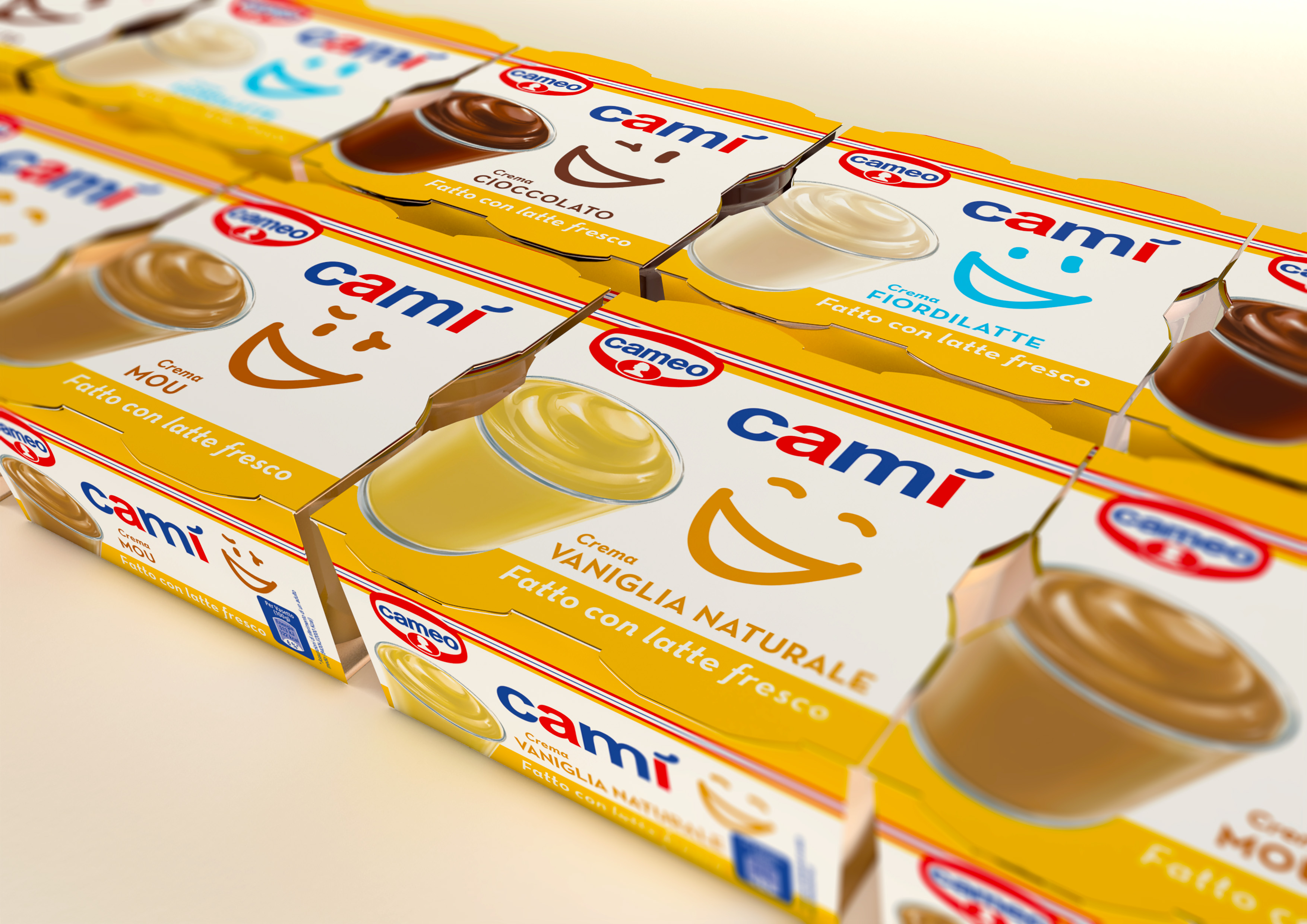
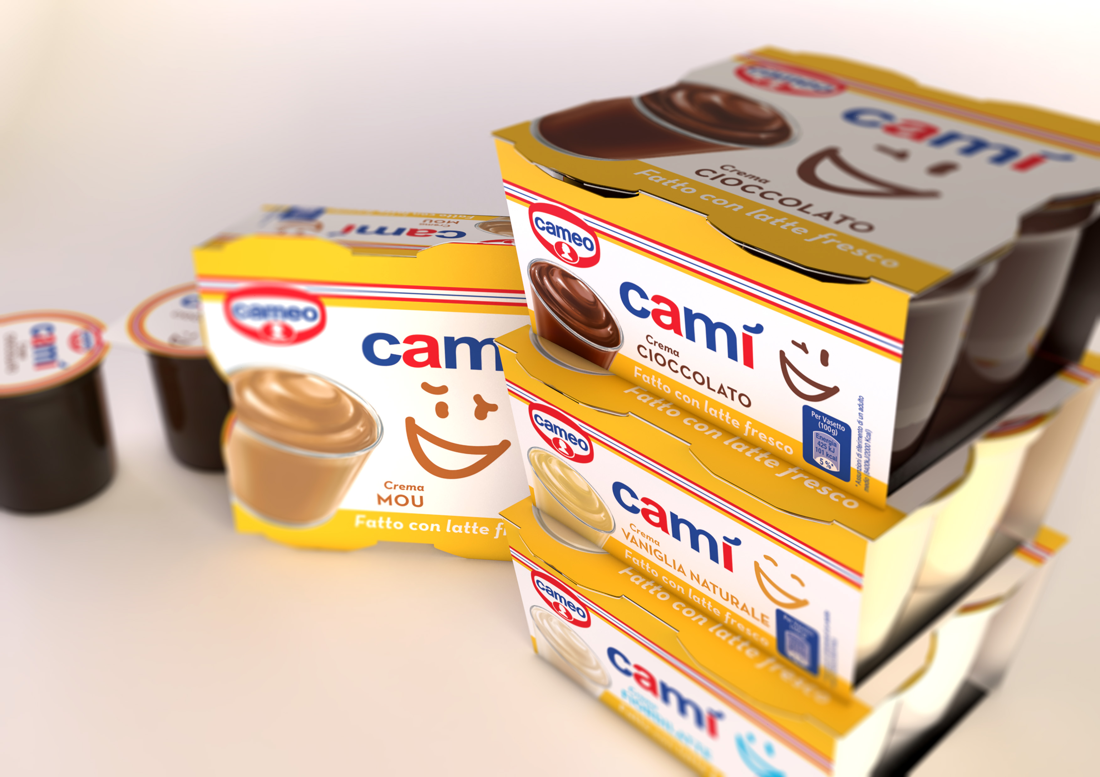
Cameo, the Italian brand of the Dr. Oetker group, intends to launch a new line of puddings on the market. It is a classic product, coming in classic flavours. It targets families, with a genuine, simple and traditional attitude. It also differentiates from its competitors for its simple, genuine and natural ingredients (e.g. fresh milk) and the absence of gluten, preservatives and hydrogenated fats. The perception of the mother brand Cameo supports this genuine image with its solid reputation in the cake mix sector.
OBIETTIVI DI COMUNICAZIONE
It is necessary to communicate the pleasure given by a great taste (paramount in the dessert world) and the simplicity of the ingredients used.
SOLUZIONE CREATIVA
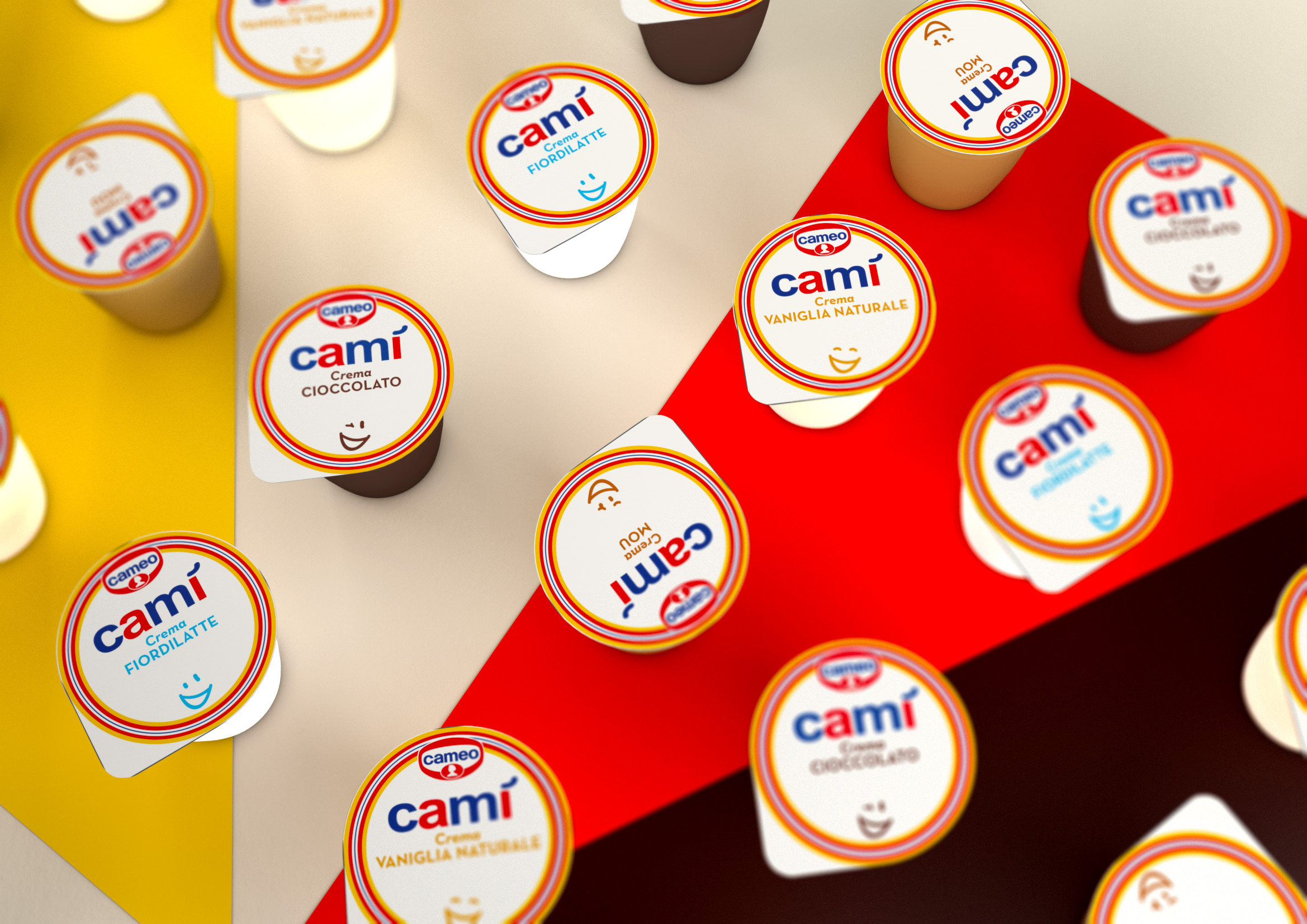
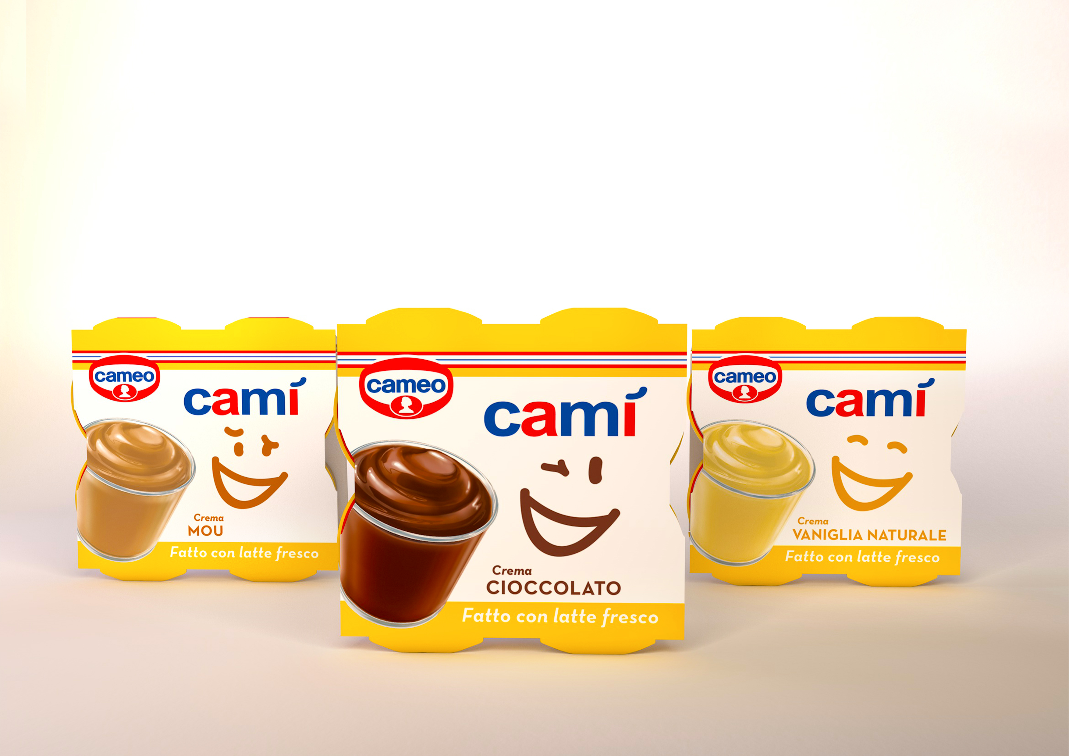
The communication device used to convey both pleasure and simplicity is a smile. Four different types of smiles have been designed (one for each flavour) and placed on a milk-white background. This clean choice not only makes the packaging distinctive, but it connects to the main product plus (fresh milk) and conveys simplicity. The yellow used on the upper and lower bands gives a feel of positivity and happiness. The logo uses the same lettering and institutional colours of Cameo’s, in order to capitalize on the positive, genuine perception of the mother brand.
P.IVA 08721430968 - Cap. Soc. €500,00 interamente versato - N° R.E.A. MI 2044407