B&H
JTI
SCENARIO
Since 1873, B&H is one of the most famous British tobacco brands.
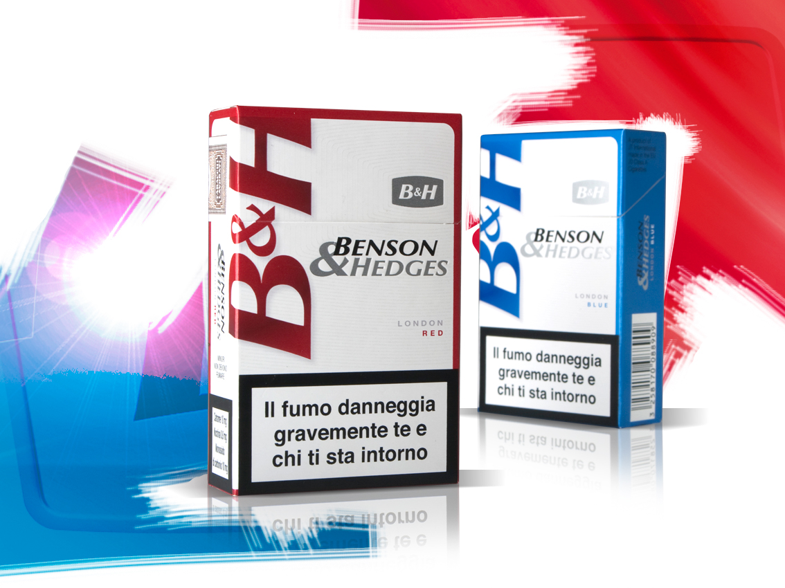
B&H cigarettes were being sold with two different types of packs on the Italian and European markets. The colours on the Italian pack lowered the brand perception and mainly appealed to an old target. The European pack was perceived as a premium one, but it was not as personal as it was supposed to be.
OBIETTIVI DI COMUNICAZIONE
Creating a unique design for the EU market. The new packaging was required to feel premium, accessible and young.
SOLUZIONE CREATIVA
The sentence “Colour your world” guided the restyling process. Now bold colours revitalize the brand image, whilst the pearl-white background conveys quality and premiumness. The “Benson & Hedges” writing was brought on two lines and now appears to be more related to the B&H logo, which is the main visual asset of the brand.

 Torna indietro