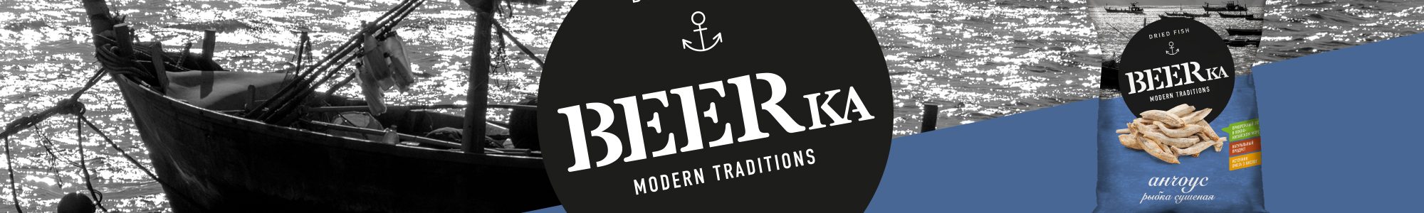
BEERka
KDV


SCENARIO
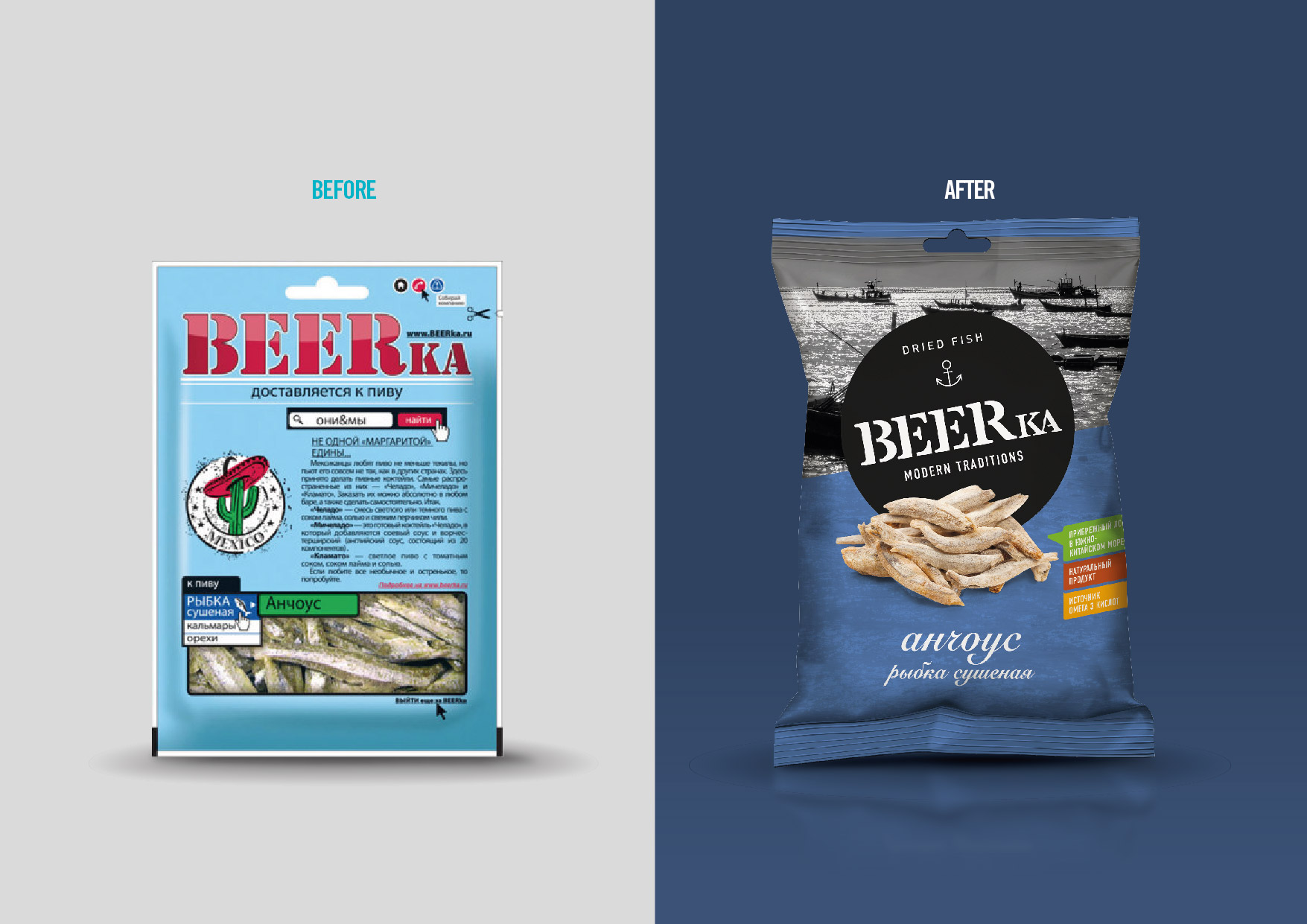
BEERka is a brand of traditional Russian snacks and part of the portfolio of the KDV group. It is well known in its own market, but despite the good quality of its products, it has lost part of its share due to an outdated and inconsistent communication across the brand lines (dried fish, meat, tree nuts and croutons), which are sold in supermarkets on different shelves.
OBIETTIVI DI COMUNICAZIONE
It is necessary to create a strong system that will point out the qualities and the peculiarities of each product while making them recognizable at a glance as part of a single, unique, modern brand.
SOLUZIONE CREATIVA
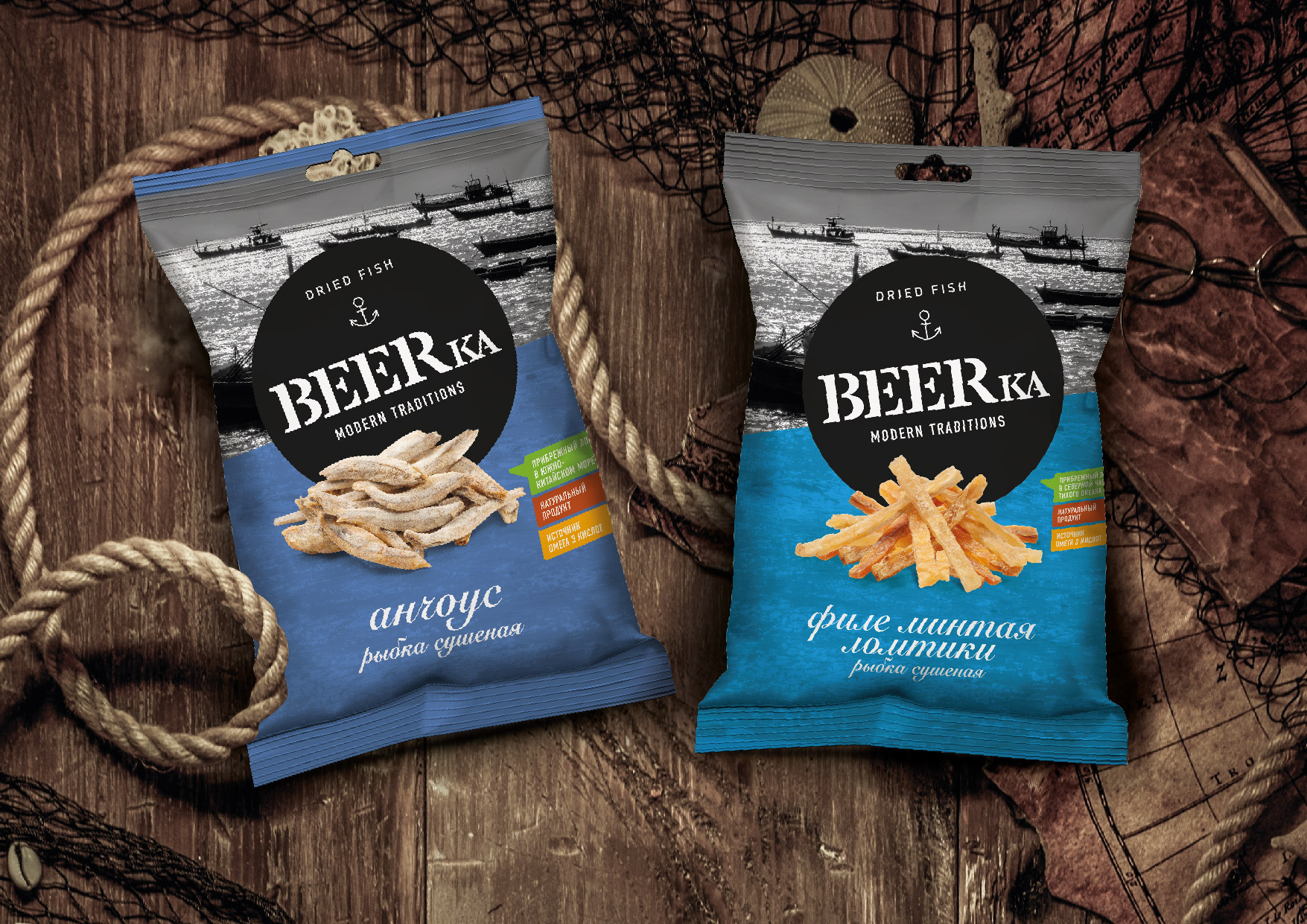
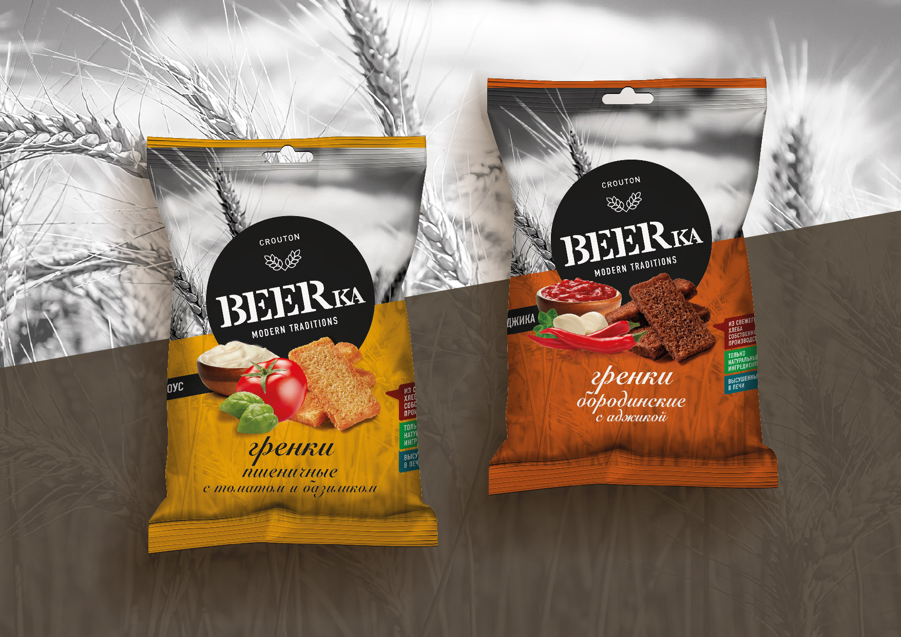
The new, strong visual identity is based on a new logo that plays a preeminent role on the packaging. The icons used to differentiate the 4 categories of product have been included in the logo itself in order to stress their belonging to the same brand. The pay off Modern Traditions combines with contemporary graphics, in a new system that divides the packaging in two areas. On the upper side a black and white picture evokes places connected to the ingredients and underlines the high quality of the products. The colours used on lower side echo the relevant world of each type of product (blue for fish, red for meat, warm tones for wheat and green for tree nuts). The product pluses (naturalness, functional benefits and origin) are claimed through balloons that connect to the main visual.
P.IVA 08721430968 - Cap. Soc. €500,00 interamente versato - N° R.E.A. MI 2044407