Agromonte
Agromonte
SCENARIO
Agromonte is a brand of Società Agricola Monterosso, a Sicilian company specialized in cherry tomato preserves. The quality of the product (harvested in summer only and processed within 24 hours) allowed the company to export it all over the world. Monterosso was the first brand to pack its sauce in beer bottles, a Sicilian tradition that dates back to the WW2, when housewives would collect the bottles left behind by American soldiers. Over time though, this type of solution was adopted by several competitors.
OBIETTIVI DI COMUNICAZIONE
It is necessary to give back to the brand the visibility it once had. This must be achieved by restyling the logo and creating a new packaging system. The brand also needs to stress its Italian origins, following the growth it has experienced on the international markets in recent years.
SOLUZIONE CREATIVA
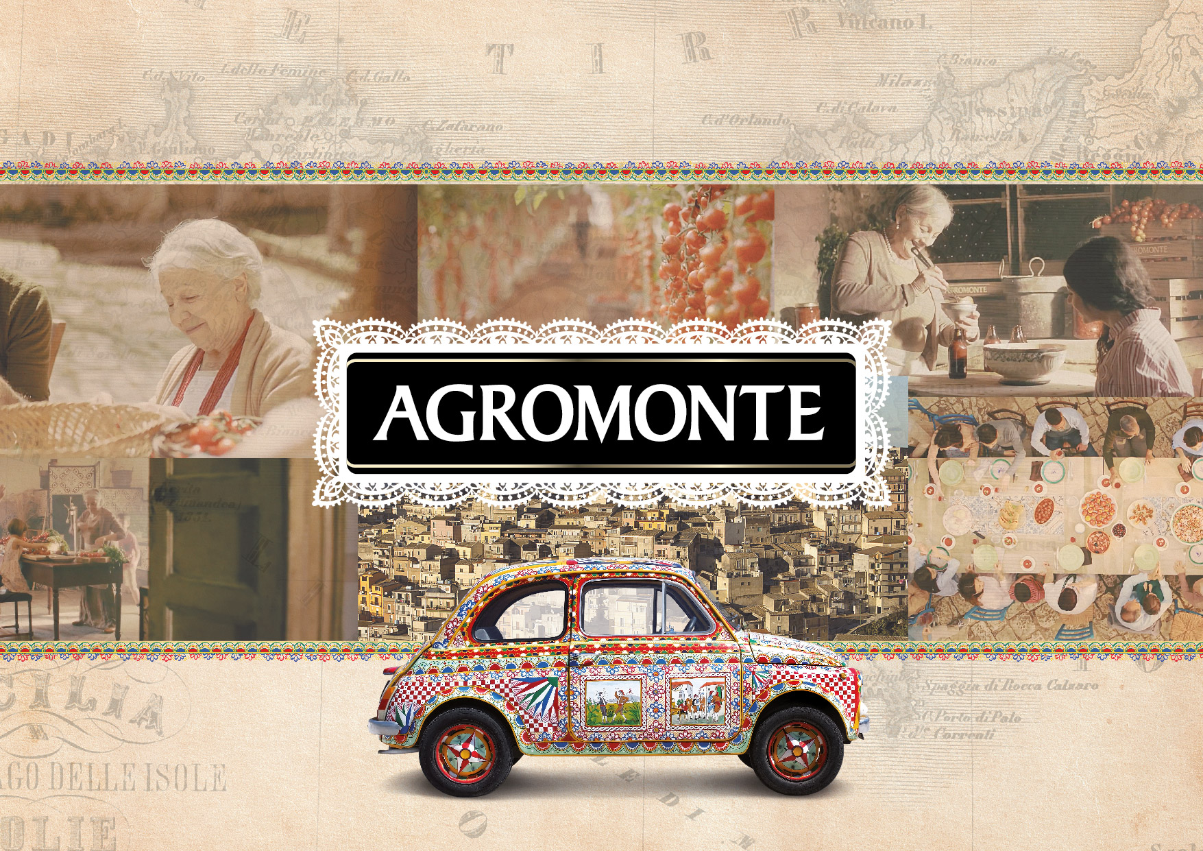
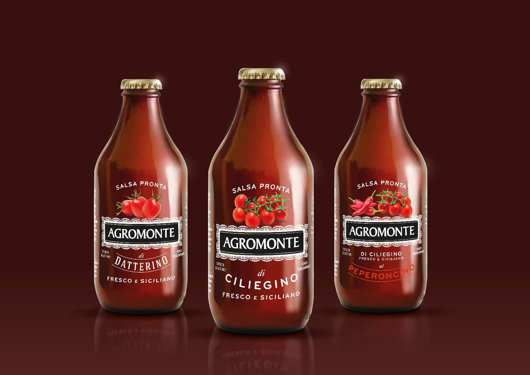
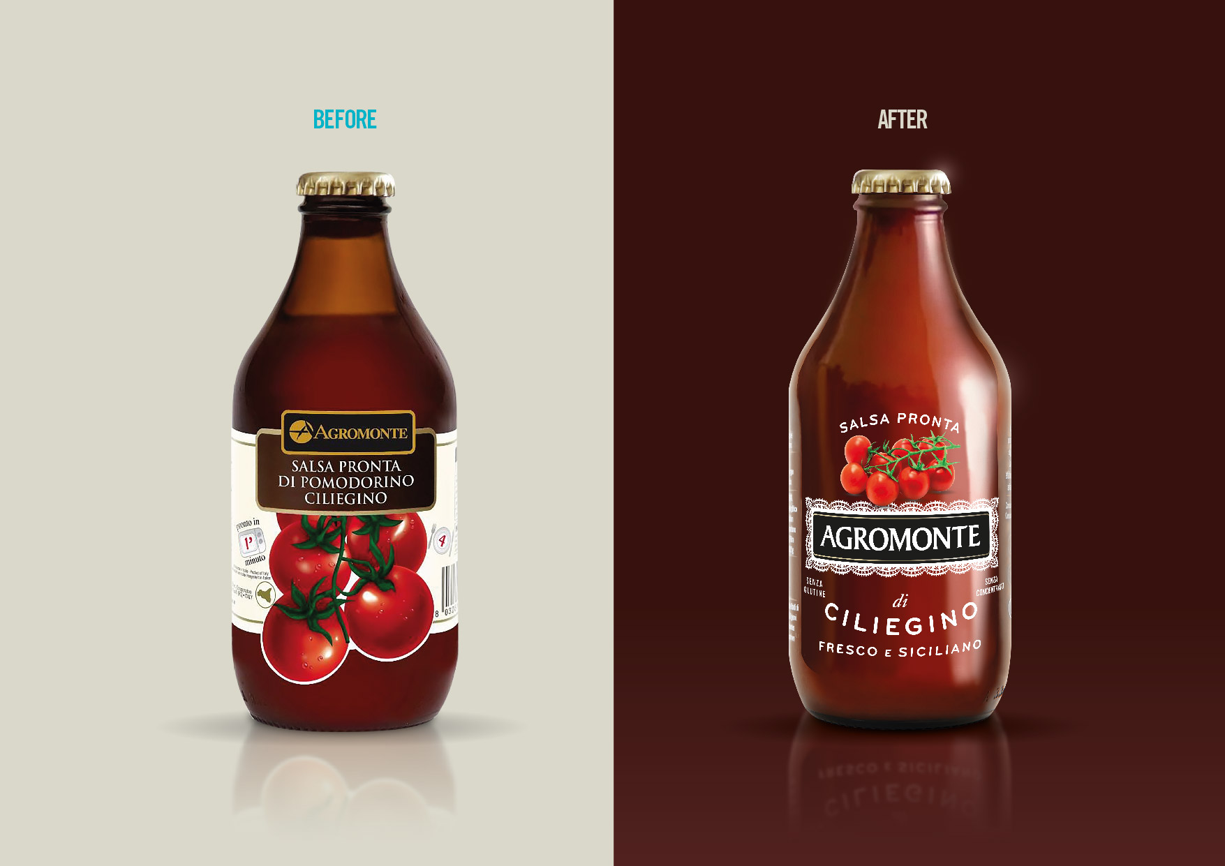
The first step was making the logo unique, more Sicilian and Italian looking. The traditional regional lace connects it to the Mediterranean island – on the domestic market – while evokes the world of fashion and made in Italy in international consumers. Also the text on the packaging has been used in a decorative way, in a style that is warm and typically Southern Italian.
The tomatoes in the main visual have been reduced in size to look more precious, like jewels would.
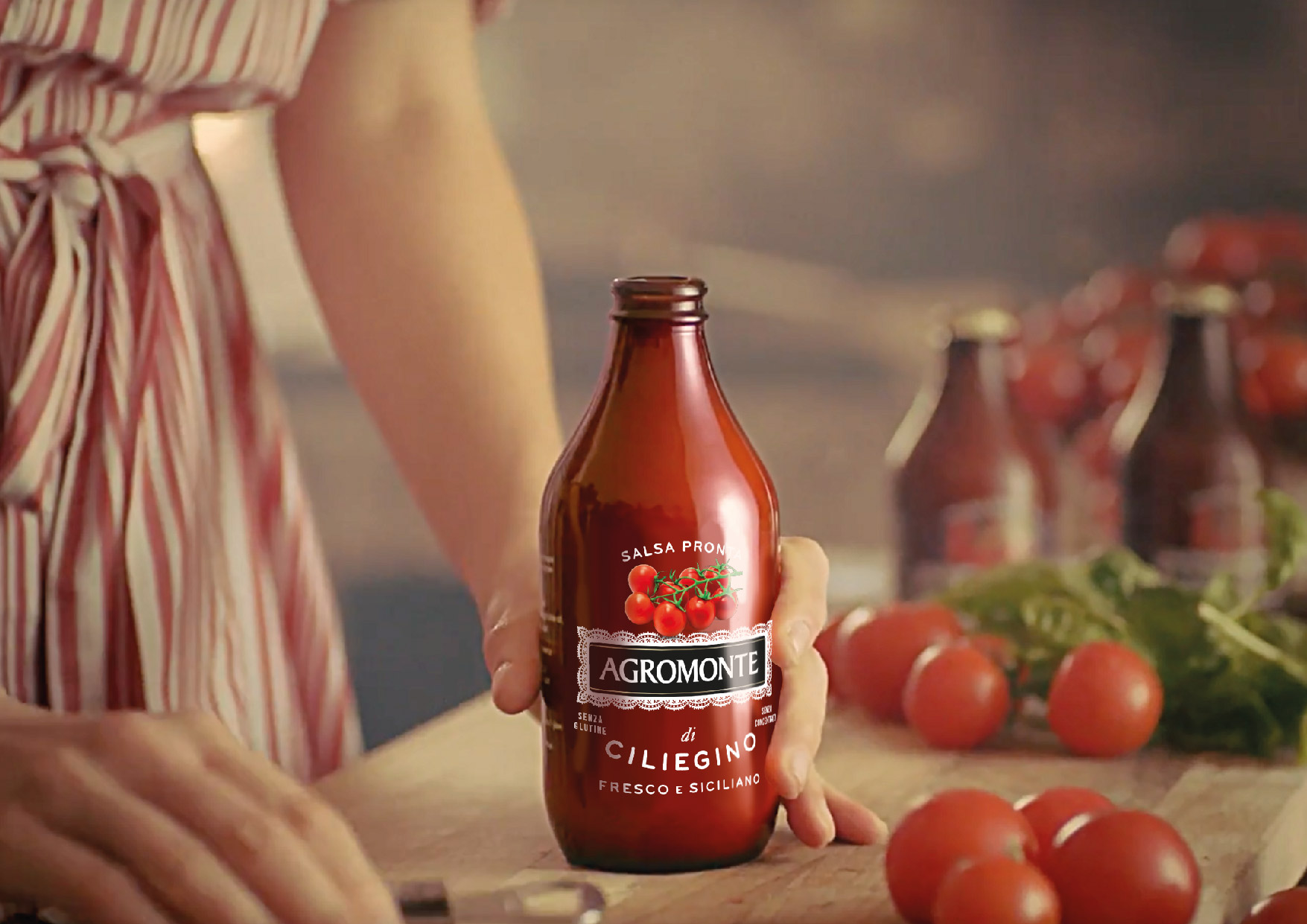
In restyling the brand’s best selling product (cherry tomato sauce), a see-through label was chosen both to show the content and, especially, to give greater visibility to the colour red – the colour of passion – underlining once more the Sicilian origins of Agromonte.
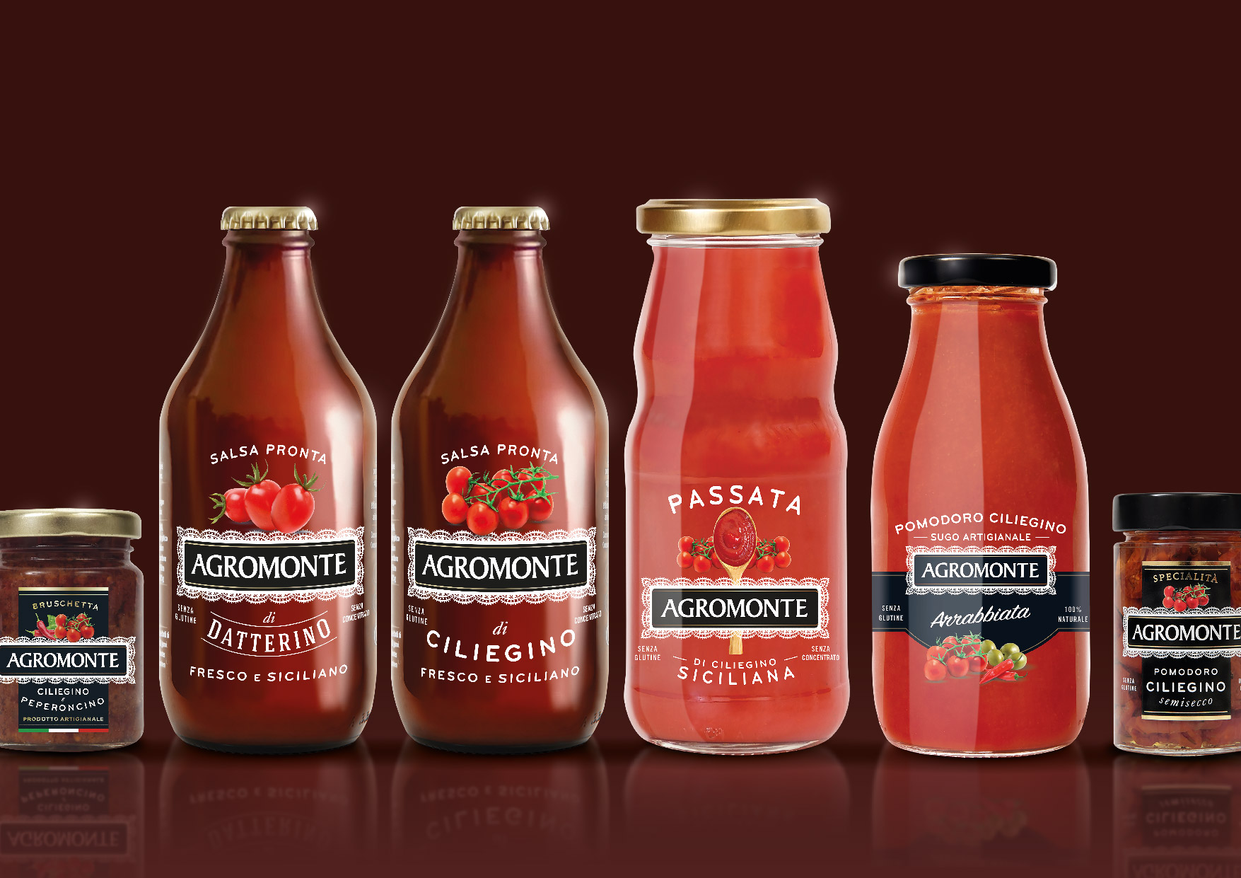
The restyling concerned several product lines each with its graphic peculiarity: Sughi (where a coloured band was added to increase the appetite appeal), Passate, Bruschette (endorsed by a black band) and Bio (where a label with a rough, natural feel was used).

 Torna indietro