Biscotti dei grandi
Plasmon
SCENARIO
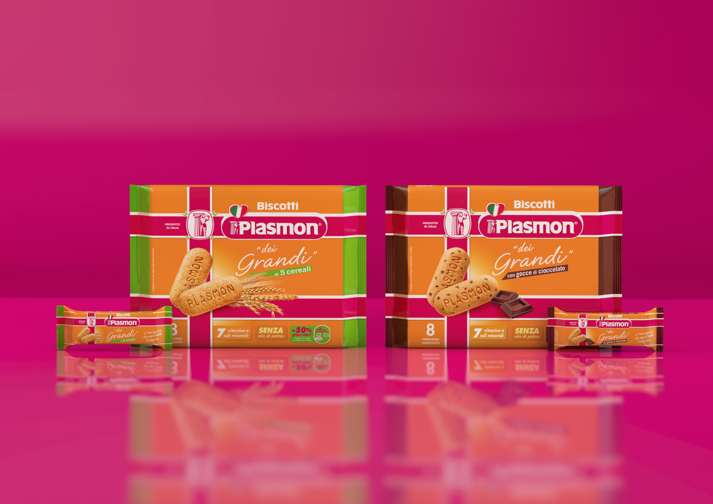
Plasmon biscuits are one of the most iconic, famous and beloved products on the Italian market. Despite being specifically formulated for children, they are often consumed by adults who are looking for a cuddle, for the taste they loved as children, for the well-known nutritional properties and the reliability of a brand they trust. In order to satisfy and stimulate the growth of such demand, Plasmon decided to extend the brand into the adult biscuit market by launching “Plasmon dei Grandi” a new line with two different flavours. Although taste and texture have been angled to the taste of the new target, the features of the new biscuits are closely related to the original ones, including the iconic shape and the presence of added vitamins and minerals.
OBIETTIVI DI COMUNICAZIONE
The brand extends for the first time into the foods for adults territory. The challenge is to keep its DNA unaltered and firmly restate Plasmon’s brand values in the new segment.
SOLUZIONE CREATIVA
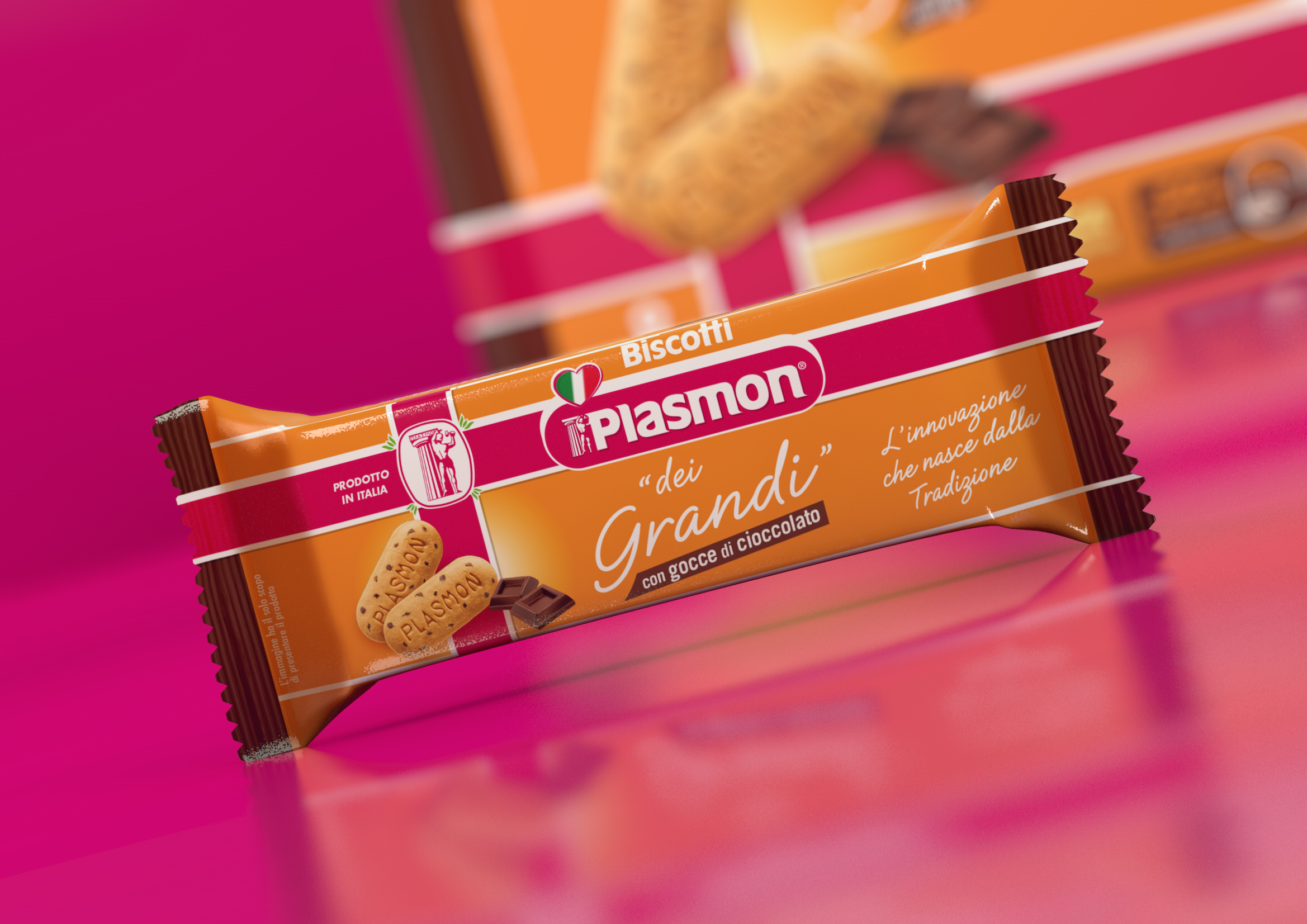
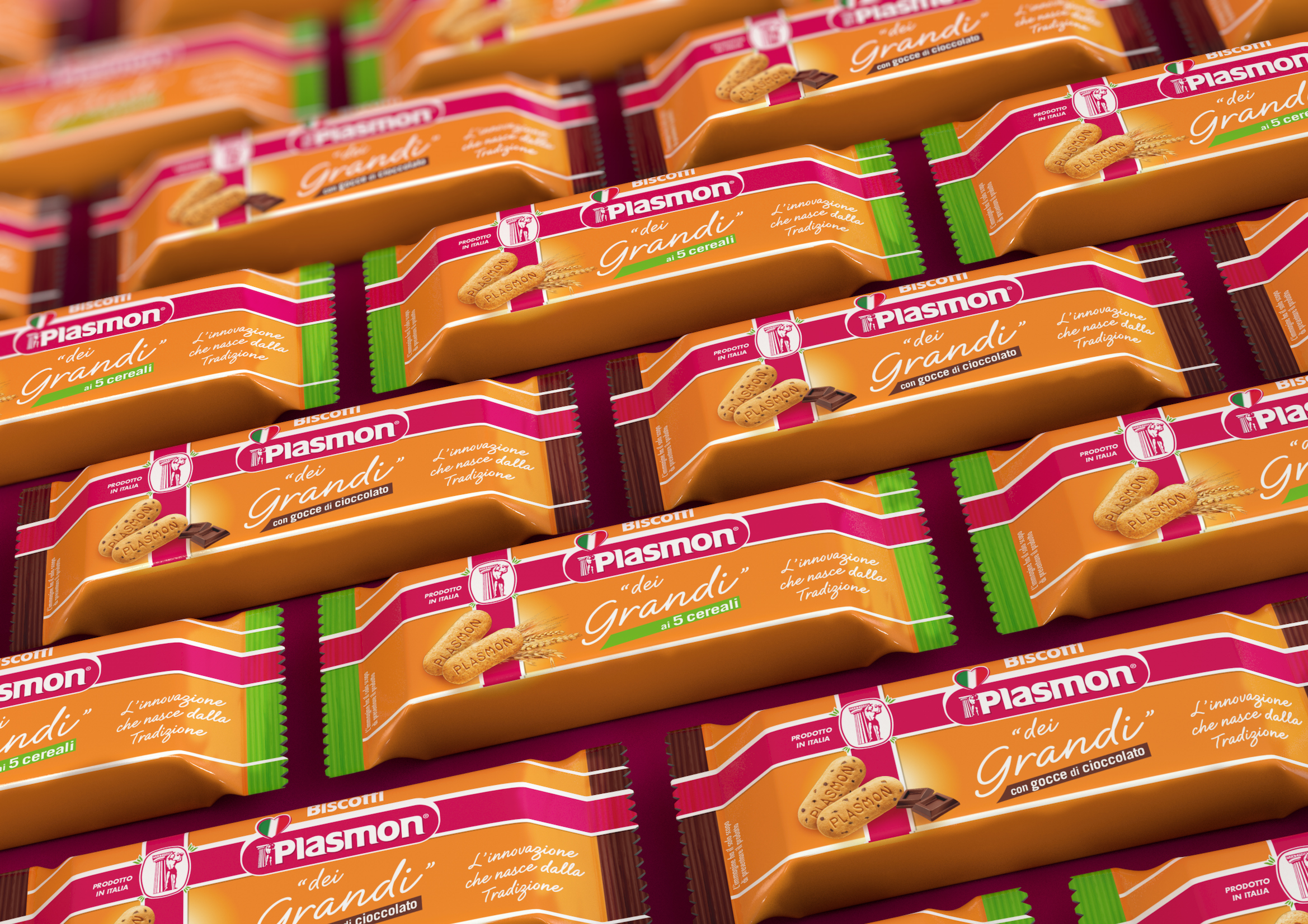
The new pack re-uses some historical brand elements that strongly identify the brand, such as the double cross on the front side. Also the “hammerer”, a true brand icon, stands again in its own, separate logo, in order to gain visibility. This design choice has a double purpose: rooting the new product into the brand’s DNA and addressing a part of the target who has enjoyed that very same communication during their childhood.
According to the style of the brand, information on the nutritional values can be found on the rear of the pack.
The claim used on the POS display was “ a ognuno il suo”, i.e. “everyone gets his own”. The same message, #aognunoilsuo, was used as the launch hashtag on social network campaigns.

 Torna indietro

