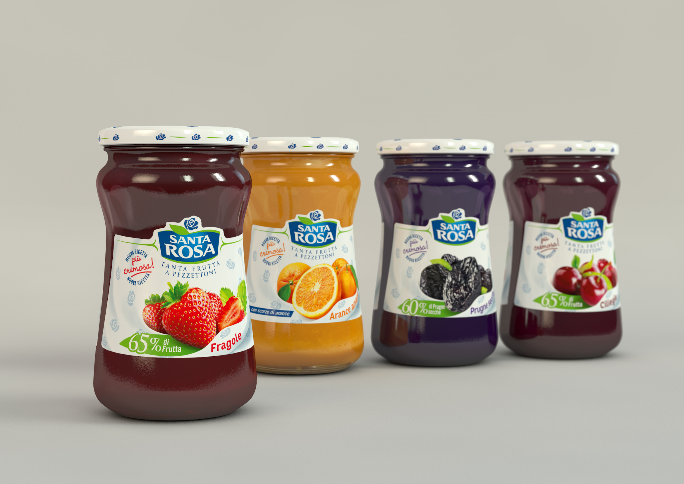
Santarosa Jam
Valsoia
SCENARIO
Created in 1968, Santa Rosa is today one of the 3 main players in the Italian fruit jam market. Santa Rosa, however, enjoys the highest level of brand awareness.
Part of its reputation was built around its historical pay off Tanta frutta a pezzettoni (with big chunks of fruit), a feature that always differentiated the product from competitors’.
OBIETTIVI DI COMUNICAZIONE
By a soft restyling, the brand must re-state the quality and naturality of its products in order to let the consumer perception live up to the brand awareness.
SOLUZIONE CREATIVA
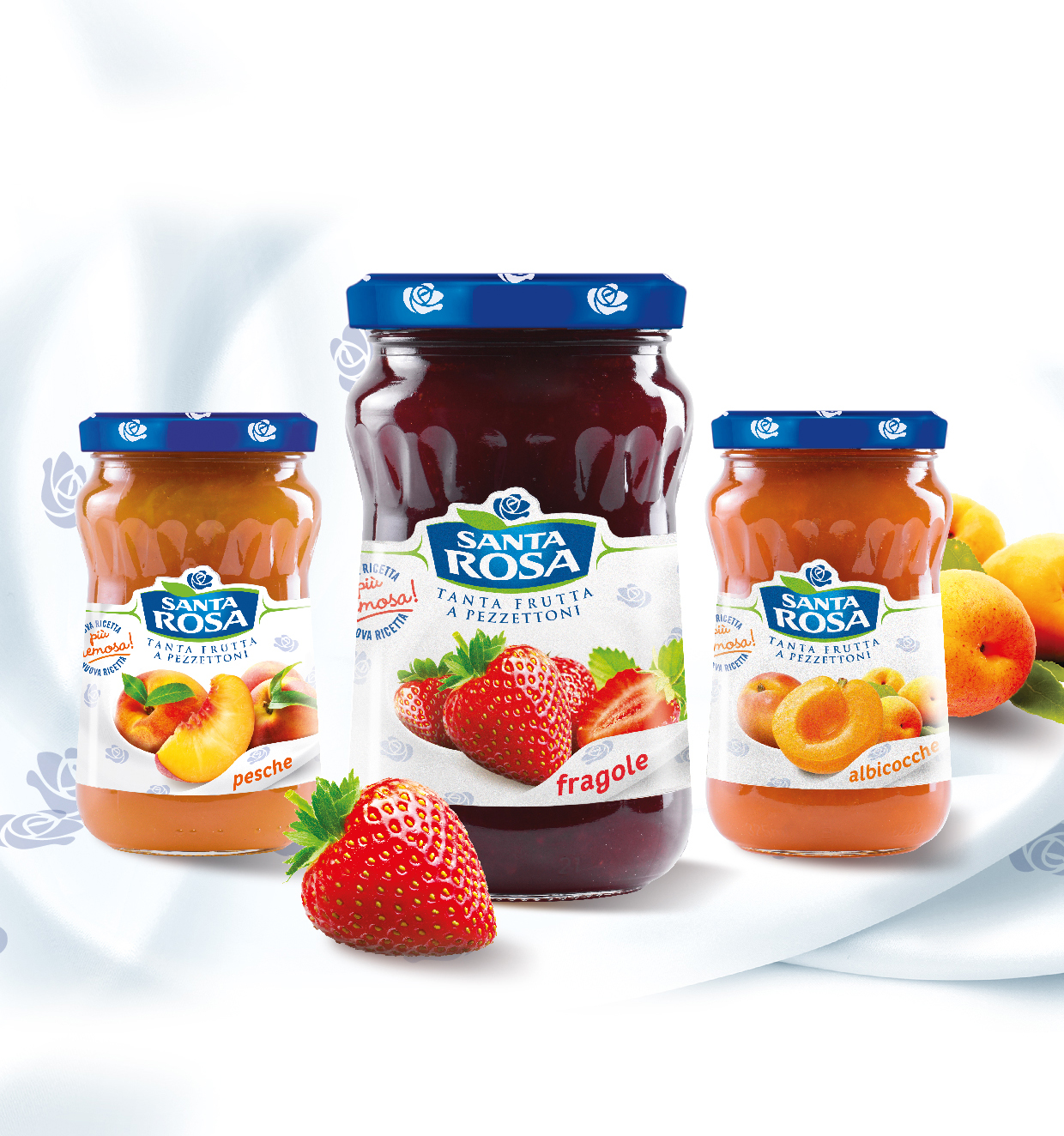
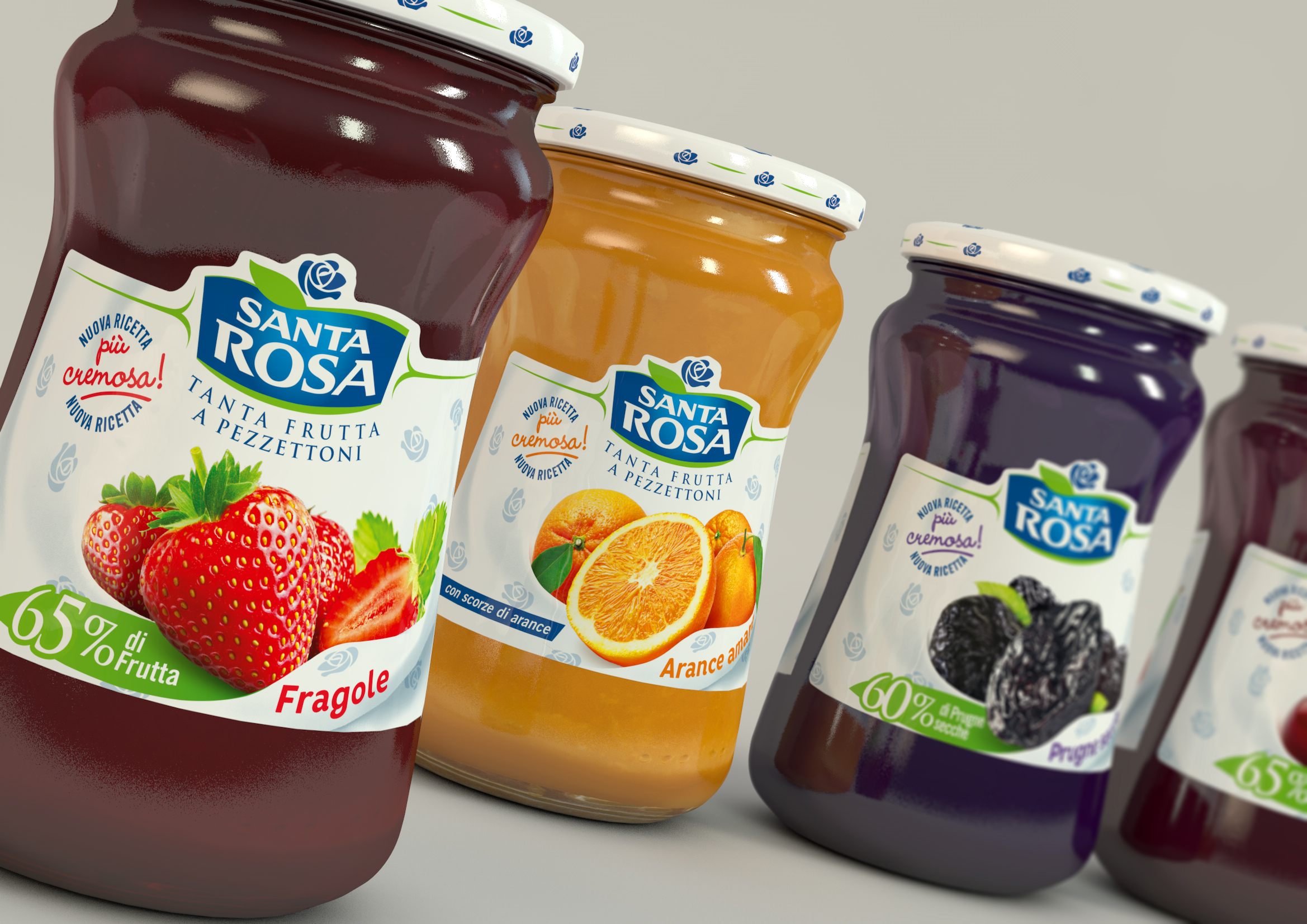
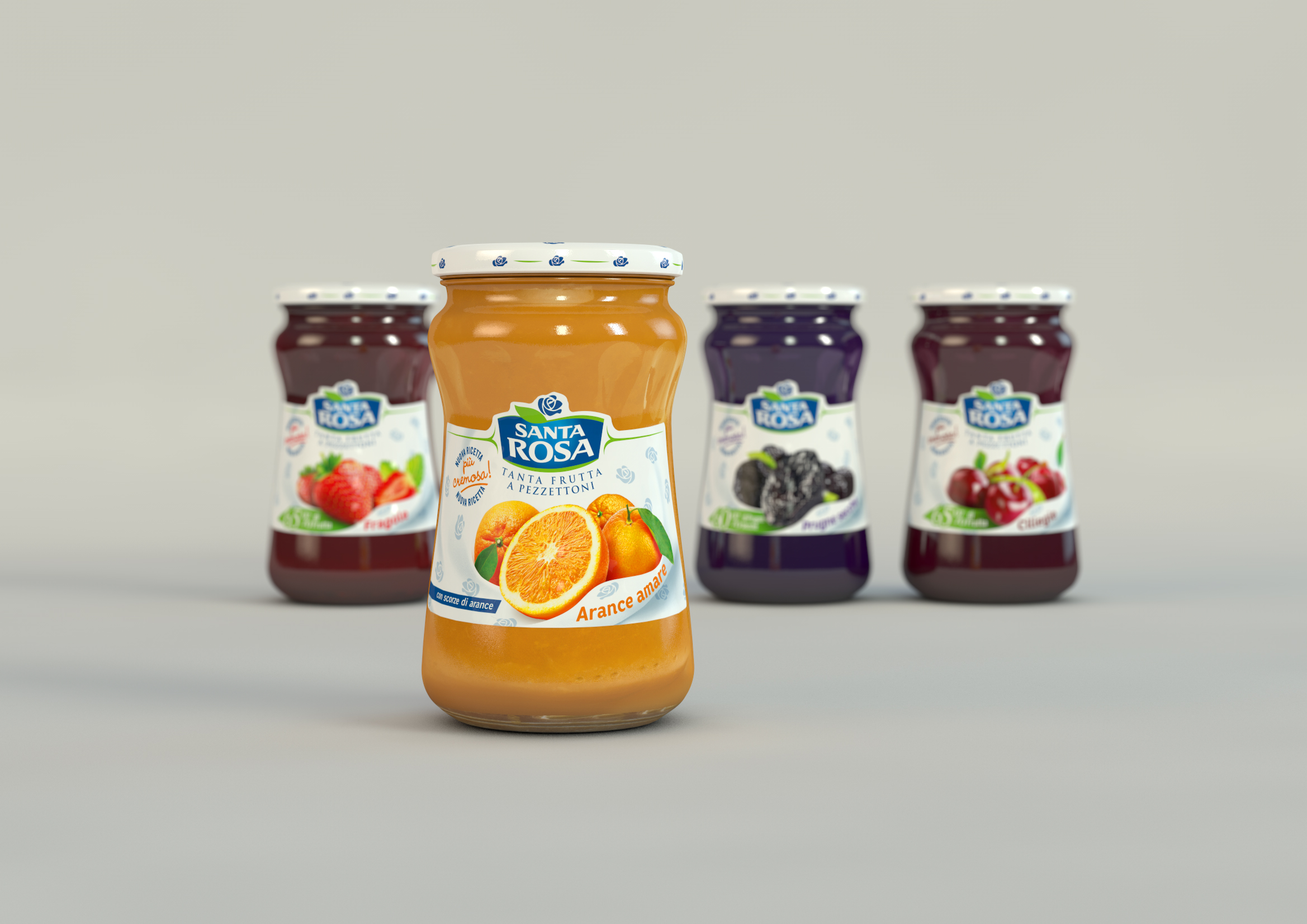
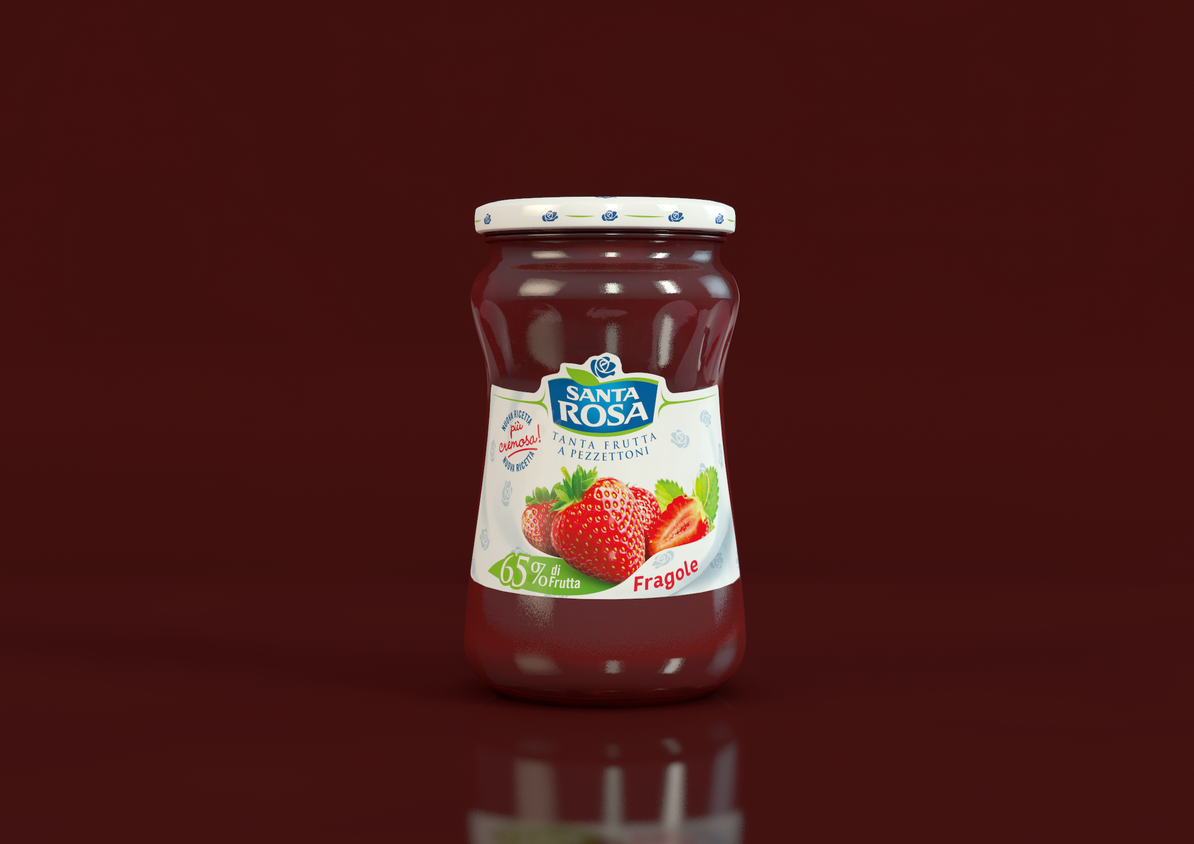
The presence of very well established brand codes, suggested some light but numerous touches. For a more natural effect, the logo was improved with some decoration elements such as two green lines (stylized leaves) holding it up from the sides. The same decoration was added to the cap.
As the pay off was a key element, it was moved under the logo to make it more visible and integrate it with the brand also on a graphical level.
The main visual was improved with a simpler and more natural fruit image. The tablecloth where the fruit was laying on was also retouched and now appears more natural, and cosy thanks to its unfolded layout and a wiser use of white.

 Torna indietro