
Rıso Flora
Colussi
SCENARIO
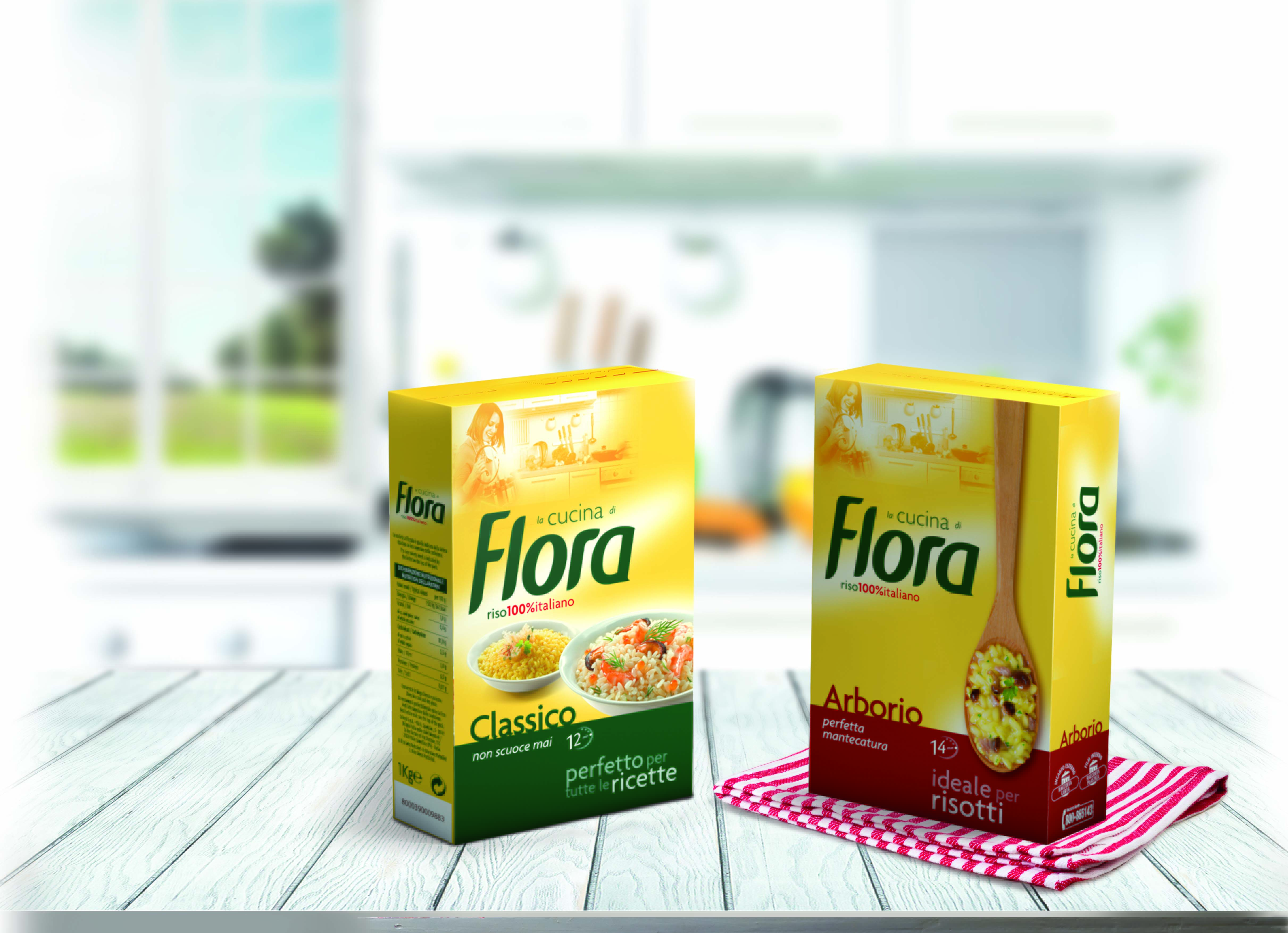
Flora appeared on the marked in the late ‘60s introducing the Parboiling process in Italy and becoming the leader in the newly created segment. Later the company extended its range in order to meet the most recent market trends. However, the new lines did not get all the recognition they needed as the brand was mainly associated to its most successful product: the parboiled rice.
OBIETTIVI DI COMUNICAZIONE
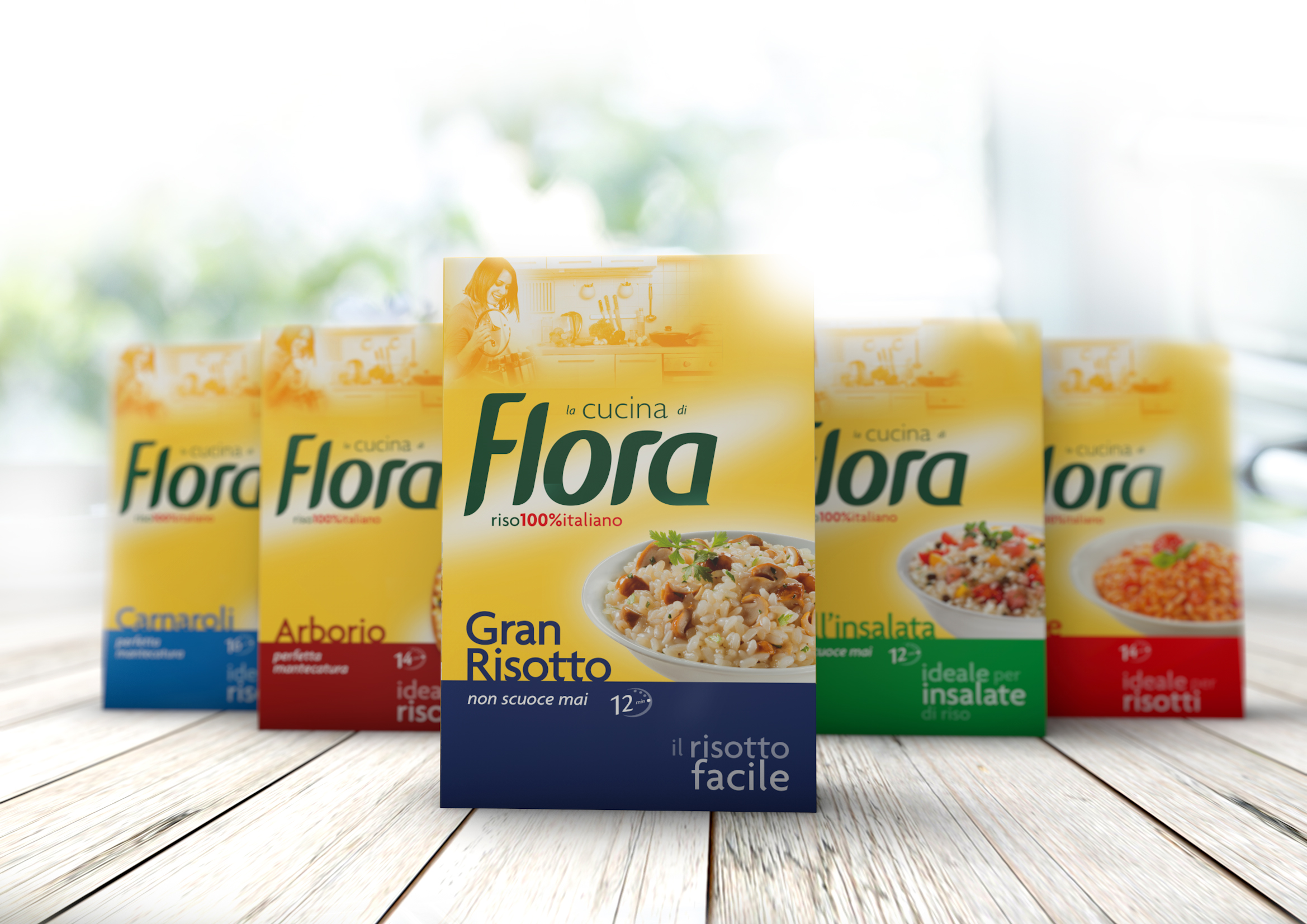
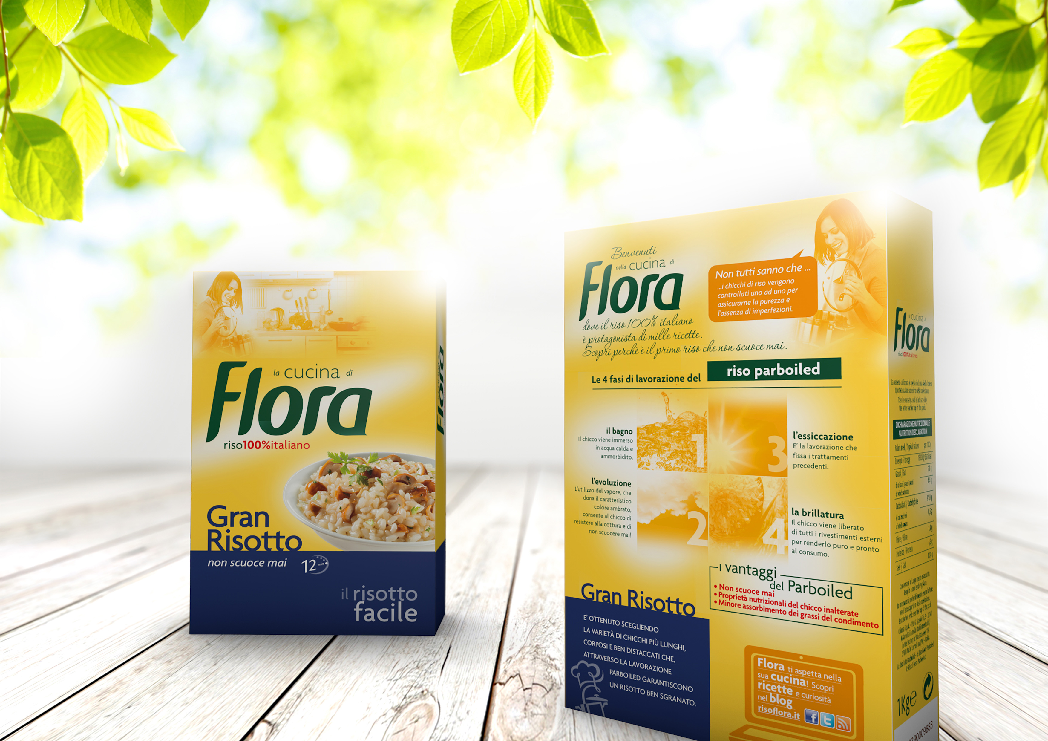
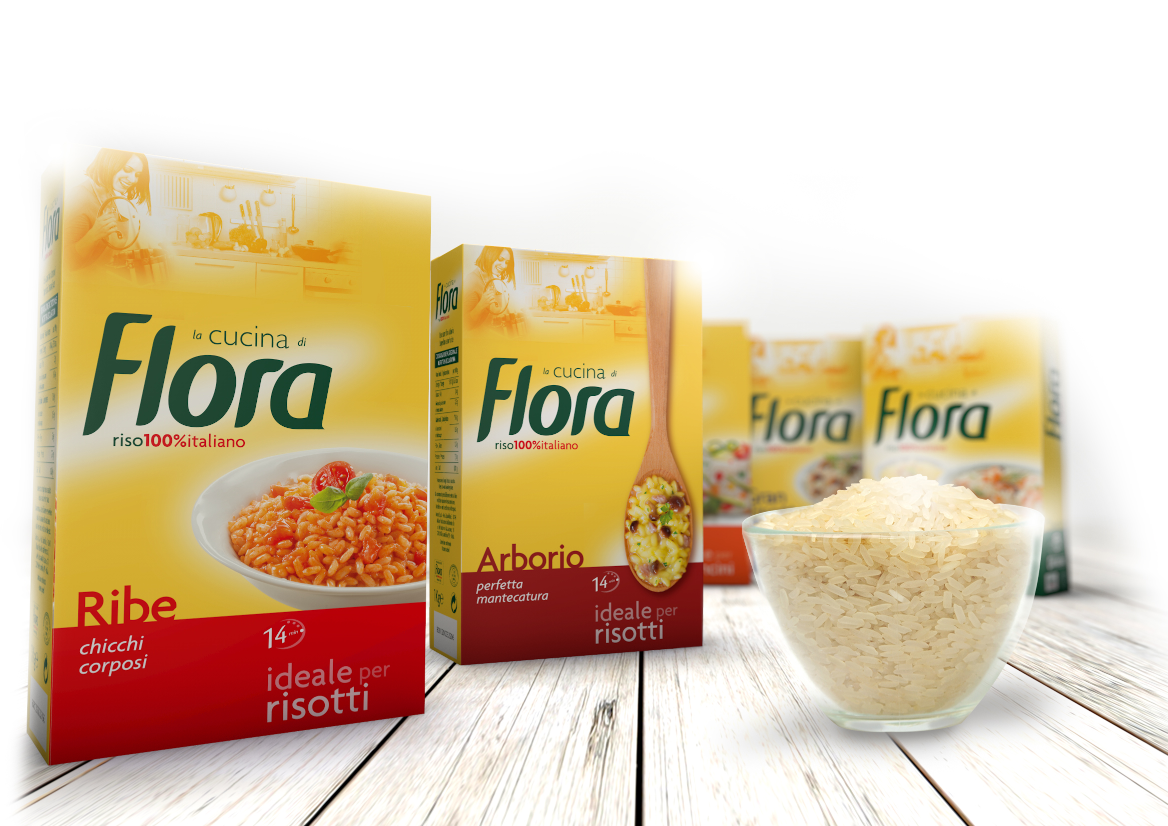
The objective was to create a new, strong brand identity, in order to make the brand more independent from the parboiled line and give value to all of its offering. A new graphic system was also needed to present the range in a clear way, give it more visibility on shelves and add more premiumness to it.
SOLUZIONE CREATIVA
A strong identity has been achieved through personification: being the brand name also a name for woman, a woman appeared on the pack and the first letter of the logo was made capital, as in given names. Chromatically, the pack was divided in two, to add clarity and premiumness. The institutional yellow became warmer and more personal. To illustrate the range, more emphasis was put on the use each rice was intended for (even to the aid of images such as a wooden spoon for quality risottos or several serving suggestions for the versatile parboiled, now simply called “the classic” that never gets overcooked).
P.IVA 08721430968 - Cap. Soc. €500,00 interamente versato - N° R.E.A. MI 2044407