
Riva del Garda
Agraria Riva del Garda
SCENARIO
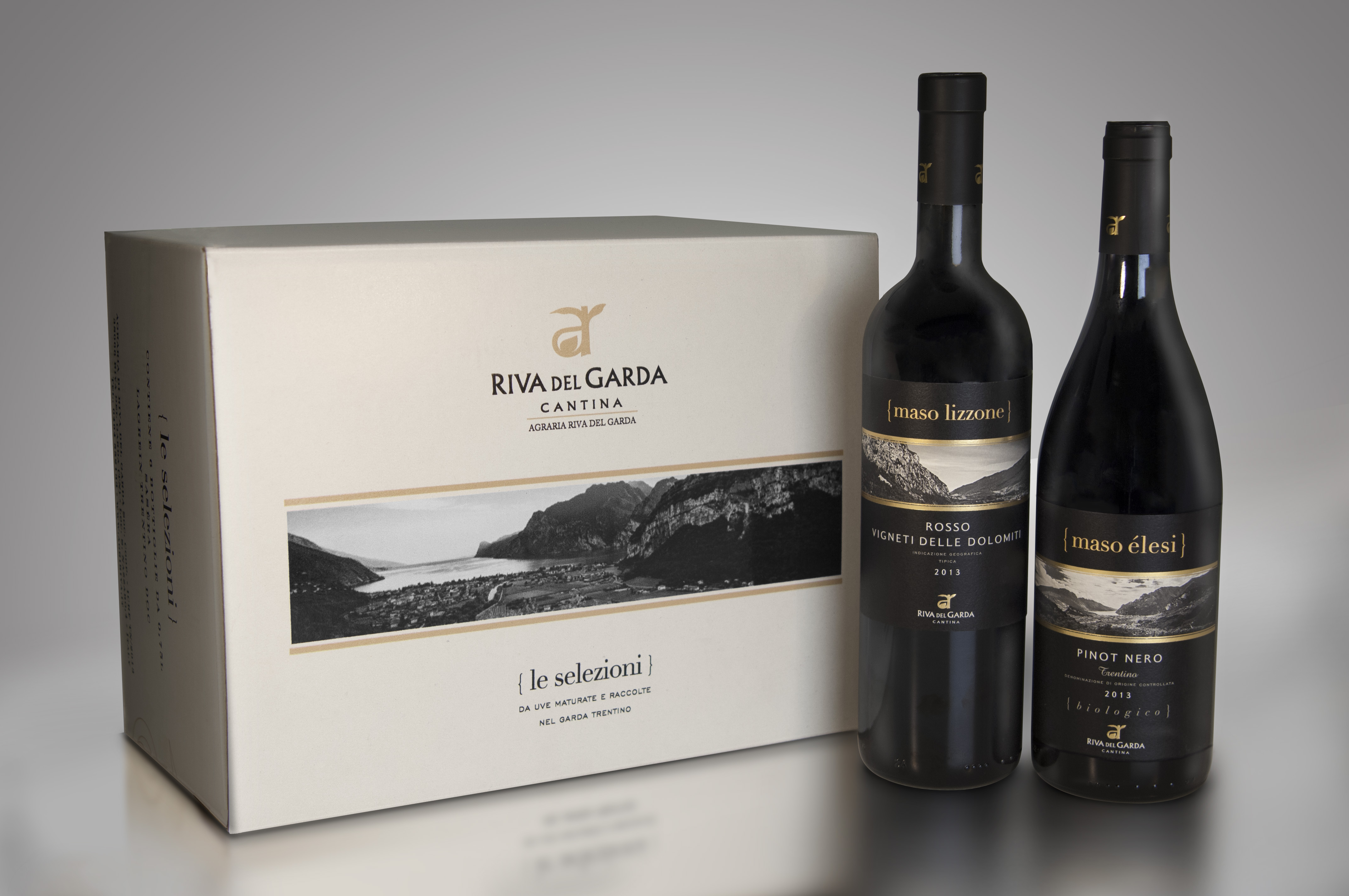
Agraria Riva del Garda, a wine cellar founded in 1926, needs to create a new visual identity and packaging system for its lines Le Selezioni and Collezione Apponale, the former being sold in small retail and wine shops, the latter in the HO.RE.CA. channel.
OBIETTIVI DI COMUNICAZIONE
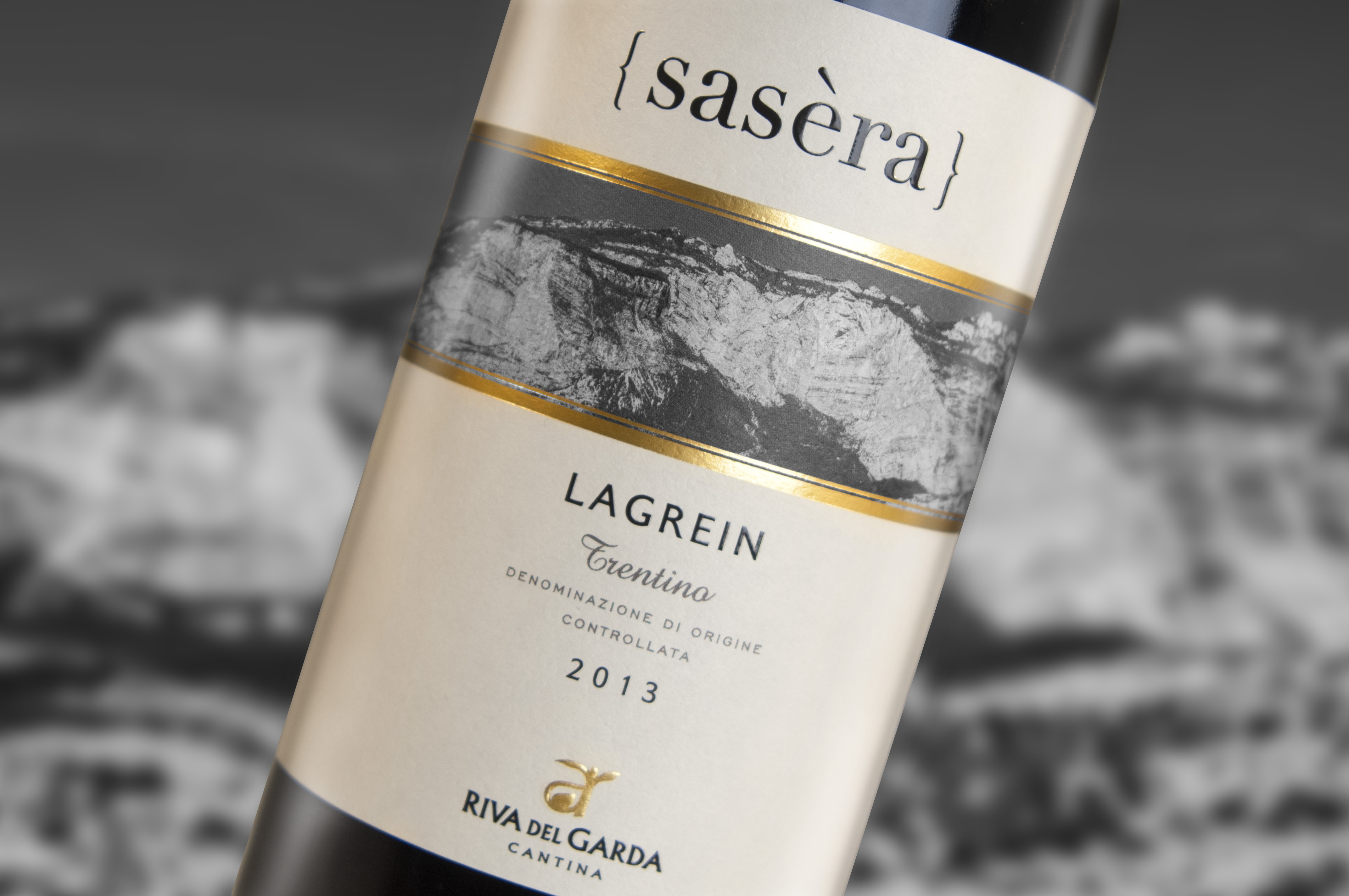
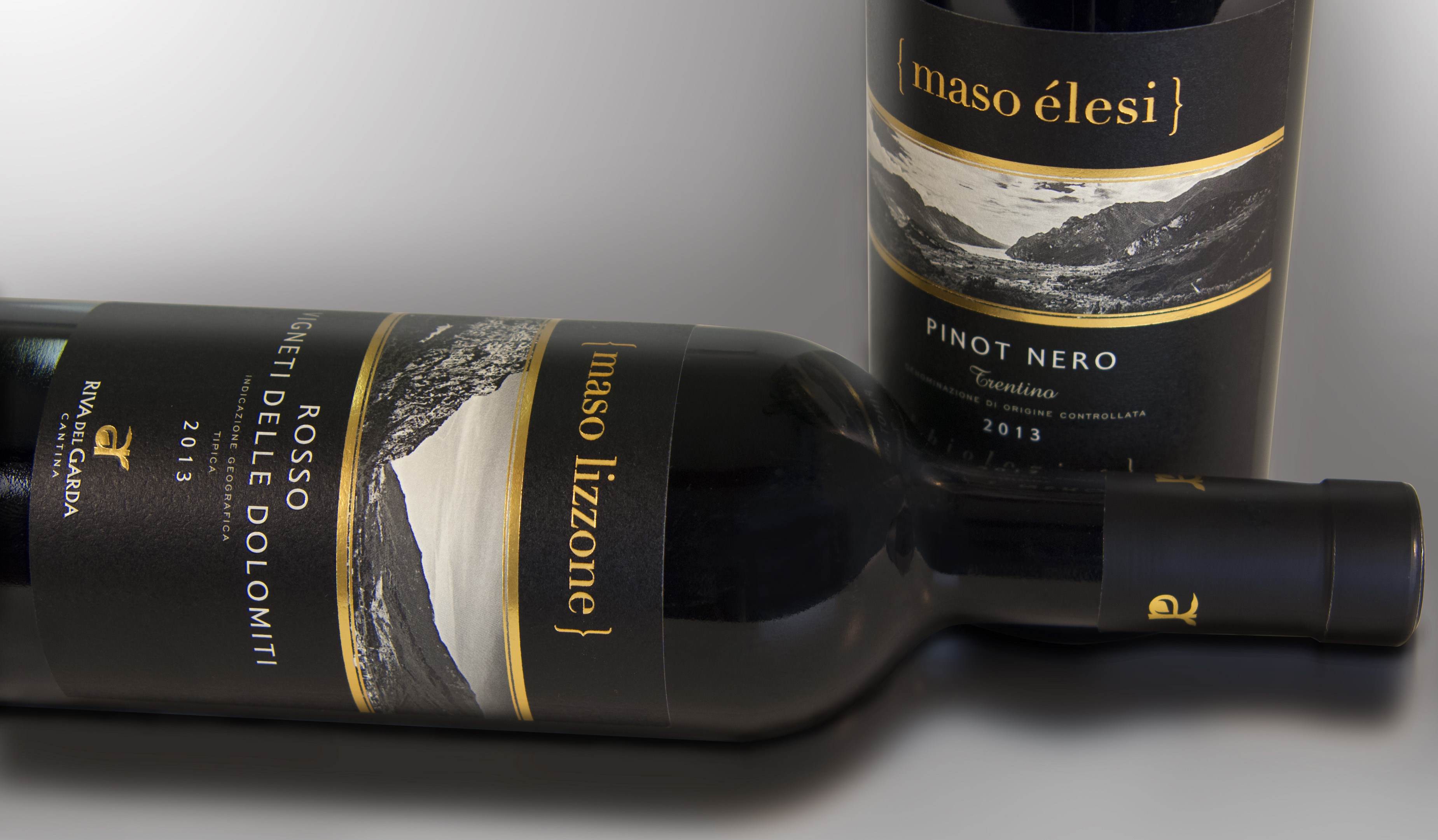
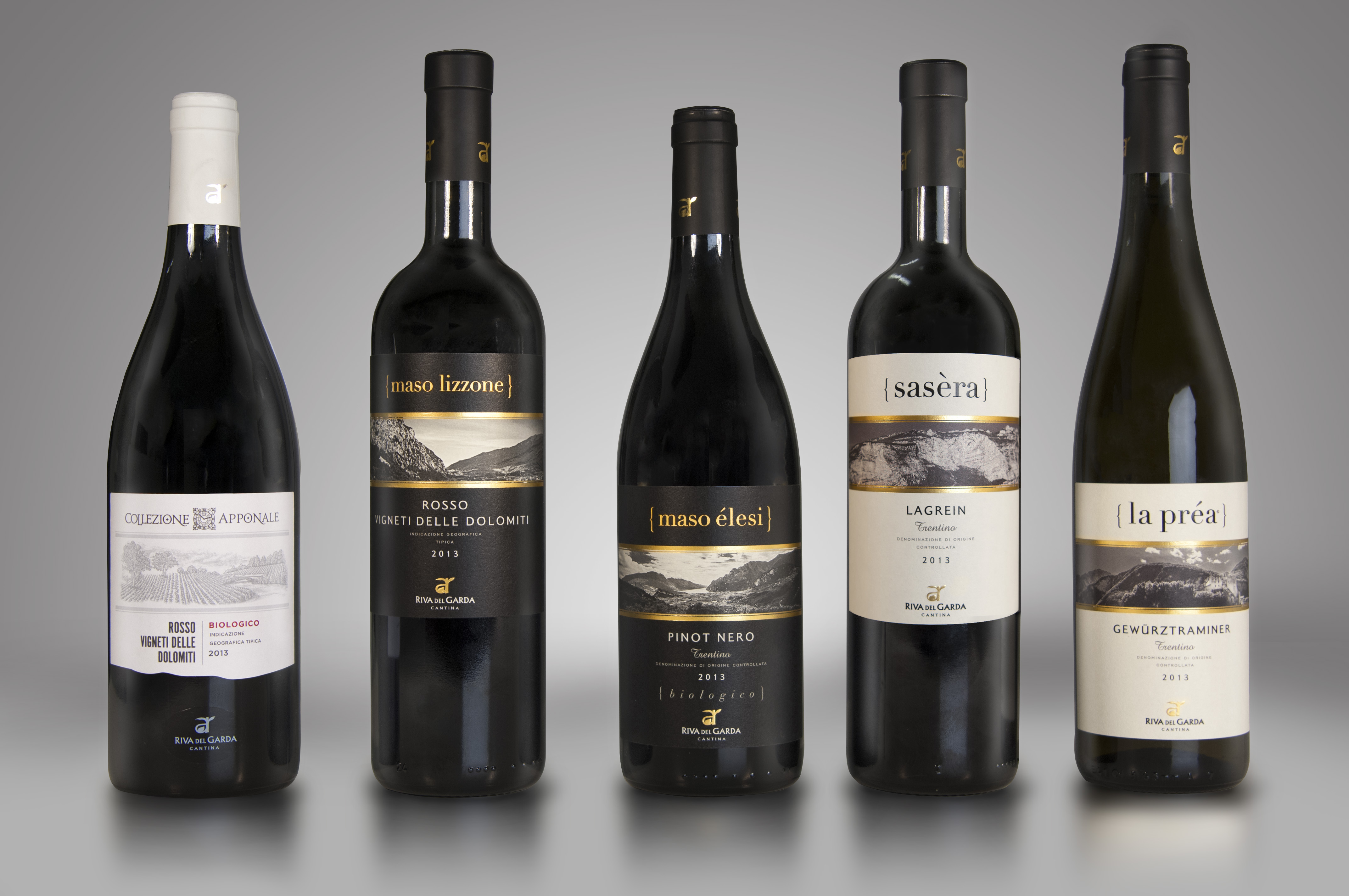
The agency was required to create a new visual identity in order to convey the pluses of AR, from its way to enhance the vineyards to its environment, from its traditions to local lifestyle and taste. The label will be the only communication media, so it has to be clear, direct, personal and distinctive.
SOLUZIONE CREATIVA
To create an identity in line with the positioning of the brand and the latest consumer trends, it was necessary to capitalize on the territory and the rural and local aspects of the company. Le Selezioni, uses a photographic shot to tell illustrate places and bring the consumer -often a visitor or tourist- back to the emotions of the land where each wine comes from. The curly bracket is a former graphical element that has been expanded to contain the local names of the vineyards. Collezione Apponale instead, uses an accurate handmade drawing to convey both the territory and the care needed to make a masterpiece.
To further stress the link with the territory, the big tower clock – an icon for Riva del Garda – has been incorporated into the name.
P.IVA 08721430968 - Cap. Soc. €500,00 interamente versato - N° R.E.A. MI 2044407