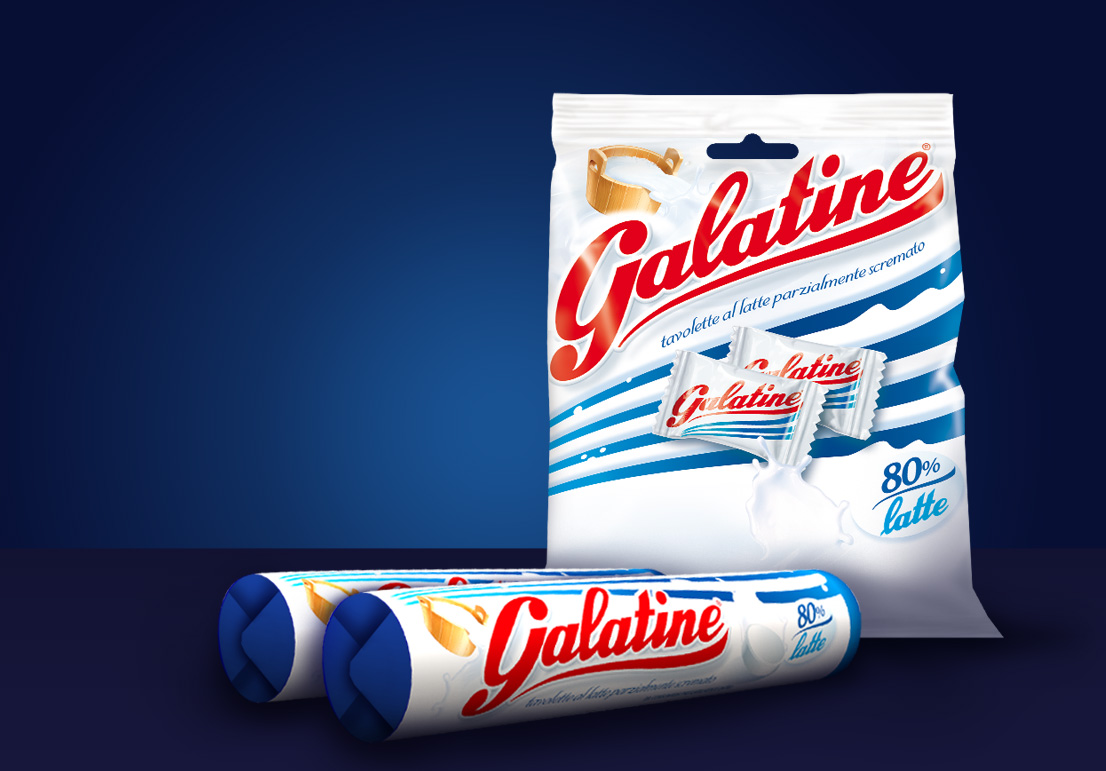
Galatine
Cloetta
SCENARIO
A historic brand for milk candies, Galatine chooses a restyling to achieve a resync with the contemporary visual moods.
OBIETTIVI DI COMUNICAZIONE
Reshaping brand identity and packaging system with a fresh, new sensibility, without losing a style continuity with the essential traits of the brand heritage.
SOLUZIONE CREATIVA
The restyling redefines the Galatine identity in a sparkling, fresh mood. The fluid brand name font, the dynamic design of the institutional blue lines and the milk fall showed in the visual create a dynamic visual architecture, perfectly tuned with the contemporary style.

 Torna indietro